It is possible to change dba i only made 500 cards. And google website. I read where it wont take much
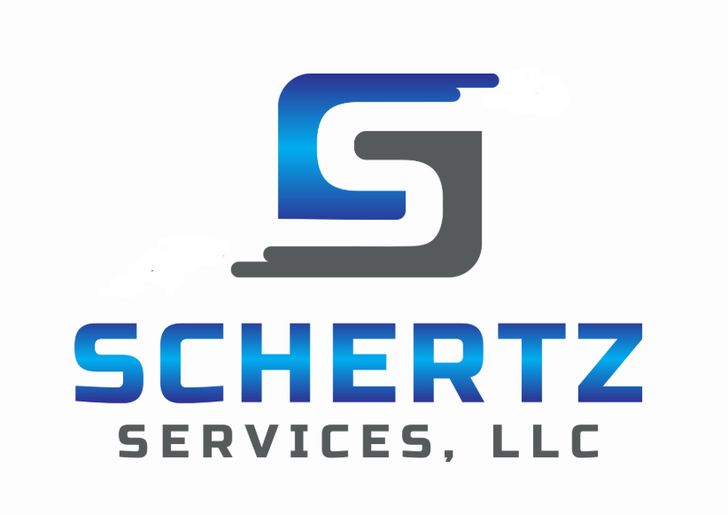
Just got back the logo I suggested to him. It took a couple tries due to the language barrier. How does this look?

4 Likes
Better - Did you get him to do one w/o the fly away pieces on the S. Would still like to see. Typically cleaner is better.
1 Like
I like it. But I think it will be easier to look at on signage and trucks without the gradient
I didn’t. I think they give the logo some symmetry. I can delete them and post a pic.
Thats the one for me!
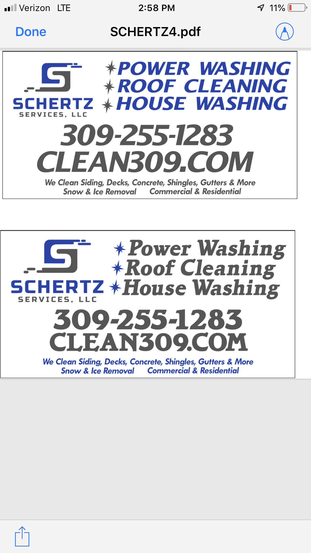
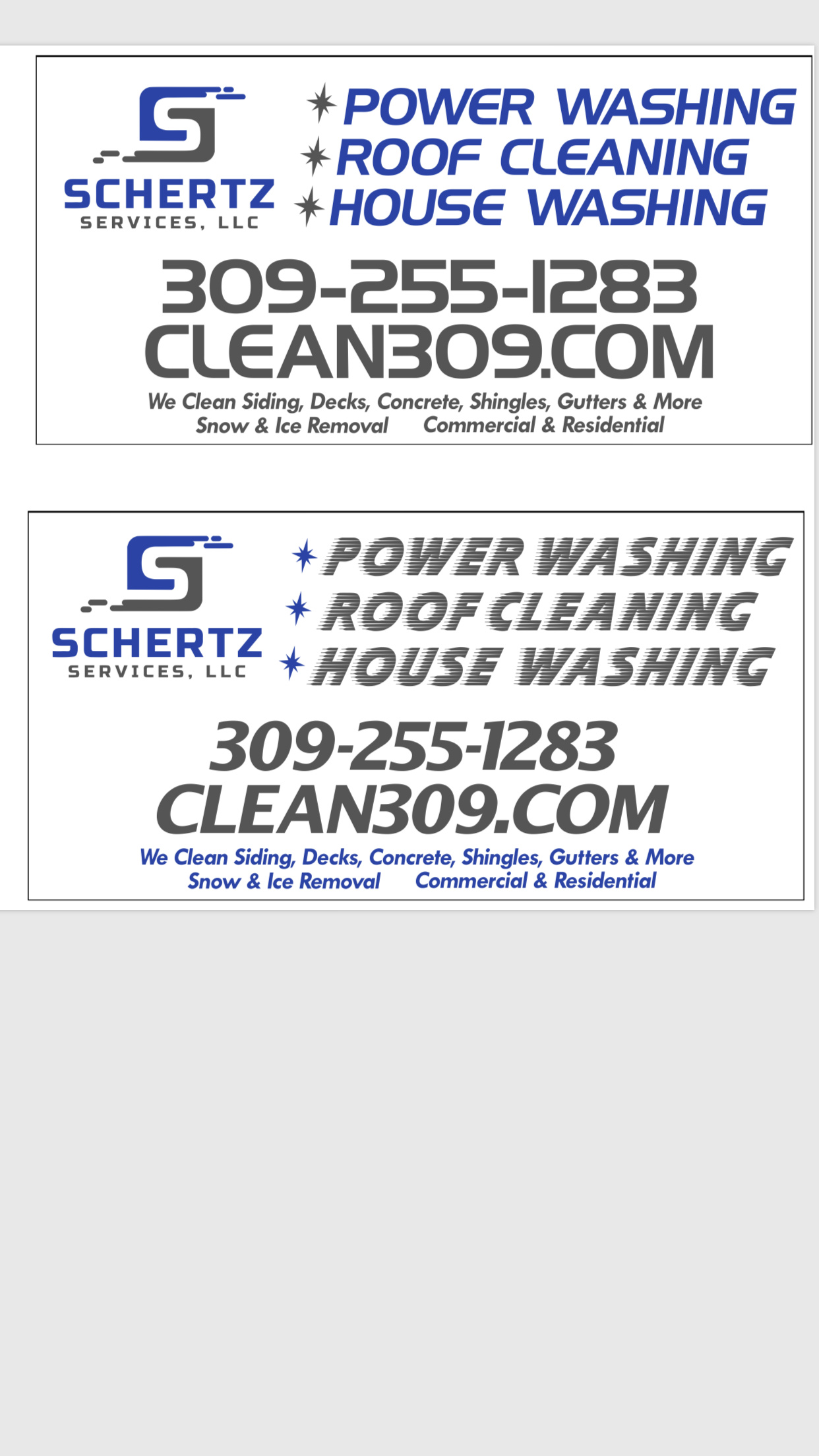
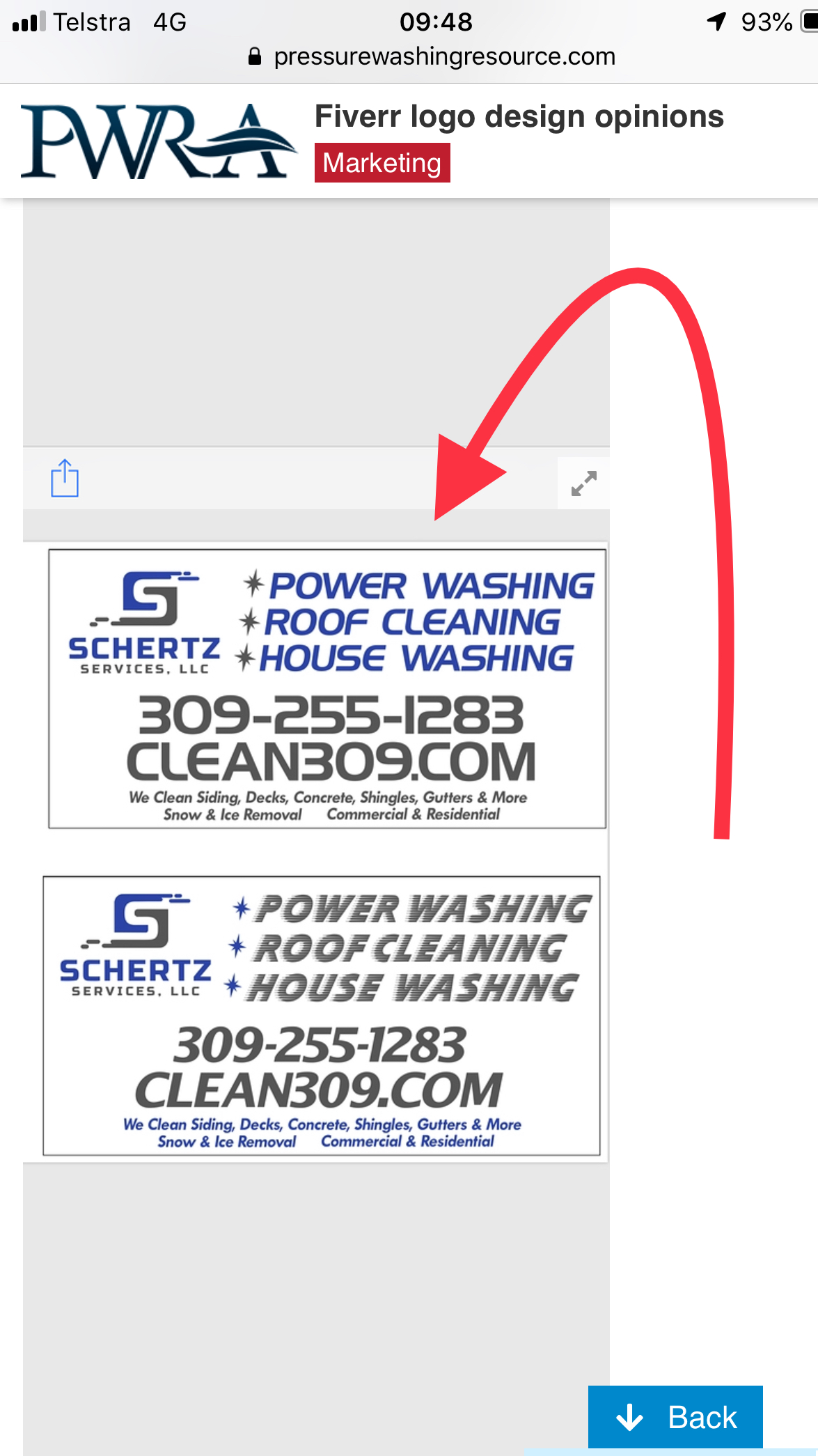
1st one but it seems like it needs more blue or shadowing. Something to make it pop more.
First one - if it was aligned correctly 
Where’s the alignment off?
Also do y’all think it should say power washing or pressure washing?
The text in the first pic I’ve attached is correctly aligned to the complete logo.
The 1st design which is best (second pic) it should be lower, aligned with the complete logo. (It’s too high)
I’m working on some modifications for you. Let me know what you think so far…
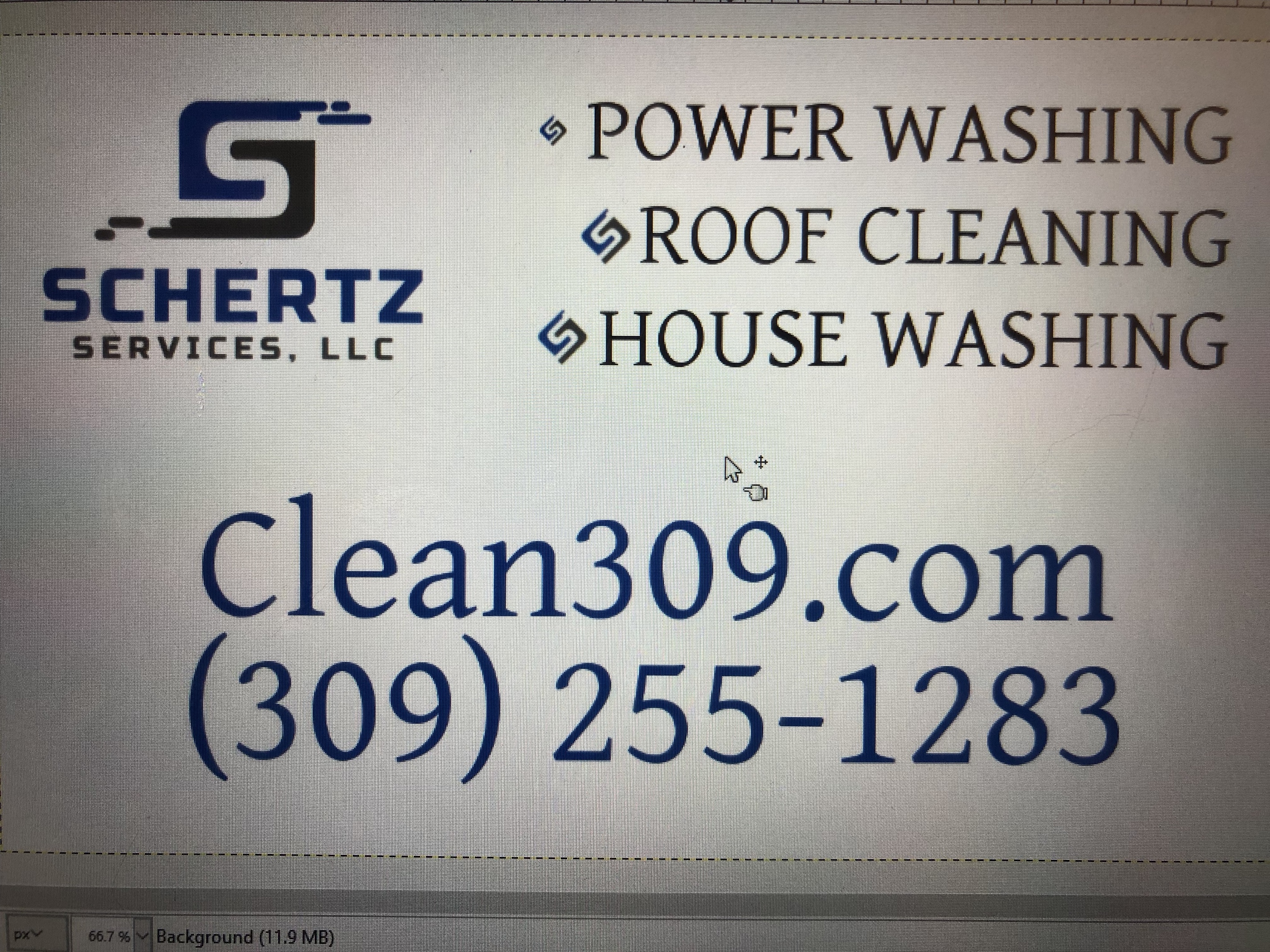
Do you know the name of the font in your logo?
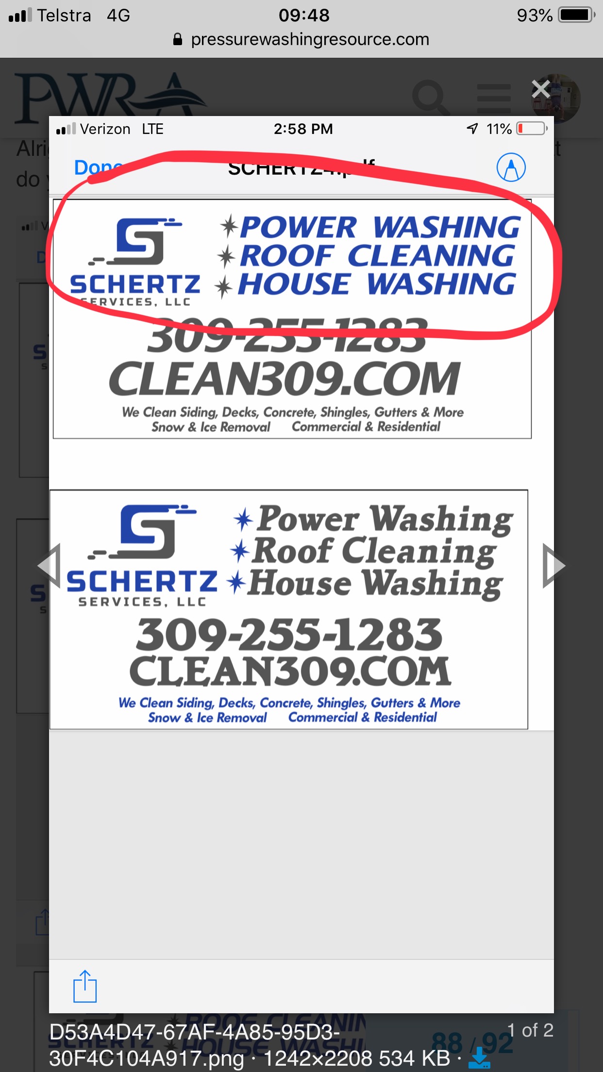
I do not. This is a huge sign too. 5 foot by 10 foot. I like the idea of the added services at the bottom. Your design looks clean!
Yep, just hadn’t gotten to the point of transcribing those.
Torn between which size to use for the bullets
I see what you are saying now!
1 Like
The thin lettering concerns me though. I feel like it would loose some visibility from a small distance.
5x10 is big. I have the same font on my truck, much smaller, and it has great visibility
1 Like
I like 1, but black letters instead of the blue up top and small services in blue.