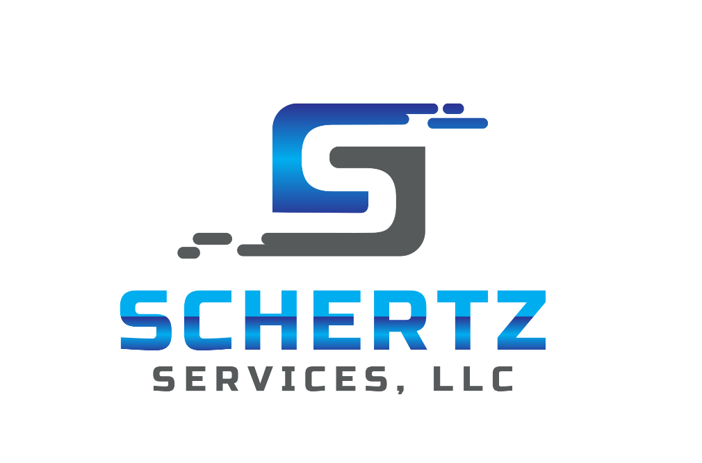
Good morning! I just received my initial designs from Fiverr and wanted opinions. Of the 3 of them I know I do not like one (I’ll note that in the picture I post). Let me know honest opinions. I paid $37 for the initial design and only have 2 days to suggest changes. These will also be on WHITE backgrounds. Yes after reading all of your posts about truck color I am caving… We will buy white trucks in the future and the beast will get a white 4x8 foot advertisement on each side of the bed. Since I can only post 3 items in a row here is the first picture. If you would please only (heart/like) the one you think is best. If you don’t like any please comment why!
22 Likes
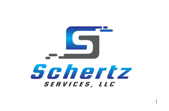
This is the one that I do not like. I really wouldn’t consider using this one. I just wanted to show it so you see what kind of work you get on Fiverr.
I like #1 over #2 because of symmetry. I wkuld suggest a smoother gradient. It’s kinda hard to read because of the sudden breaks in shades.
1 Like
I agree, the third one is wierd. My preference is the first one but I’d probably shrink the name and/or eliminate the flying dots.
1st one, looks awesome.
1 Like
I was thinking the same thing. If he could take the change off #2 and apply it to #1 it would be better.
1 Like
Yes, exactly. And maybe a very thin dark colored border. Nothing drastic. Barely noticeable
Who are you using on fiverr? I used actualreviewnet
1 Like
I personally like a big name. I think the flying dots give it a nice smooth transition.
1 Like
I like the first one. Just keep in mind the color transitions might not translate to a clothing print. Its not that noticable but you will see it. I know I do on mine.
3 Likes
Like the gradiant. Don’t like the italic. 
1 Like
I’d take anything over the clip art house! 
Joking aside, #1 looks awesome. I agree with you about #3. It’s pretty silly.
I liked SCHERTZ in all caps better
1 Like
but still using the gradual change and not lines like #1 right?
1 Like
I like the text better on number one but the S logo better on two.
I don’t think that really matters as much. It’s simple and clear to read.
If it didn’t need a change in color at all my vinyl guy wouldn’t be scaring me… I sent him a proof and asked him about the color change and he said he can “spray paint” the gradual change in…
I mean this guy has been in business since before I was born. But the thought of spray painting vinyl to show a gradual change in color makes me afraid.
1 Like
They do make printable vinyl. No clue how long it lasts though. Can’t be much different than printing a vinyl wrap.
M3 makes a really nice vinyl that does really well with color translation.I forget the name but my guy will know it if you care. Something with laser cut or something. Mine is about a year old and holding up better than some wraps I’ve seen after a year.