It will basically be like having a box truck. But the sides will flip up with air shocks. Gives me a place to work out of the sun as well.
2 Likes
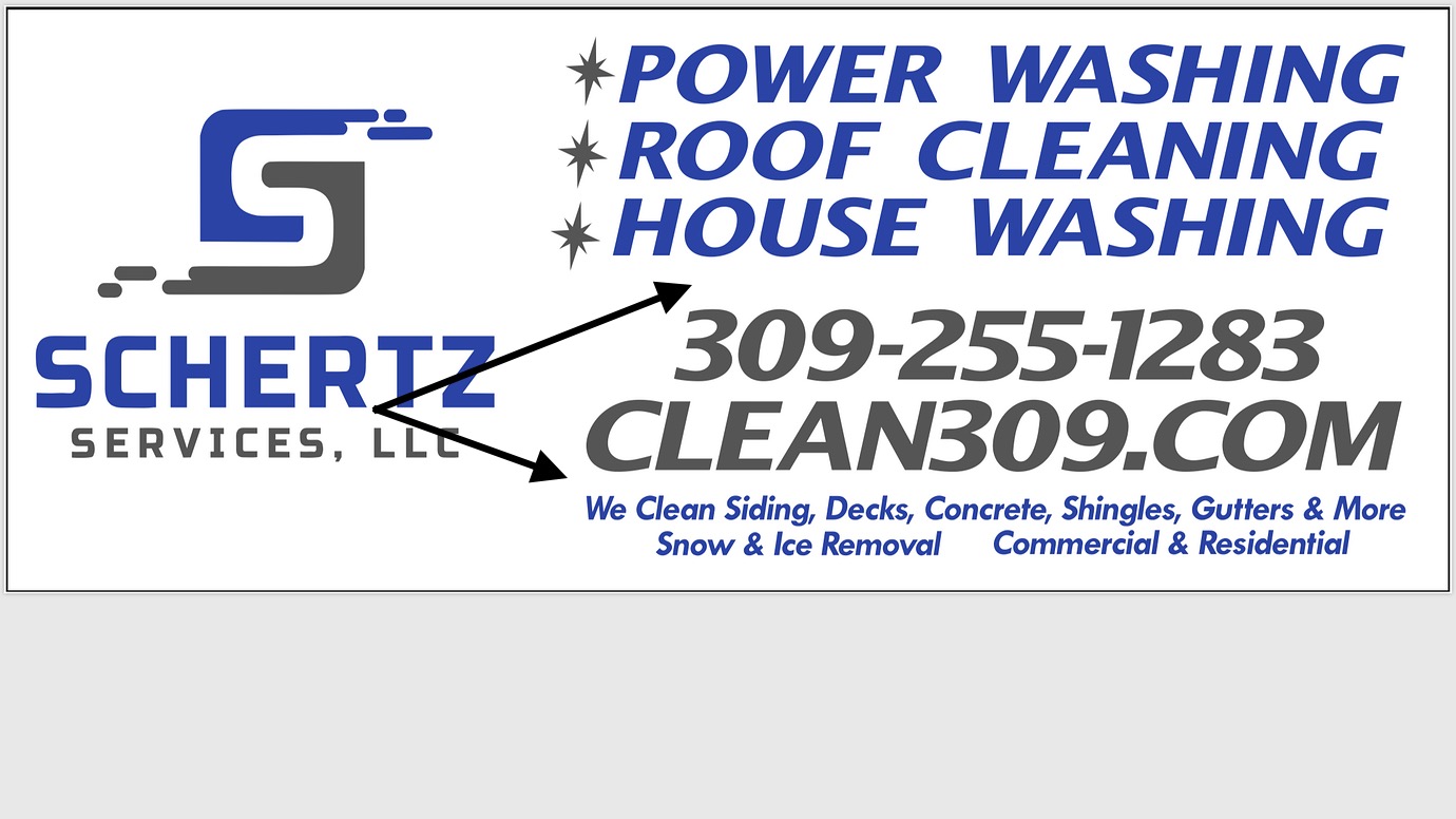
I feel like that is a lot of black! Ps changing your profile pic really threw me off lol
Yeah but Maybe make the small services the same color as the top portion… something to separate each area.
1 Like
Better? Dont want to confuse the older populations around here
1 Like
Older? I assume you mean the folks that have been here a long bit lol… I just turned 30!
1 Like
Yes… if your confused, then they might be super confused.
1 Like
Lol I was hoping! I feel 50 after this last few weeks of snow torture!
1 Like
Personally I like the top left simple. The leaning letters turn me off. 
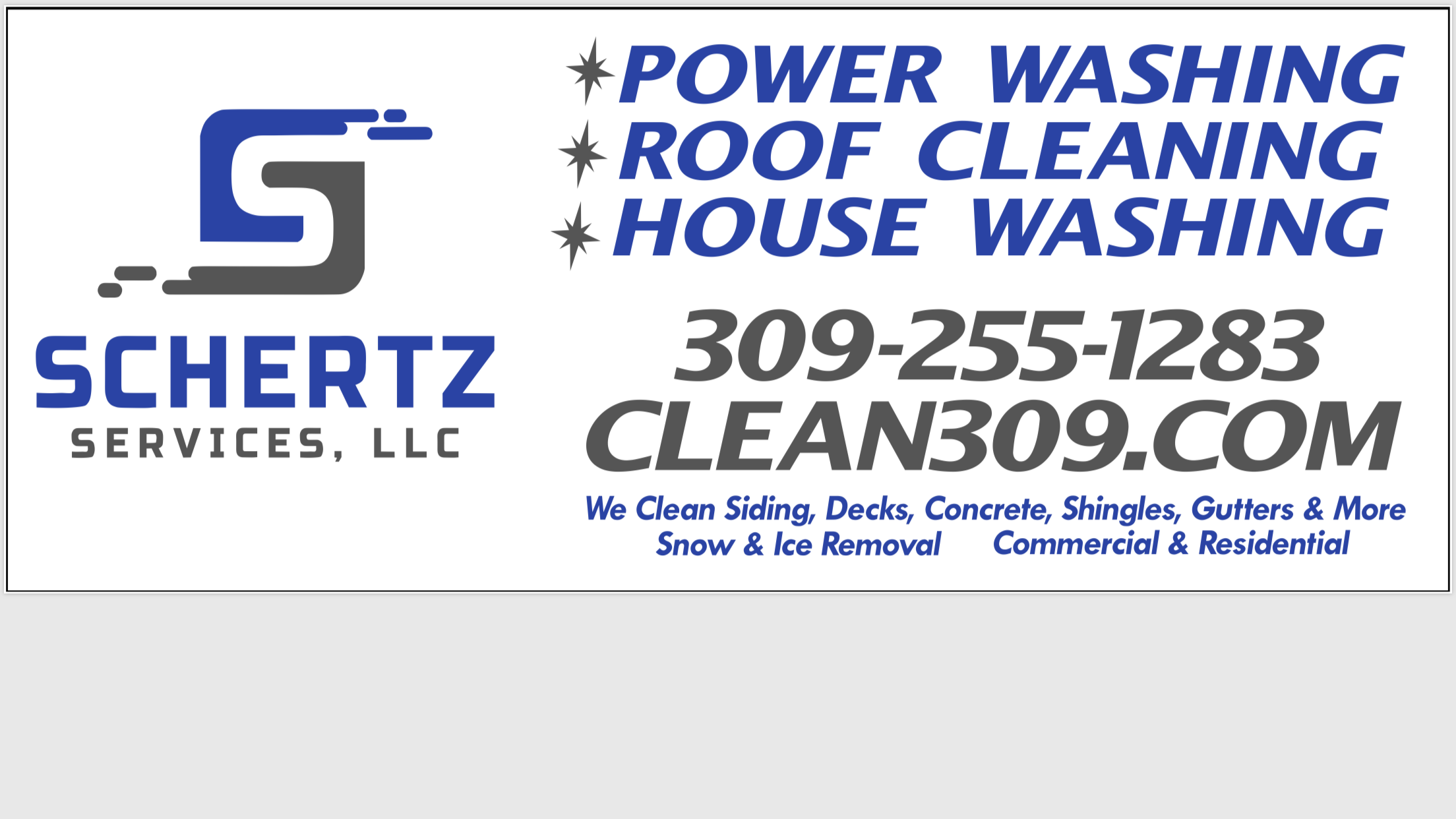
Just got another proof back from the printer. This is a 4 foot tall by 10 foot long billboard. I like it, and Blaire likes it. But do the folks at pwra like it? I know the logo is big. But we’re talking about a very large billboard!
6 Likes
Looks good. Maybe some clip art.
@squidskc has shunned clip art lol
looks great man!
Looks awesome!
Ahhh that looks great! Very bold.
The only thing I don’t like is “snow & ice removal commercial & residential” have you tried it without?
The placement looks odd and a little squashed :)
Looks nice, but everything seems to be italized/italic
Also the fonts aren’t modern, check these out:
https://www.canva.com/learn/sans-serif-fonts/
3 Likes
This guy helped me with my business logo design. Perhaps he can help you as well.
That irritates my OCD. YMMV. ![]()
1 Like
I actually like the way it is. Go figure! ![]()
2 Likes
I just paid to have this logo designed. I like my logo. Just wondering if the lettering and all looks nice.
1 Like
