They all look great, but the most important thing to have is that it’s clear what service or product you offer. Like some have mentioned here, a picture or logo that is descriptive of your service is huge.
1 Like
Boy darn is it hard when the two are nothing alike without clip art! We’re big anough at this point that it’s just something that I want to carry me. The S brand will do fine. My big fish could care less about my logo. But when the small fish see me working at the big fish I want them to take note.
1 Like
They will take note, but not because your logo has a snowplow in it. A clean good looking logo will carry you. Simple can be a great thing. Some of the best logos I’ve been a part of designing had no correlation to the company’s industry. But an eye catching clean “professional” appearing design. Personally I think your on the right track with that first design you posted. And I’ll add this if it helps, you can think of the inside of the “S” being a plowed area! And the two parts of the “S” kind of look like a plow. There ya go, I just tied your logo to your main business! 
4 Likes
I like the rounded corners on #1 S tho instead of the curves on the 2 S. Agree, lose the flying part of the S on #1 . I think the Little more rectangular and blocky look of the #1 S looks more substantial and stronger.
1 Like
Also, late to party, but what’s up with the ‘clean309’ crap? Sheesh - Stick with the SchertzServices. You don’t go to EAT309 to find your nearest McDonalds or GAS309 if you’re searching for Exxon.
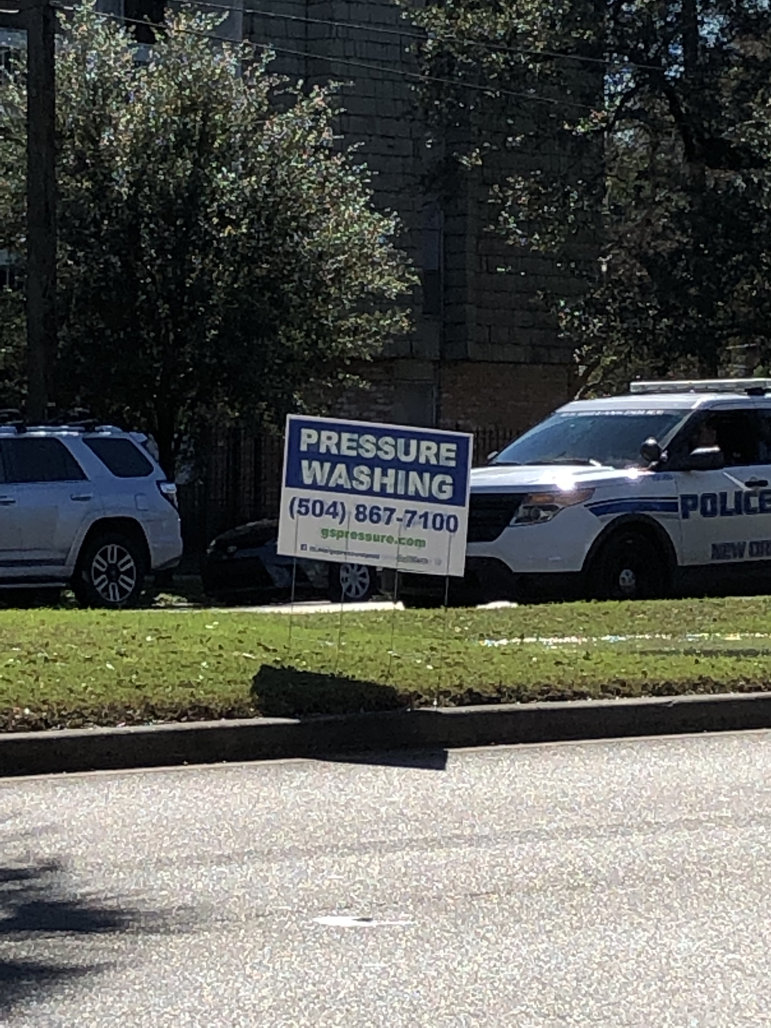
Your sign too busy. Limit it to 2-3 things as I think Infinity mentioned. Also, think of coming up with an all encompassing tag line. ‘We provided seasonal exterior cleaning services for residential and commercial clients’ or some such.
2 Likes
Your logo should be the cat. Everyone remembers the cat.
5 Likes
Good one
    Schertz Services LLC
    Home of the Naked Cat
Coming Soon to a House Near You
8 Likes
Our old website url still works! But 50% of people can’t spell Schertz. It’s been mentioned to me many times.
3 Likes
Heck 90% of the people can’t drive either but they still do everyday, lol. With your spiffy new logo it’ll be burned into their minds now. They just couldn’t see it well enough before.
1 Like
I agree with the website url change. It’s much easier to remember and spell.
1 Like
I like it. It won’t fit on a license plate, but if everyone did that, it wouldn’t be so cool…
Also, I’m not certain on how redirects can effect SEO. At one time, I know that they could damage your ranking if done improperly.
@FourSixTwo.digital, any insight on redirects?
3 Likes
I like it!
1 Like
So if I google one of our services is a far away city that I have backlinks attaches too it still shows up in google as the old site. The old site still works and always will. I was on the phone with a SEO guy yesterday and he said it will not effect it negatively as long as I keep up to date information and don’t just abandon the old site url.
2 Likes
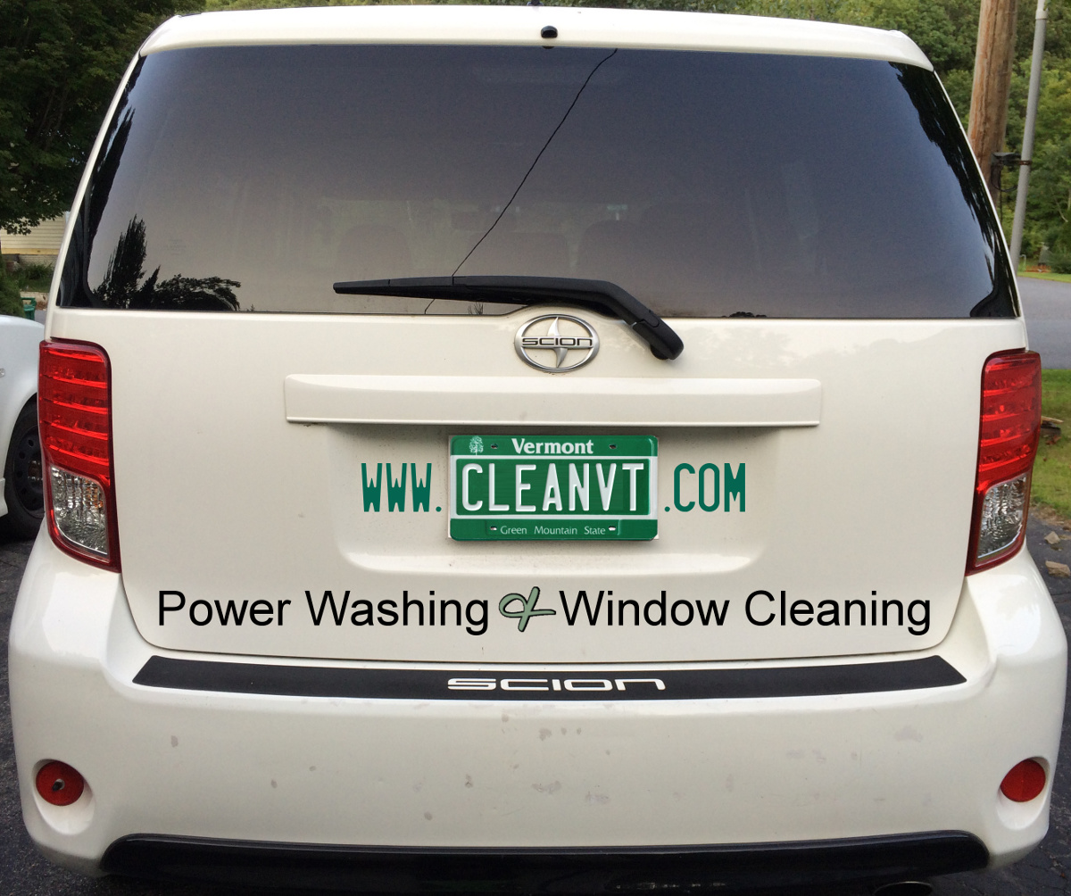
I would put what you do. I.E. shertz power washing.
What we do will be in big lettering next to it.
1 Like
you wont get enough traffic to affect anything. ( no offense)
I don’t think any pressure washing company would get enough web traffic where re directs effect anything.
Googles looking for large scale spammy links.
Redirecting your old website is imperative.
People have favourited your site for a later date maybe, written it down, adverts you have placed on free sites for local businesses - they all get clicked. If they go to a dead link, they google “pressure washing” and you might miss out.
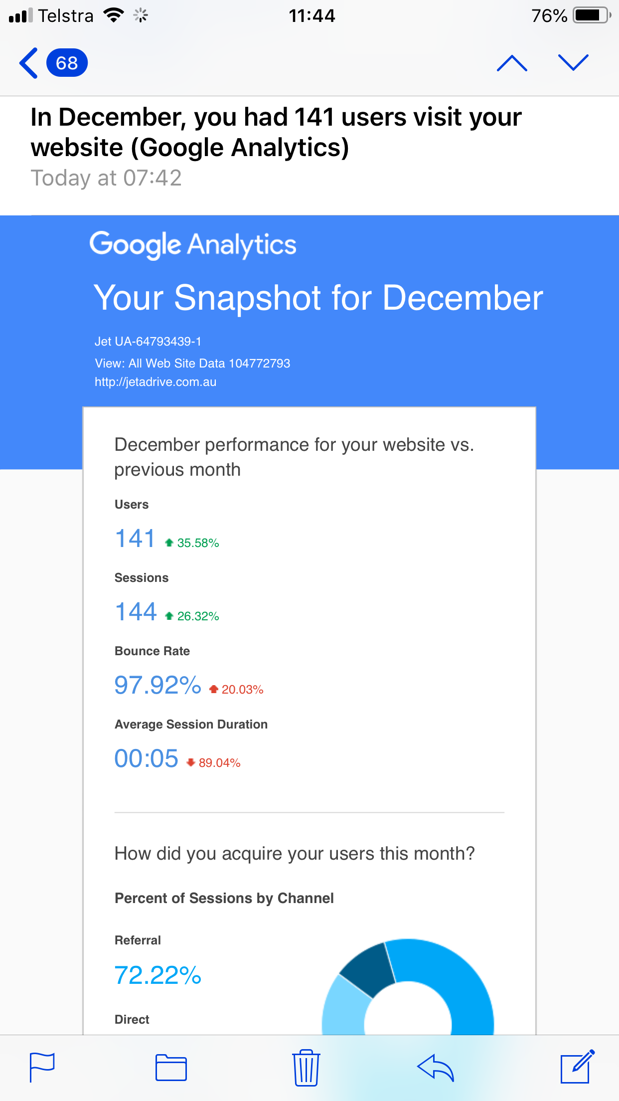
My old website from three years ago, which I only recently took the redirect off, still gets 140+ hits a month.
1 Like
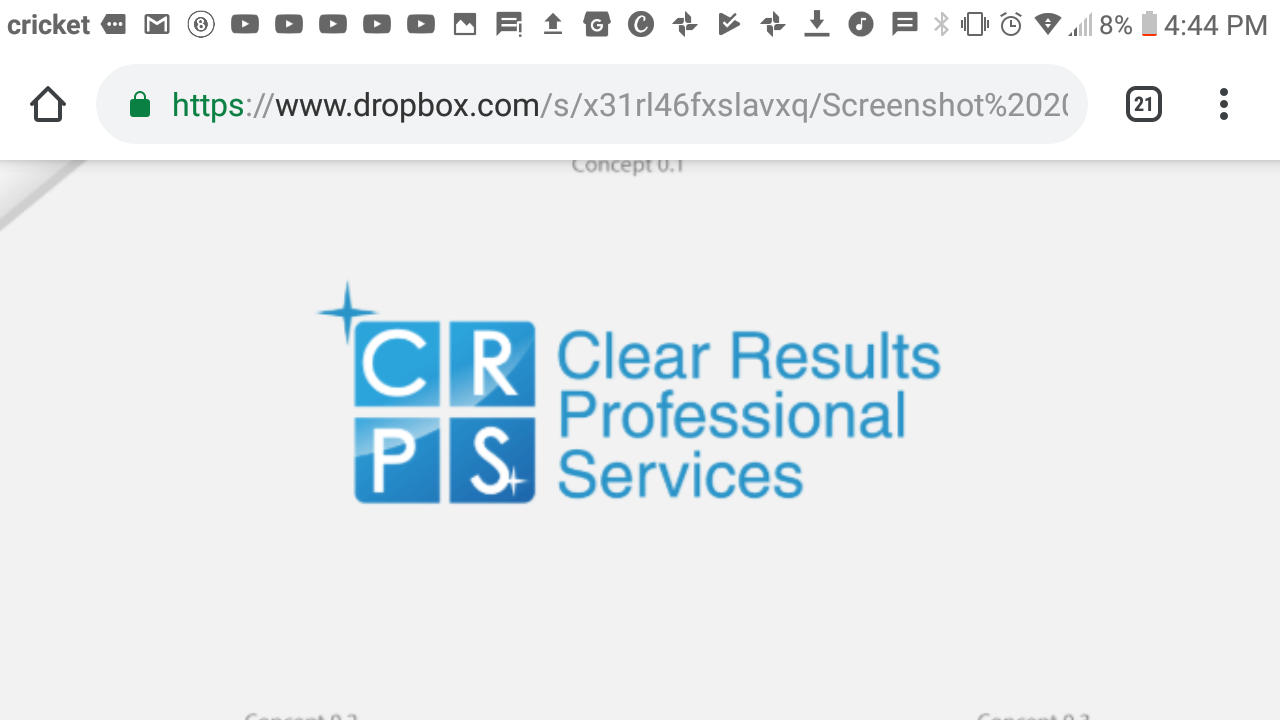
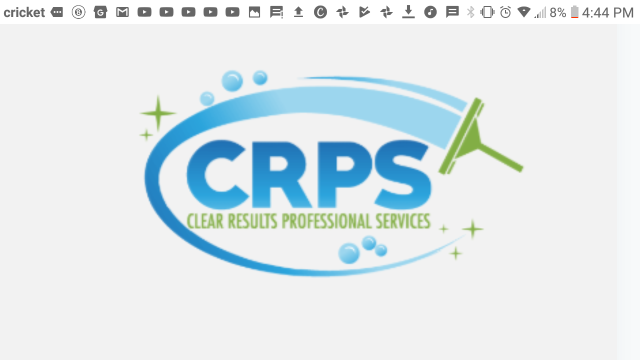
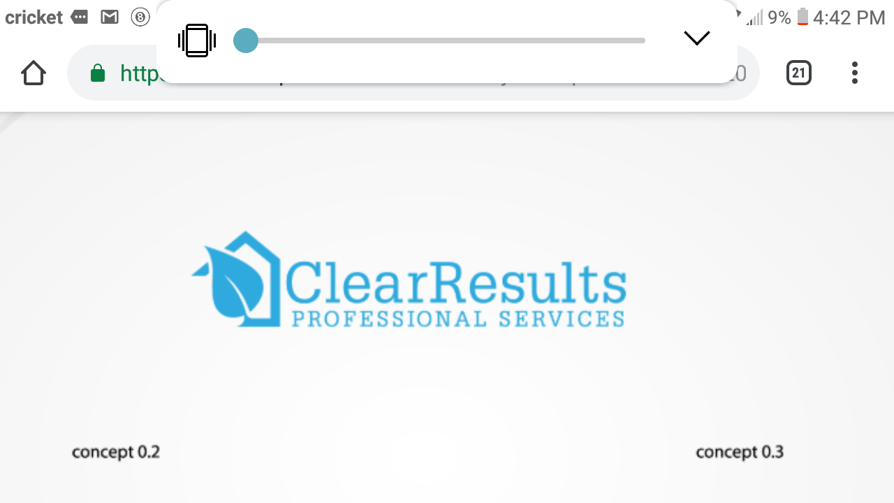
These are some logo concepts i had designed at fivver. I would like your opinions on which one is best and any chages that can be done. Your help would be very well appreciated.