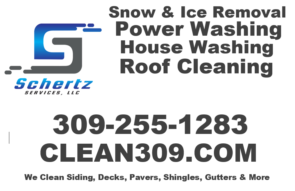
So a very barbaric sign with the logo. NOT something I am sending to the cutter. But how does this layout look for a 4 foot by 8 foot sign? I know some of the services are wrong sized compared to each other.
What colors would you use?
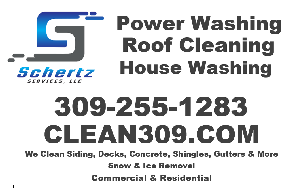
So a very barbaric sign with the logo. NOT something I am sending to the cutter. But how does this layout look for a 4 foot by 8 foot sign? I know some of the services are wrong sized compared to each other.
What colors would you use?
Logo n.1 looks like a videogame company logo
I like n.2’s logo because you can easily make a sticker of it, like it’s just an easy circle
I can’t tell on my phone what that black background is with white spots, but it’s fine
I used to use the word services but now i don’t, because it was to vague, would you consider it to say Schertz, Washing and snow control, or something like that?
I don’t think so… I am just trying to build a brand awareness logo. We are a majority snow removal company but I am also full on snow removal customers. So I want the big “logo” and name rolling around on the trucks with pressure washing attached to draw attention to that side of the business.
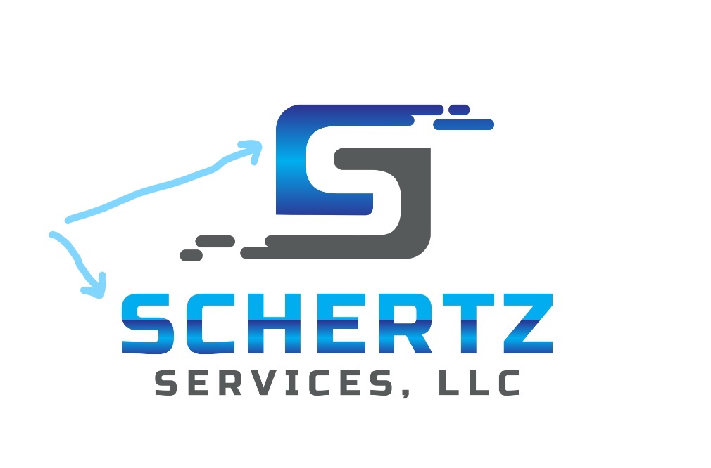
The first S looks awesome as a stand along logo.
But doest convey what you do
It’s really hard to convey what we do when snow removal is polar opposite of pressure washing. It’s been my quagmire of 2018
A lot of successful guys on here have a logo that doesn’t really convey what they do.
I like the first one. Don’t really care for the gradient though and might consider just doing a solid color. You want it to be consistent throughout its use. Solid colors you should have no problem with that, but a gradient wil be difficult for some printers to match. Like @squidskc said, the all caps of the first one look better. I know you were just trying to show the smoother transition, but just saying I like it better. I don’t think it matters if looking at the logo conveys your business or not, most company’s don’t. I spent a while in the printing business years ago selling everything from designing logos to print ads, and rarely did a logo convey the business. No offense, but the first one is WAY better than what you had. Looks good.
Printable vinyl works great. As long as you’ve got a good sign guy, he’ll select the best material for the application.
Good to know! About to have my new-to-me Sprinter lettered up, and printable vinyl would look much better than plain flat colors.
I asked him about it and he said it fades in a few years. Is that true?
I know that my sign guy laminated the logos with a clear UV layer before installing them. I’m guessing that they still won’t last as long as straight vinyl, but I plan on getting 3-5 years or so out of them at least.
The two year old vinyl on 4-slice shows no signs of fading.
I asked him to alter the color change to match the logo. I think that will help a lot! I post it when hes done.
I like the arrows, makes you foucs on both things separately.
If nothing else I registered the new domain name and got it linked to my old website.
It was hard to write down www.schertzservices.com
Now you can just go to www.clean309.com and it sends you to my old site! Still maintain my SEO from the other site.
True, your logo could be of an almond, as long as you make it yours, people will recognize it and think of you when they see one. (Like the Coca-Cola bottle silhouette, or Amazon smile)
Missed this the first time scrolling through. I’d find a different sign guy if you want the gradient. It’s a very simple process for someone that has the right printer. The hardest part for my sign guy was cutting out the logo. For whatever reason, he still hasn’t managed to get his printed graphics to play nice in his plotter/cutter. So he cut my logo out by hand with an x-acto. Added maybe 10 minutes to the install process, and came out beautiful.
Not sure which sign design I like better. Both of them seem a bit too cluttered in parts. First one at the top, the other at the bottom. If it were me, I would stick with 3 services and only one line of text under the phone number.
Regarding the logos:
As everyone else said, number 3 is no bueno.
I like the circle concept of number 2. I think one thing throwing it off is the slightly different angle of the italicized name from the logo. If the angle were matched perfectly, or the italics removed entirely, I think more people would be voting for that one.
I also like all caps for the name.
Ultimately, I think number one is my favorite. I look forward to seeing how it looks with the matching gradient.
Like @Infinity said, having the gradient printed shouldn’t be a problem to make it look right. The only thing I would worry about with it is having it match on different platforms (ie: truck, business cards, uniforms, etc.). But the sign guys I used to work with would have no problem with printing the gradient and making it look right.
Yes great move, I’m doing that with yard signs and door hangers this gear. Wash(zip).com