Why isnt Juan’s or Juanita’s name capitalized? Also, why choose Hispanic names for those job titles?
Now, who would you hire; you?
Or this extraordinary looking fellow?

(Leave the ball valve out of this @Innocentbystander)

Ok, you’re right. That wasn’t necessary. I edited my post.
It’s unfortunate that you stopped reading at that point, though. I gave some straightforward, simple, and actionable advice on how to improve your image. That’s something most people on this site are interested in, regardless of how tactfully or bluntly it’s offered.
I’m really not sure exactly what your reason for joining this forum is. What are your goals?
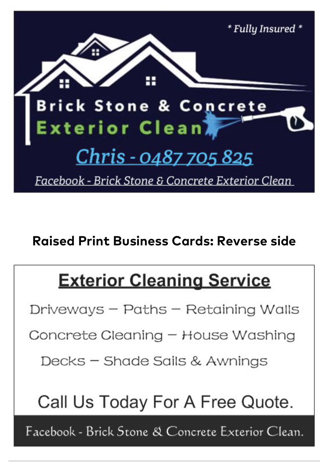
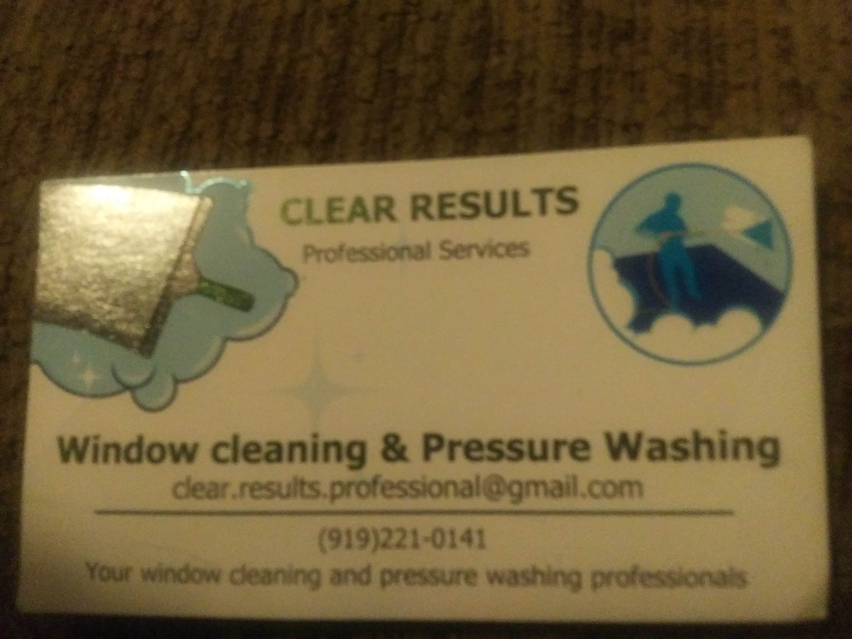
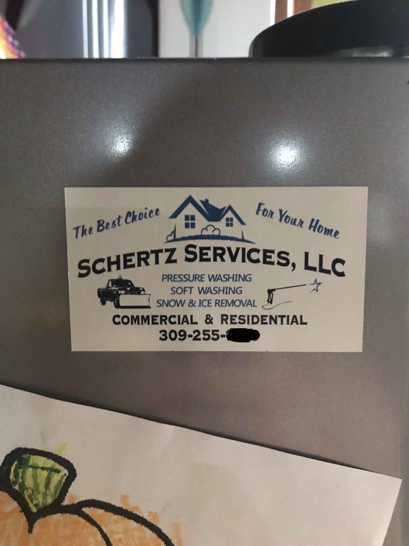
@Infinity. Alex i love how the colors pop with the white background on my card… water drops are my favorite part though. My # is on the back.
Should i fill in the water drops on the next batch of 25 cards i order in Vista Print?
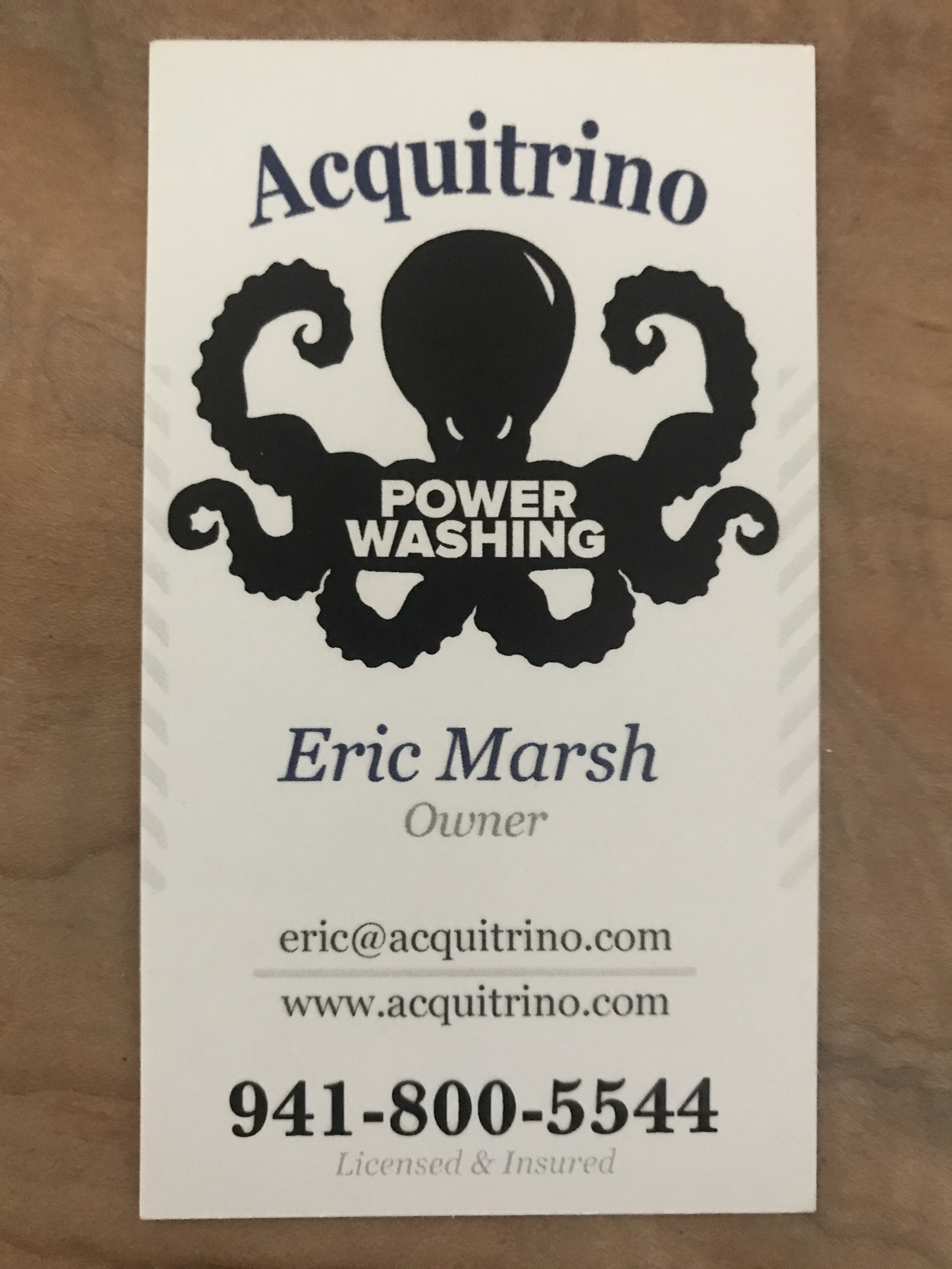
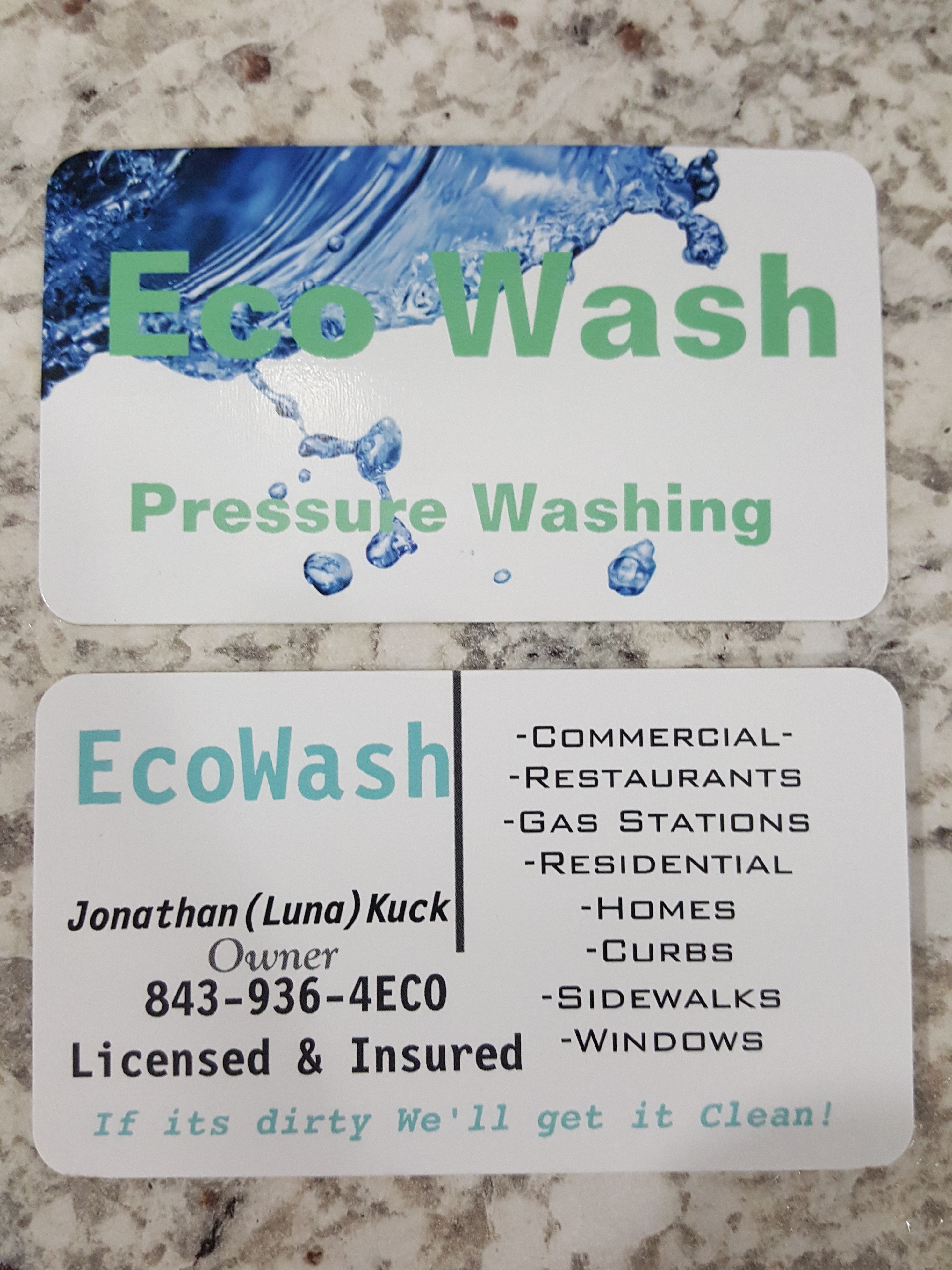
Might want to go check to make sure CleanNScreens doesn’t own the trademark to their card.
Yours might qualify for infringement…
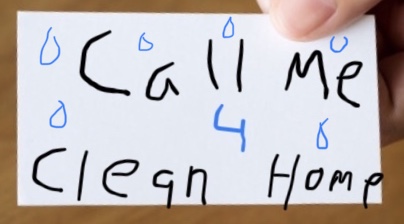
Dude your killin me with that 
I’ll say it’s a good start. As you grow, you will make changes. Over the years I’ve changed my cards a few times myself and each time they’ve looked better than before. I once give a guy my number on a peace of paper because I didn’t have a card with me. Now he’s one of the largest commercial accounts that I have. Read and research as much as you can and learn to be efficient with your equipment. The rest will fall into place.
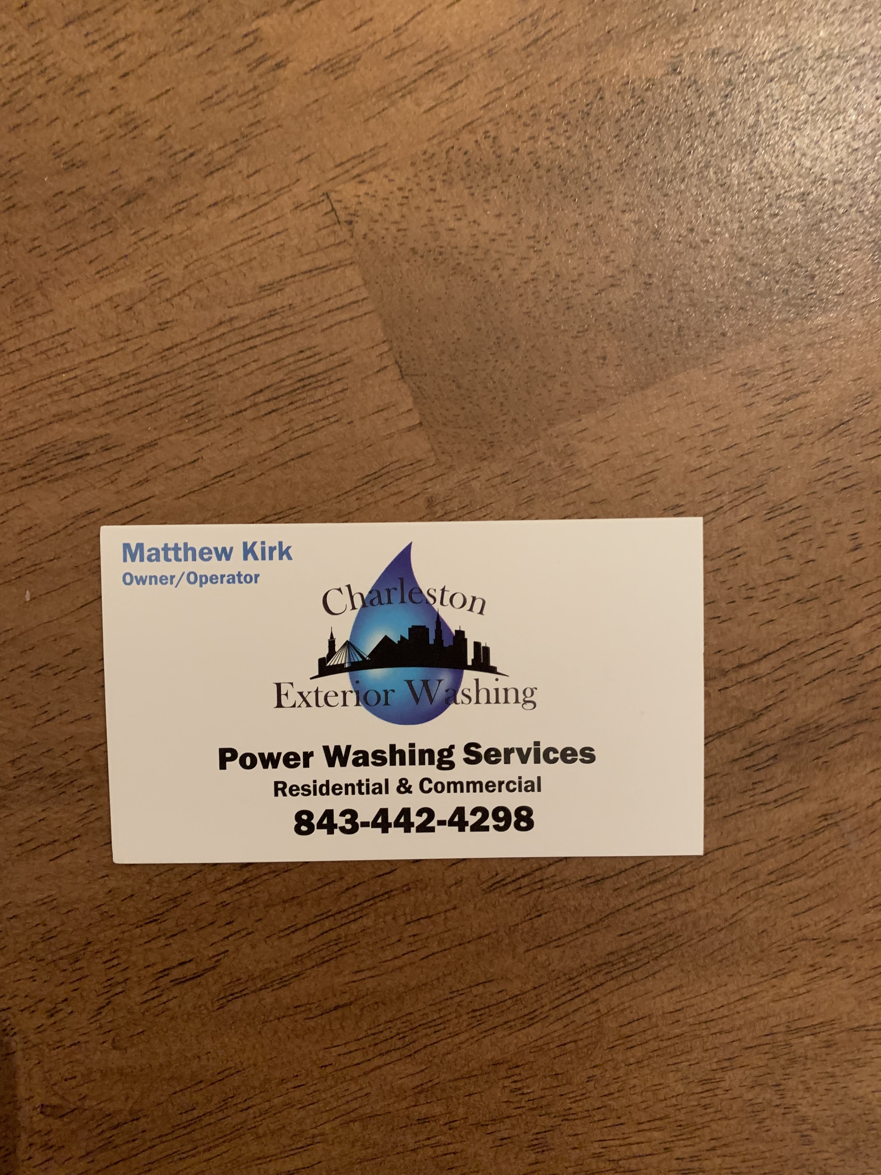
Very unique. I like it.
Did you buy that number? Easy to to remember.
Well put. It’s all about progress. Marketing copy makes up one small piece of the puzzle in running a successful business. For some businesses, that could be nearly non-existent.
Each time I get new cards printed, I like to think they’re a little better than the one before.
I took my own advice about simplifying on my last redesign. This was on the inside of our previous card:
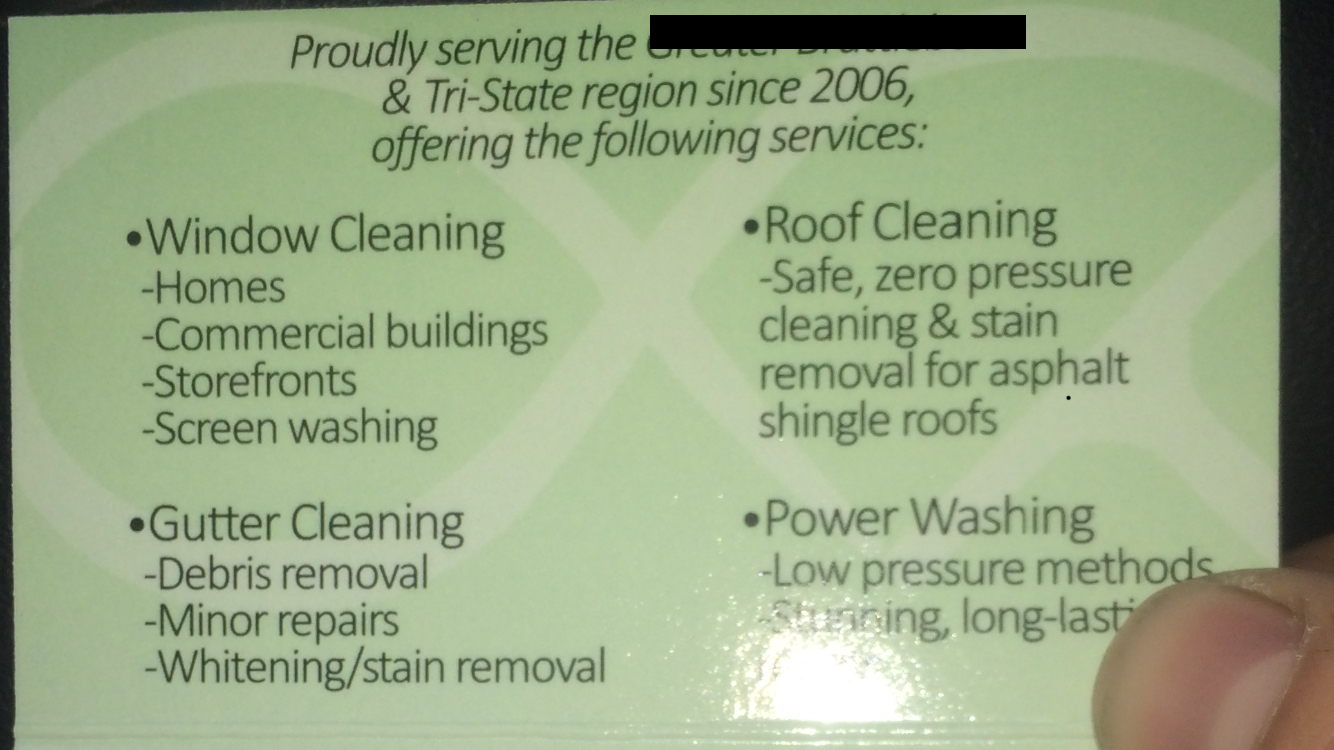
Current card is posted above:
On a side note, I went 3 or 4 months this year with no cards. Ran out and didn’t get around to reordering. I just invited people to snap a pic of my vehicle. So there’s that ![]()
Thx.
Yes I bought the number. It’s a “go daddy” product that forwards that number to my cell. I always know when it’s a business call.
I like the black!
I like it. Nice clean and simple. Only thing that I don’t care for is too many fonts on the back. Especially the italic owner title. I’d drop it down to two fonts max. And maybe center the line better. On the front a thin white outline would make your company name pop. Not anything drastic. Maybe 3pt white border or less.
Still working on finding a new brand… after y’all hurt my feelings so much I guess I have too ![]()
Fridge magnets are the way to go.
Lol I did get a little carried away with the fonts.
Just had them made. Not doing commercial yet but figured I might grow into it before I ran out of the 1000 I ordered.
How were you able to register that in SC? That’s awfully close to Micah’s Eco Clean. Might be different rules down there.