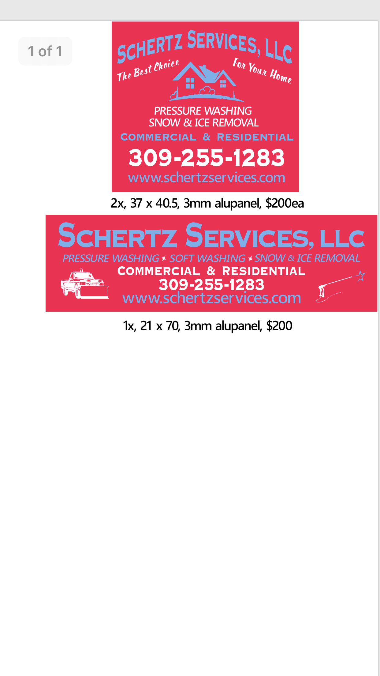
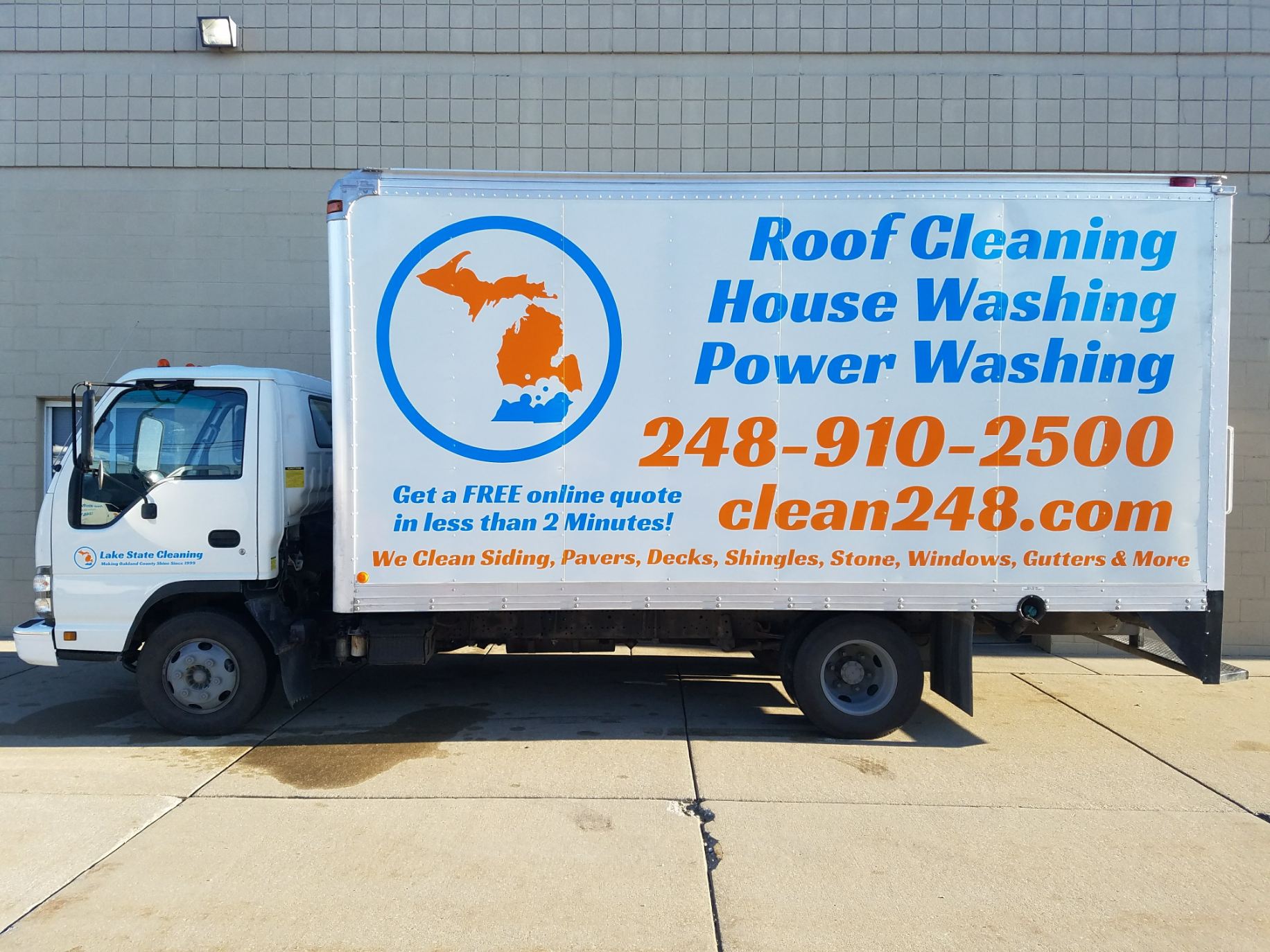
I let my sign guy design it. What do you all think?
These are huge signs that cover the entire side of a water tote on each side of the beast. The bottom sign will mount to the back of the two totes for a rear facing sign.
I let my sign guy design it. What do you all think?
These are huge signs that cover the entire side of a water tote on each side of the beast. The bottom sign will mount to the back of the two totes for a rear facing sign.
Honestly i think it looks outdated, just graphic wise, i feel it could be better.
I personally dont like adding LLC on stuff, like nobody says “yea i bought this headset on amazon incorporated”, and target doesn’t say target corporation in their building and ads.
Also i personally don’t like drawings of stuff, like that wand
Also, instead of home you can say property, to also apply to businesses
Also, doesn’t say licensed and insured, or lic. & ins. If you’re into that frase
Text looks fine though
My $ .02
Same. Looks outdated. I think it would be better if your Services were bigger, your name were smaller, and there were no clipart logos. Little cliparts look cheesy.
Oh… I hate the colors.
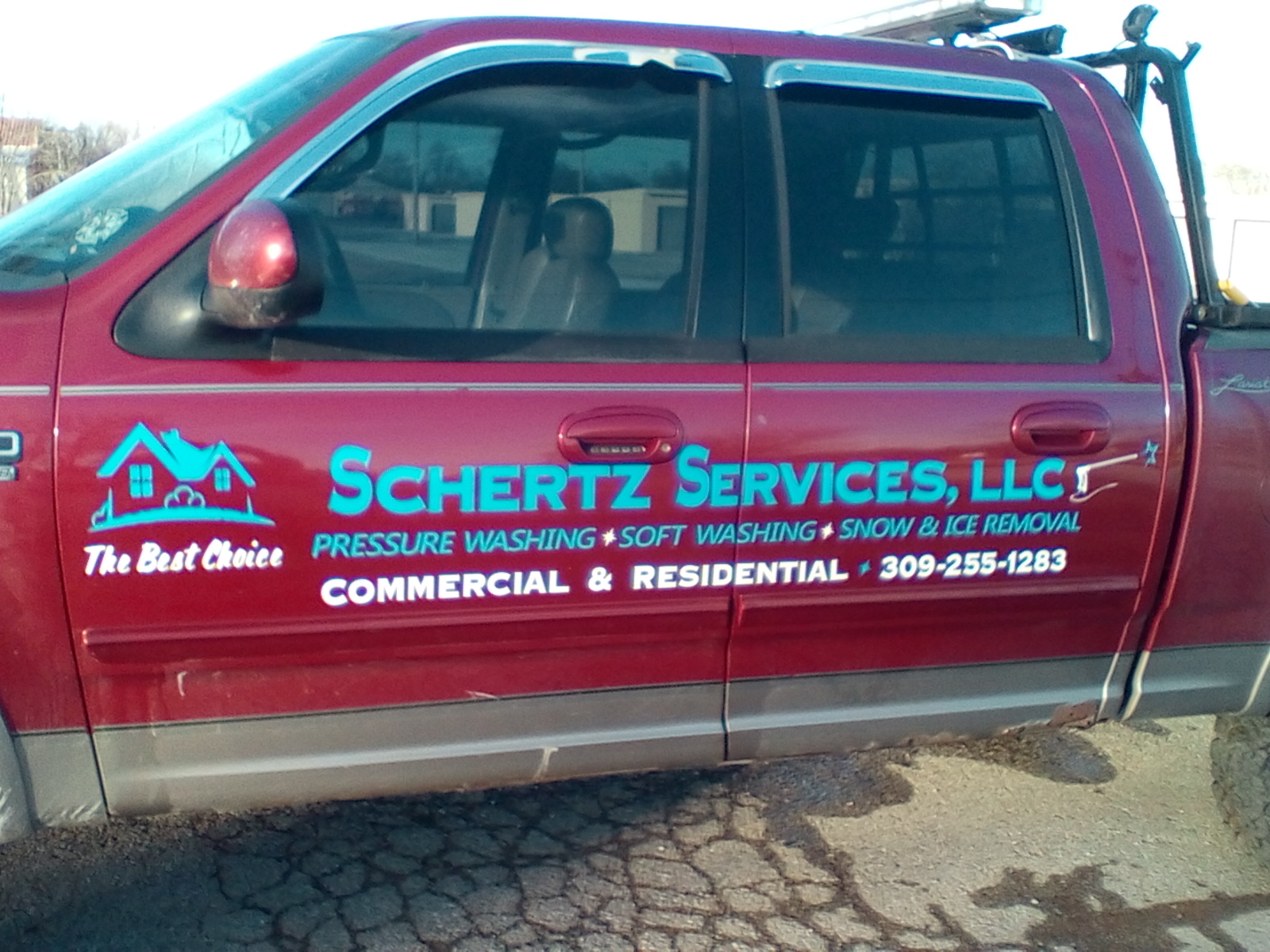
The colors are actually the same ones on my truck. The house clip art is kind of our stamp. Maybe loose the wand and truck?
So I agree with the LLC to an extent. I have had customers say “I was going to ask to see your insurance but i figured since you are an LLC you are covered”
Most construction companies have the LLC or INC after the name.
I don’t agree with property but I think we will loose “for your home”
You might want to start working on a logo or a special font for your name, so potential clients can familiarize themselves with your company as they see you driving around
My personal goal is to be the Truly Nolen (large pest control company in Florida) of pressure washing.
They decorate their vehicles to look like a big yellow bug, so when you see that driving around you instantly know what company it is.
Large companies still advertise because they are sowing into the future, every household must be familiarized with their company
I agree that you tie in your truck graphics with everything else
The llc is up to you and your perceptions, i can only share mine, I’m sure what you said about construction companies is exactly what they themselves said when making that same decision
Also, i can’t agree with Brodi’s suggestion of shrinking your company name, I personally believe that should be the first thing people read off your vehicle on the road, again it’s about familiarization
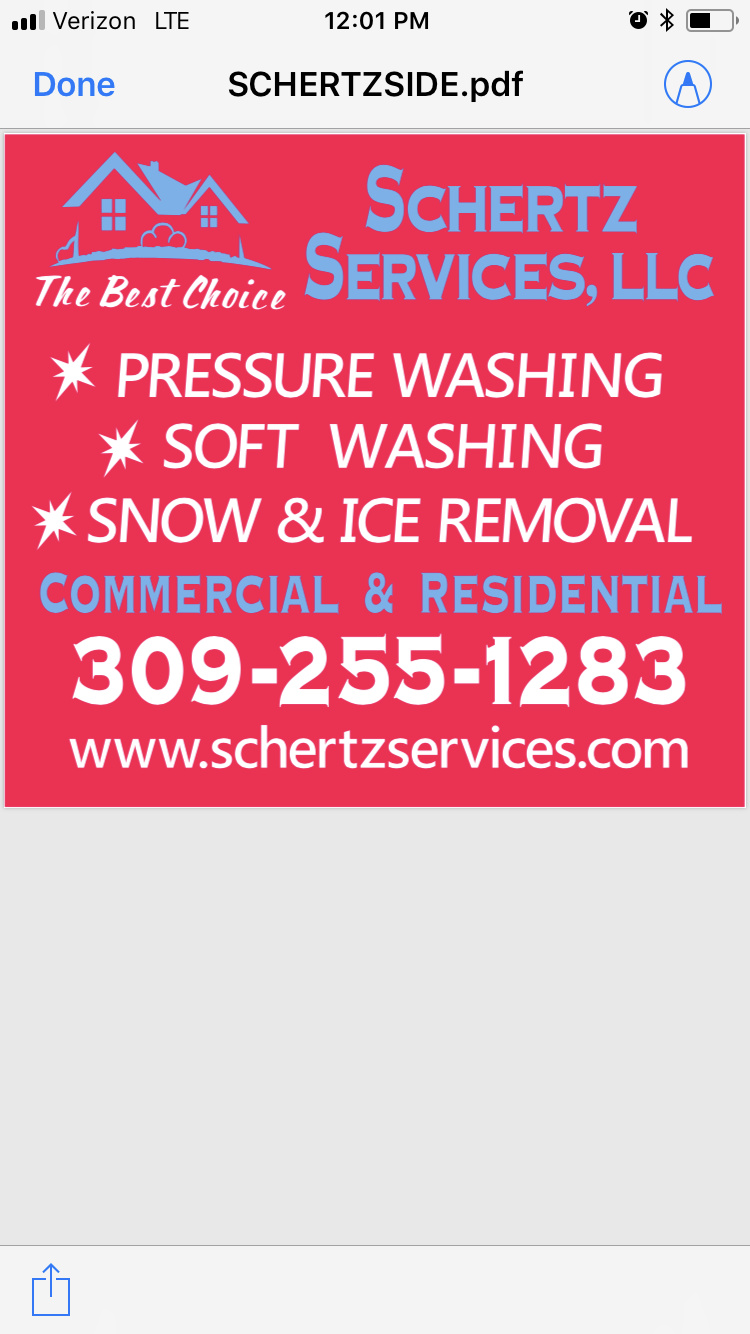
I emailed him a new layout and said I wanted the services to really pop. Make them bigger and in white. moving the logo from the middle of the thing will help. I sent him a crude picture of a new layout.
Id lose the red background color in the sign… only gonna make it harder to read blue.
Our colors are red and blue. Trucks are all red. I already ordered the signs in red. He just has to cut the lettering to put on it.
Much better looks great! The blue still blends into the red have him look into outlining the blue letters with white that should make them all pop
The red shown will actually be closer to my trucks red. Also the sign is 4 foot wide by 4 foot tall. Should be pretty big lettering!
Make your name smaller services was bigger. People need to see the service, name not as important
I’m fond of large names… on a yard sign i would agree with you!
Agree 1000%
No one cares what your name is unfortunately.
So it’s more for a look then calls… that’s cool but I like big and juicy while at astop light.
Name is tiny on a door
Like my buddies
I LOVE THAT WEBSITE NAME!! how did I never think of this?? Man I may have to change the website name now… No one can spell Schertz right even after seeing it…
Its not for looks. Our name is our work.
Chris, I dig you so this is not at all a personal attack… I think your colors, logo, and signage is out of date. Which might be a great thing if you want to look like you’ve been around for 25 years, but could also look like it’s your first year in business. Again, nothing personal, but Schertz Services sounds very clinical and the colors and clip art logo makes my insides itch. Lol
It’s going to be tough to build a brand on in my opinion. You seem to be doing great and if you’re comfortable by all means don’t switch horses. Again, purely one guy’s marketing perspective.
So other than the house I lost the clip art. I feel like the house is like your wave in your name. You don’t like the house?
I receive so many compliments on the trucks lettering. Blue on red. I thought it was a huge step up from my last lettering!
I’m kinda the opposite… I actually don’t like red for service companies. I made a post last year with articles linking to why certain colors are better than others for service companies.
Blues and greens are by far the best for service companies. They provoke feelings of trust and comfort. Oranges follow.
Red is tough because it’s compulsory and can actually provoke anxiousness and no one really hires a company to wash their house the first time on compulsion. Most people want to trust and feel comfortable with service companies.
The color choice might help you improve contact or closing numbers by 2%, but it’s the compounding of all the little things.
I think the house looks like the stock logo choice for a vistaprint business card template and 1000 other people are using it for everything from contracting to handyman services to painting etc. it’s tough to build a brand around a logo diluted by use.