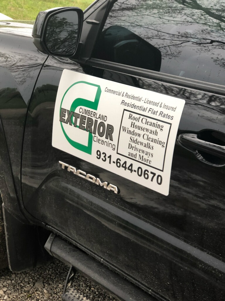
I think you could spend $15-30 at fiverr and get a logo that suits your brand, an easier to spell domain for $15 that redirects, and rebrand (gradually) your LLC with a DBA and you’d probably see a marked improvement or a change in market (Young dual income homeowners rather than retirees on fixed income for example)
These things only matter if you want to scale residentially into affluent neighborhoods. They don’t do a darn thing for getting your commercial snow plowing accounts.
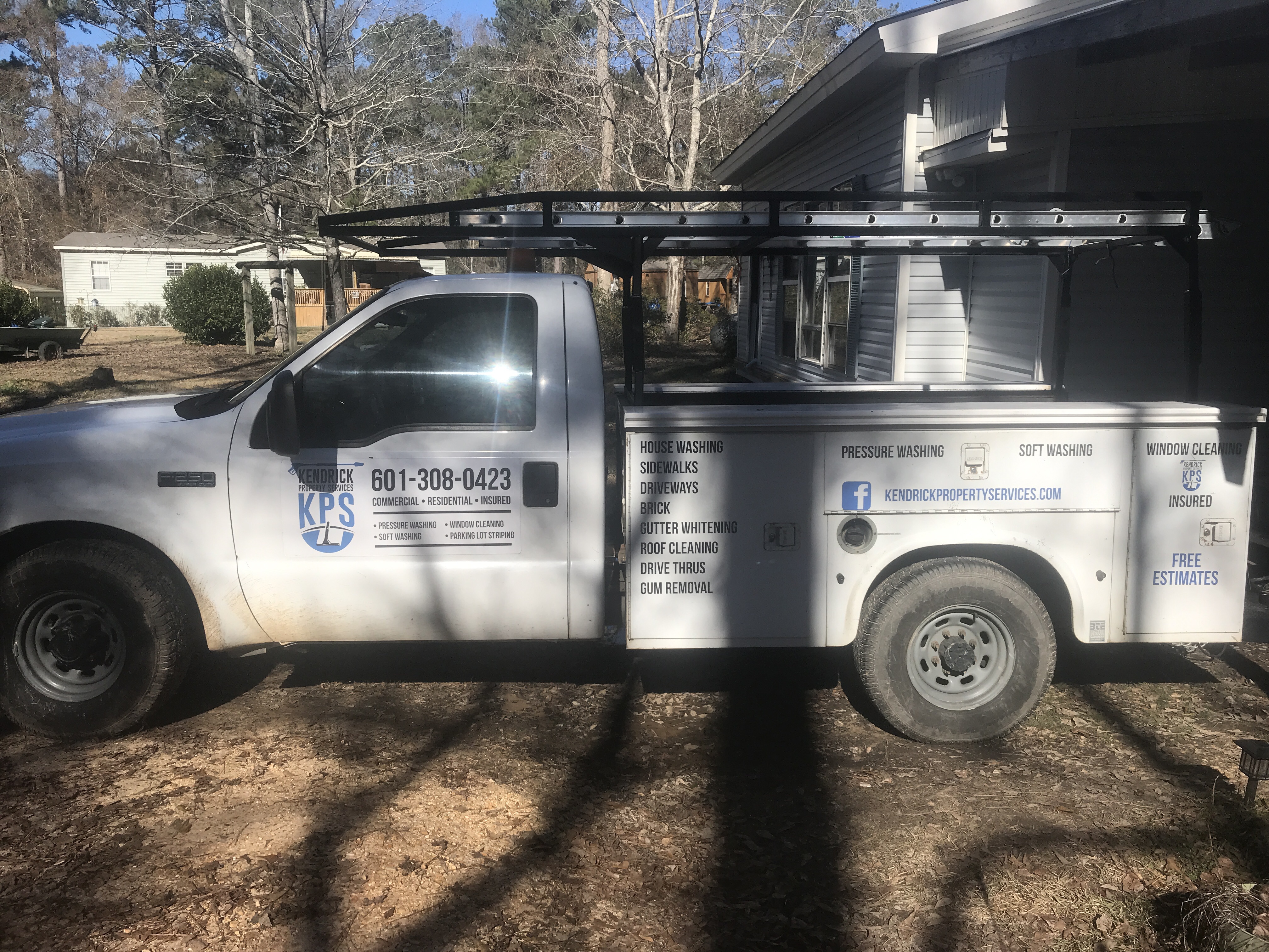
We are honestly at a turning point here. So I may not be a “part timer” much longer… But that story will come out next month if it happens… We also have the opportunity to take on 5 more Walmart’s. If I do this I will be ditching ALL residential pressure washing and just doing snow removal stuff year round. I will still do commercial pressure washing. So I am not at this time trying to get residential work… If you know what I mean?
Yeah. Something easier to spell and remember like your idea above 555clean.com or whatever.
I’m considering switching to a similar DBA ie CleanKC.com as the business name (that one is already taken and I’m likely moving to CO so it’ll be different but I think you get my point)
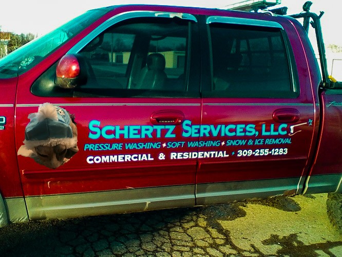
I think what’s bothering a lot of us is that there’s not a lot of contrast. I feel like it’s a little hard to read. Maybe if you just had a small black outline around the blue characters, it would help it stand out more. Especially when you get that bright red new truck.
I need to get a lighter picture of my truck. Where you see the big blue letters pictured above you can easily read it. I get what you are all saying though. Its just been kinda our think with those colors lol.
The rear sign for the big truck will be in reflective vinyl. That way cars behind me at night can see it well.
I kinda feel like a 100% white vinyl wrap is in order here. Then, your blue will pop nicely. A nice blank canvas. Data shows (tho i cant recall where) that white vehicles are interpreted as harmless/safe. Just a thought. Or, take it to maaco.
I thought about going the wrap route but for the money old fashioned lettering was a lot easier to read and less expensive. I’m sure there’s some things that I could have done better but it’s payed for itself over and over again.
It’s been great. I’m very satisfied with the ROI considering the time of year. We’re not doing SEO yet. We’ll start that late spring. I’m doing AdWords right now for immediate exposure and once my cushion gets rebuilt (spent everything on equipment) we’ll begin working on seo. But I’m very happy with them.