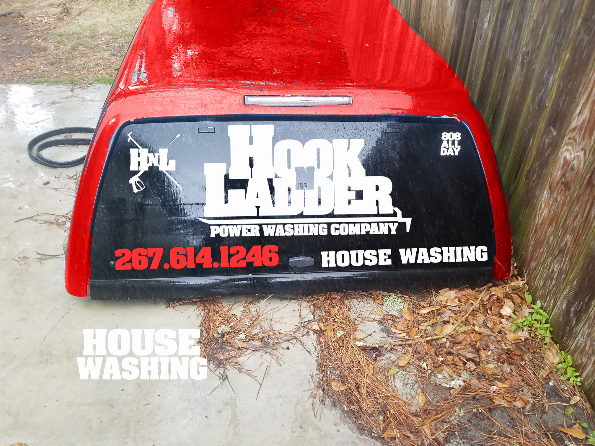
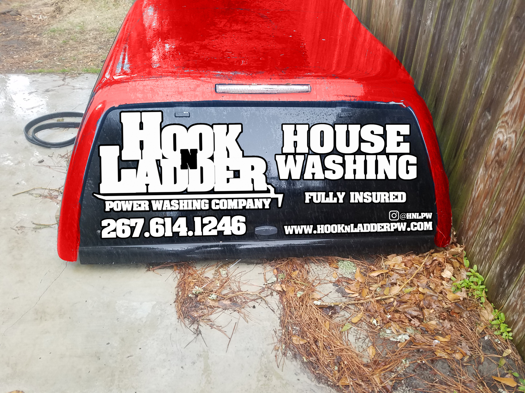
Hey guys, I am looking to get lettering on my truck bed cap. Excuse the crude red coloring, the cap is dark blue but I am planning on getting it matched to my truck. I pretty much took the lettering from my signs and placed it on the bed cap. The idea was to keep the same theme and enhance recognition. Let me know what you all think. Im open to making it better. The “house washing” on the read window is going to be red, just didn’t have time to change it in Photoshop. Thanks for the input.
4 Likes
I’d scrap the HnL logo. Too busy. I’d probably stick with white for all of it too.
Brand recognition is good, but the sides are better than the back. My thing is and always is what you do is always the best focal point followed by how to get in touch with you to pay you to do that thing.
- House Washing
- Phone number
- website (Good for SEO and some folks want to check you out online before they call.)
- Your logo.
1 Like
Brodi made good points.
Also what lettering do you/will you have on the truck? Will stuff be repeated? would you put logo on doors, and services and phone number on cap?
Hey thanks for the input. I’ll make some changes and repost when I can. To answer Joshh questions, this is the only lettering that will be on the truck for now. I am going to add some logos and lettering to the trailer here in the near future.
1 Like
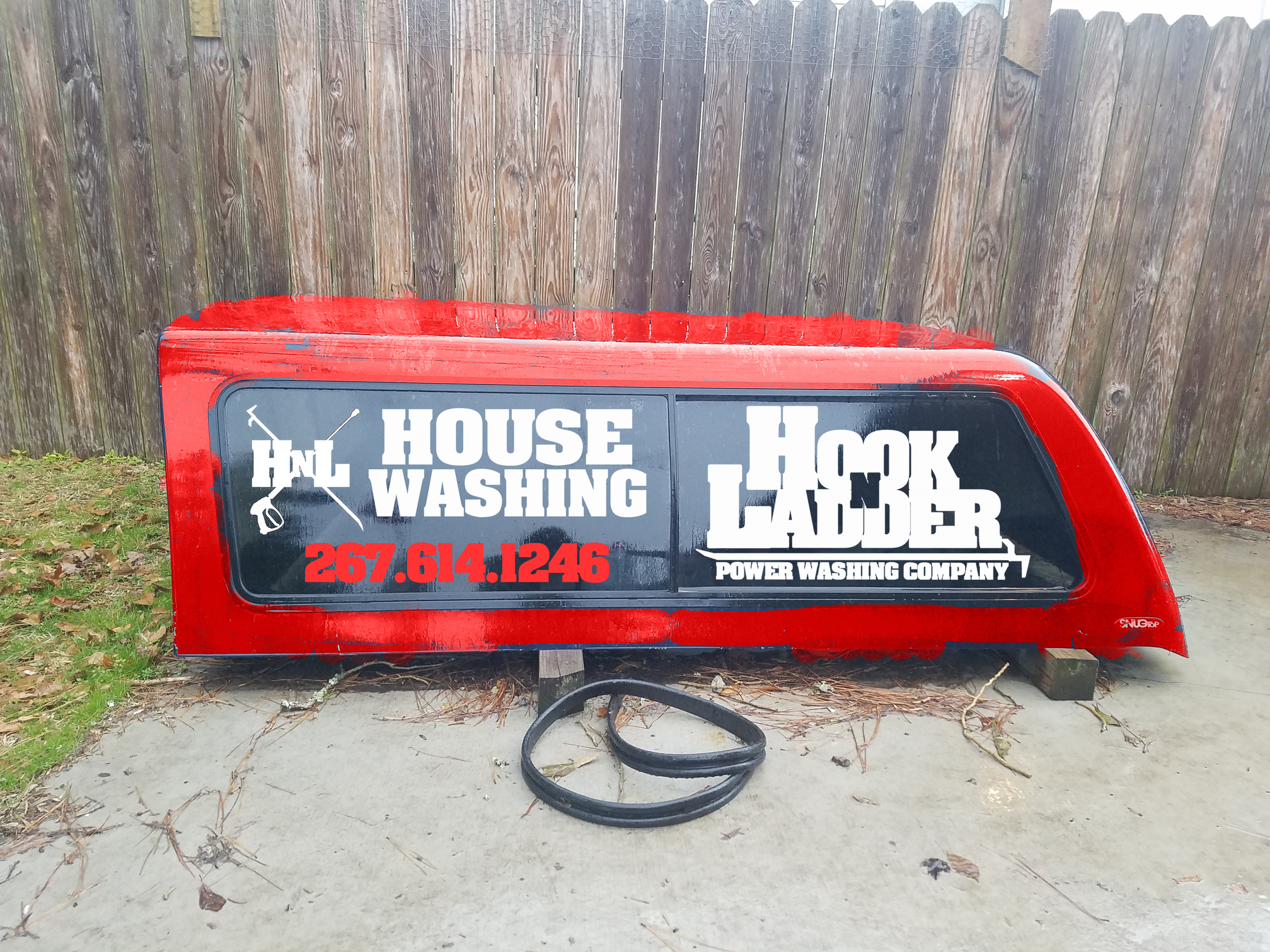
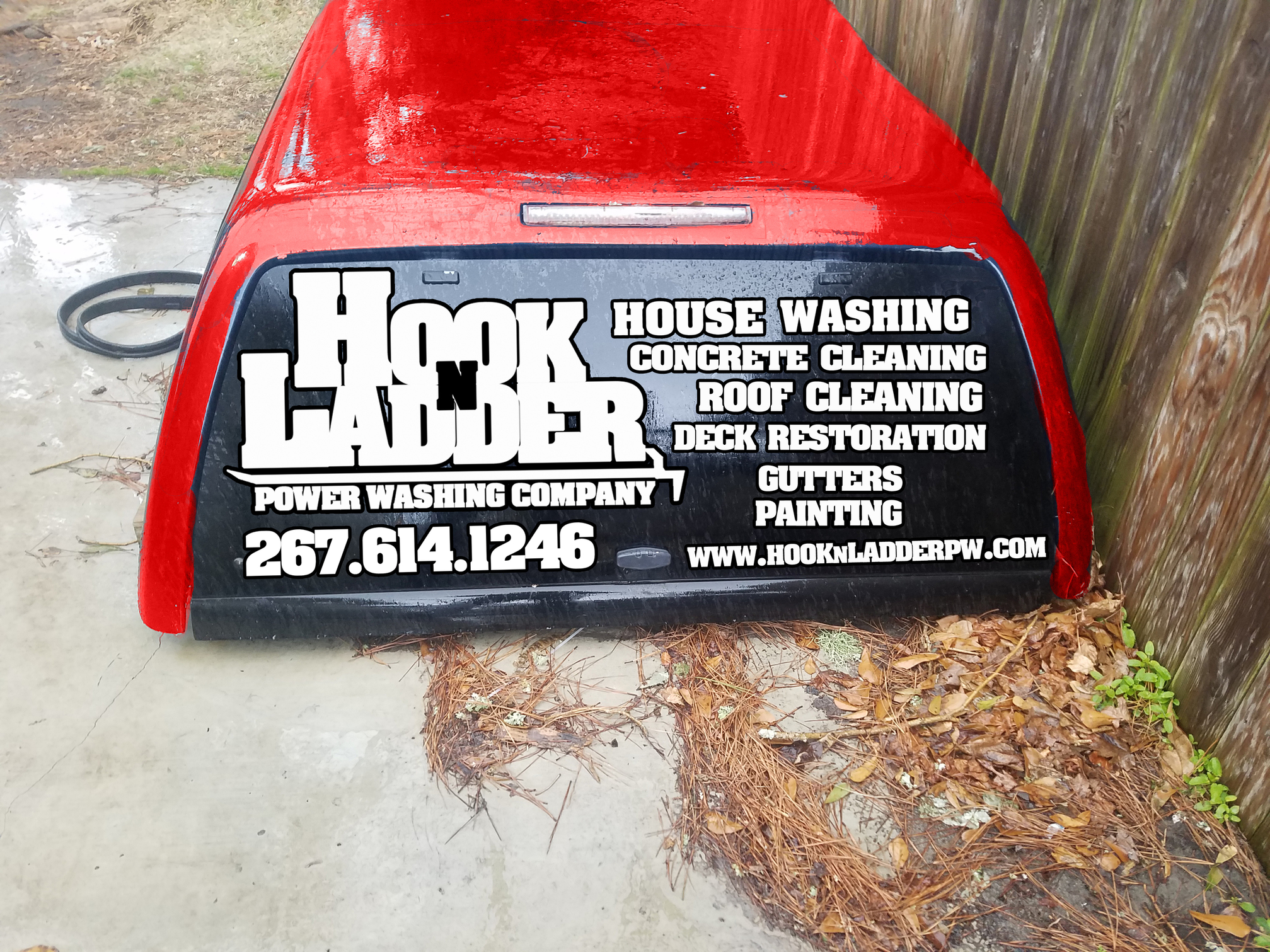
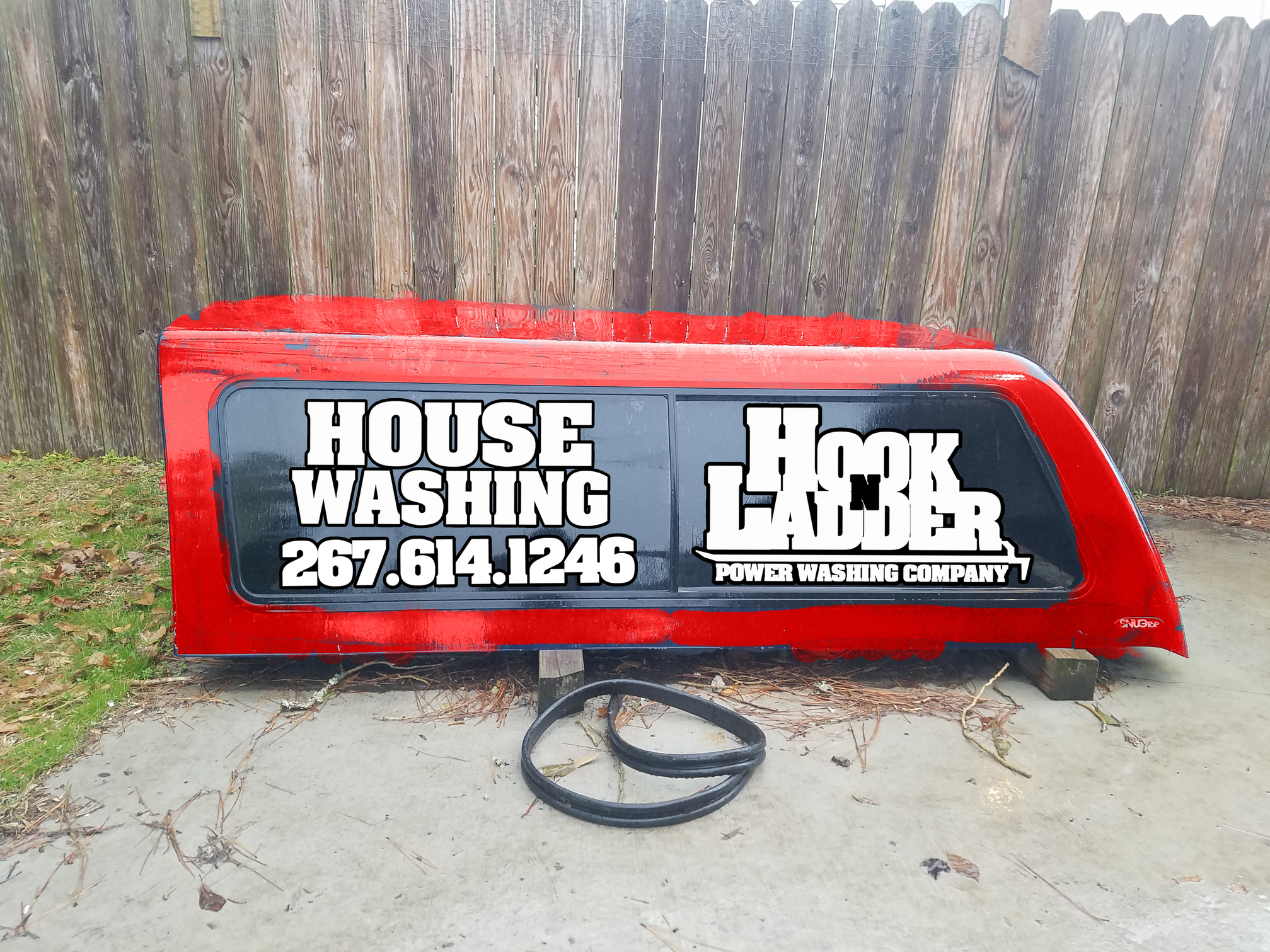
Ok, here is the updated redesign. For the side, would it be better or more pleasing to the eye to have the logo first then the “House washing”? Please critique, any and all.

Sides are good either way. The back is no good. Too much.
I’ll beat the dead horse some more. The main thing that makes you the most money like House Washing on the side gets you in the door to do the other stuff.
On the sides you have two windows so the logo and house washing work at the same size. The back I’d double the size of house washing and your number and scrap everything else except your logo but about half the size it is now. All centered.
Logo top
House Washing middle
Phone number bottom
Website under
Licensed and insured in about the same size font you have for the services there now.
Less is more.
If you find another back window for that truck topper, use yours for a year and you buy the window, next year you use my idea and if yours works better I’ll pay you for the window and the lettering. All of the vinyl lettering. You can just send me the bill for the sides, you’re back, and my back waterin all of the vinyl lettering. You can just send me the bill for the sides, you’re back, and my back lettering
I know it’s extra work, but it will be good for your business. You just have to ask people when they call you how they found you and make a note every time they say your windows and log how much revenue you get from those calls.
1 Like
Love the sides…
Do you do all of those services frequently enough to outweigh not focusing on less things? I ask just becuase painting stuck out to me and i hate painting.
Hey sorry for the delay in response. You both make good points. @squidskc Brodie I will take your advice, simplify. I’ll post the revision when I have some time to do a redesign.
@Donut Ken we do a fair amount of driveways and gutters with our house washes and some as a standalone service. The painting is new, a trial run really. I used to paint and help run a painting company. Me and a close friend did some paint jobs this past winter and he really wanted to do more of it. So we recently got a couple paint jobs he can run and I do the big picture stuff. It’s a trial like I said, we’ll see if its worth it over the next couple months.
I guess i was more referring to painting and deck restoration. I was just curious… people aask me about painting/staining and i shut that convo down quickly.
1 Like
We clean a fair amount of decks. If I need it stained or painted I sub to a painter I know. We are still figuring out the market.
Tagged you guys since you replied in earlier posts. I think this could the a winner but let me know. Brodie, I saw that you said to center everything, reason I have it this way is to use all the space and maximize the logo and house washing size. Thanks again guys.
2 Likes
Looks good, I like it… now if you could do something about that red! Customers may associate red with bad.
In all honesty since doing trailer and signs focusing on HOUSE WASHING. I have had more request for add on services such as decks, driveways, patios, pool areas, etc.
Thanks! I would change the red, but my whole truck is red hah so it stays.
I was joking… red ties in with Name pretty well.
Looks good! The only thing I would say is maybe make your logo a little smaller and the phone number a little bigger. But looks great.
And by phone number bigger, I meant maybe find a font that is a little taller. I see its all centered, so maybe find one that is a little taller.
I will try that out. Thanks. Excited to get these on the truck
I know, me too. Ha!
@HookNLadderPW I love your logo. You should be proud of your business and being a firefighter, but the 2-3 cars behind you at a stoplight don’t care what your name is. They just want to know how to call you to get their housewash. Your name could be Kim Jong Russia Power Washing, but if you have the following list of things they won’t even hear your name on the phone.
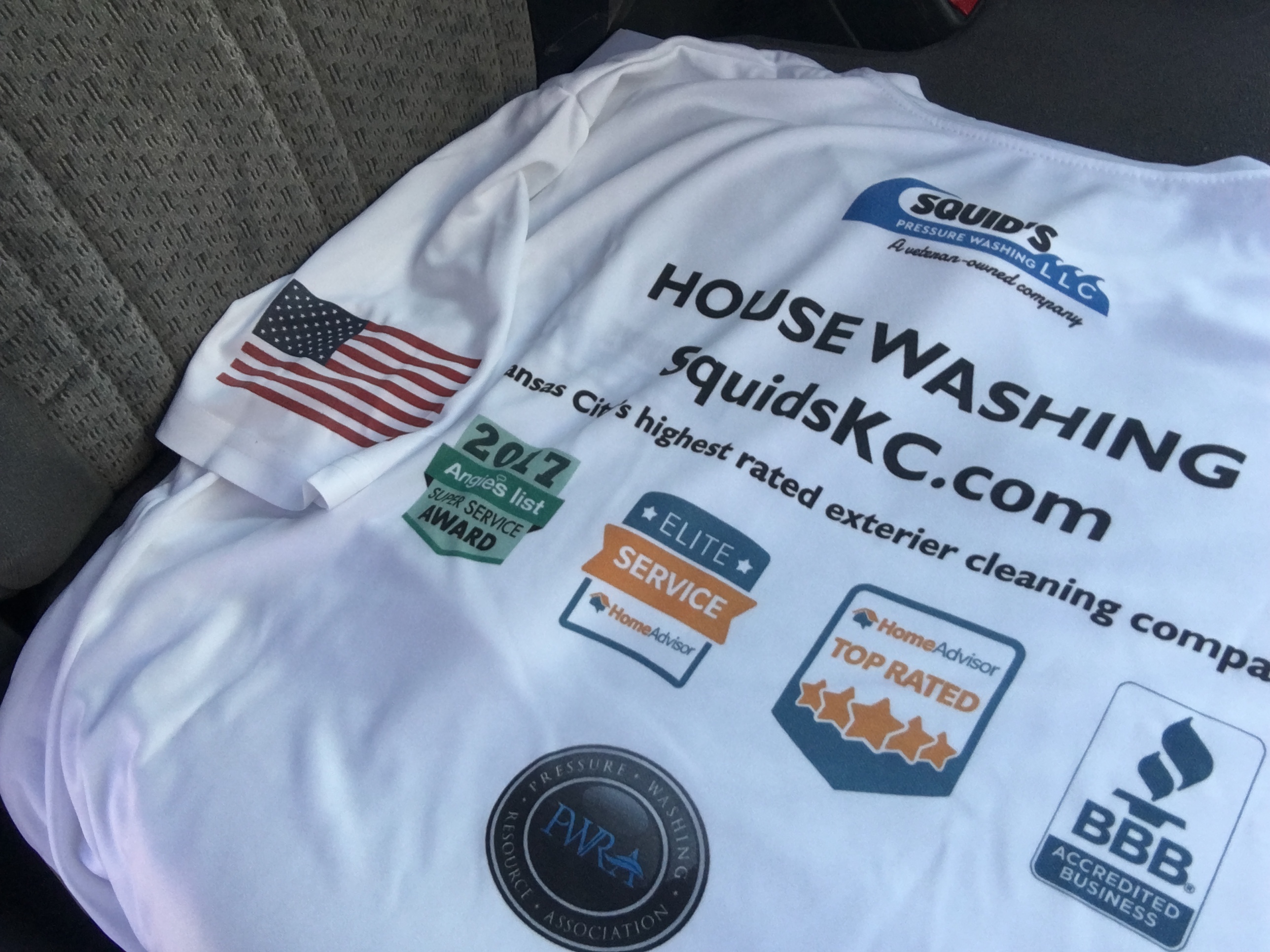
These are the new shirts once they fix the spelling error:
This is the order or importance for people:
What can they do for me? (Wash my house)
How do I get them to do it? (Phone Number or website)
Can I trust them to do a good job for the money? (Trust badges & Insured)
About 10 other things in between…
What’s their name? (If they care at all)
I’d shrink your logo to be the 4th most visible thing there.
6 Likes
