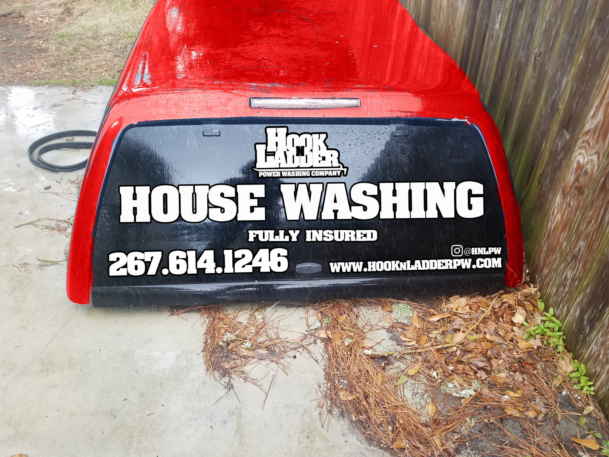
Ok took the input and moved some stuff around. Hopefully this is what @squidskc you were talking about. I don’t have any badges to put up yet but working on it. Again, let me know what y’all think and, as always, I do appreciate the critique.
4 Likes
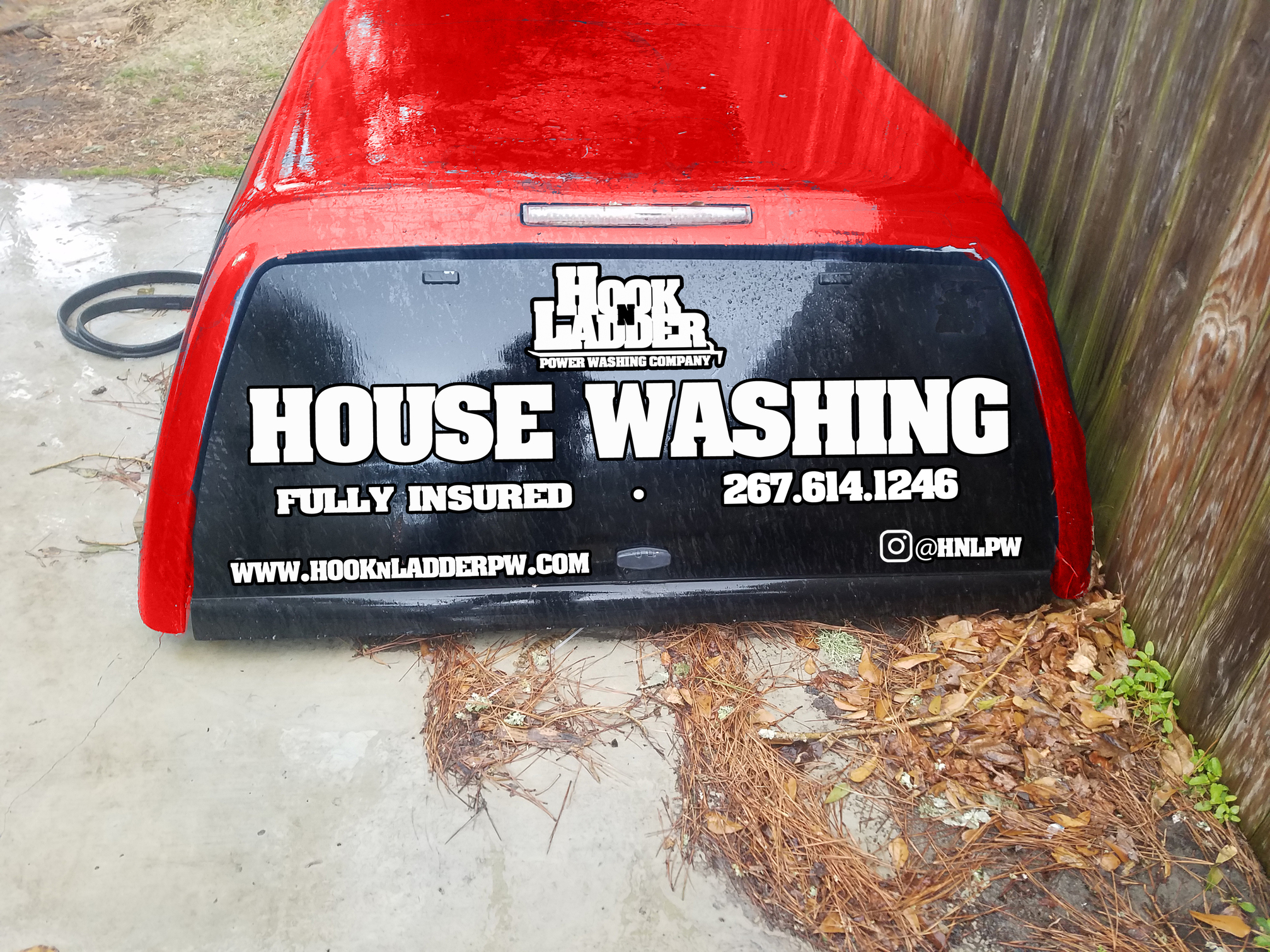
Both look great! The first one is better from viewing the number from a car or two away. I’d drop the www. as that’s a given and make your website larger.
1 Like
Woo! I liked the first one as well. Dropped the “www.”, good suggestion. Im going to submit this to my print guy and get the ball rolling. Stoked!
2 Likes
Sweet… good changes. Looks great.
Are you designing these?
Looks great man. I like the first one. And I agree with dropping the www. Good work!
Thanks guys. I’m pumped, ready to have them on the truck. @Donut yes I am. I design all my logos and advertising, as well as all my tattoos.
1 Like
Maybe a HOUSE WASHING tattoo on your forearms would be a good convo starter.
May i ask what you use for these designs?
Hahah that’s an idea! I use Photoshop and/or Illustrator depending on what the project is.
1 Like
