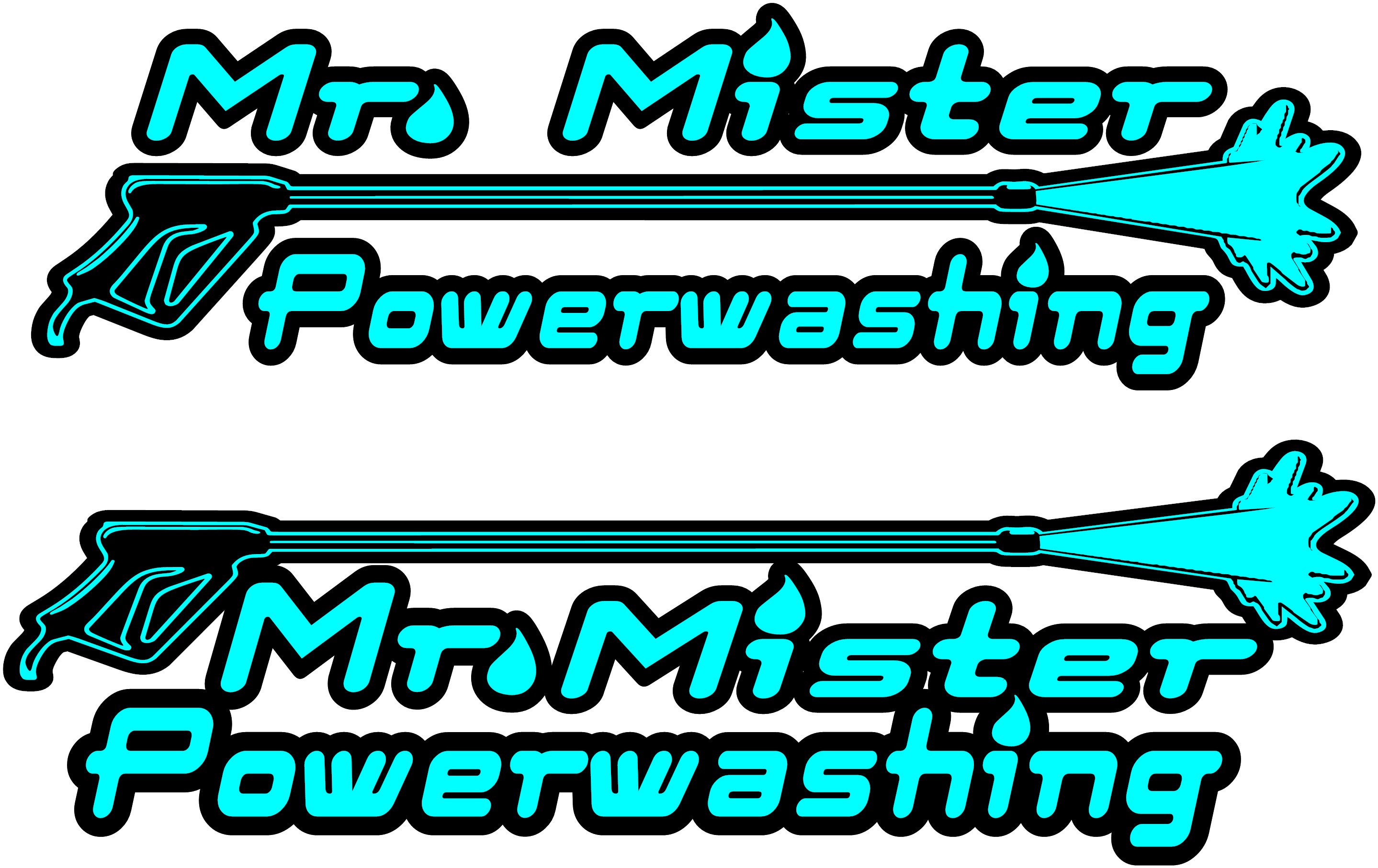
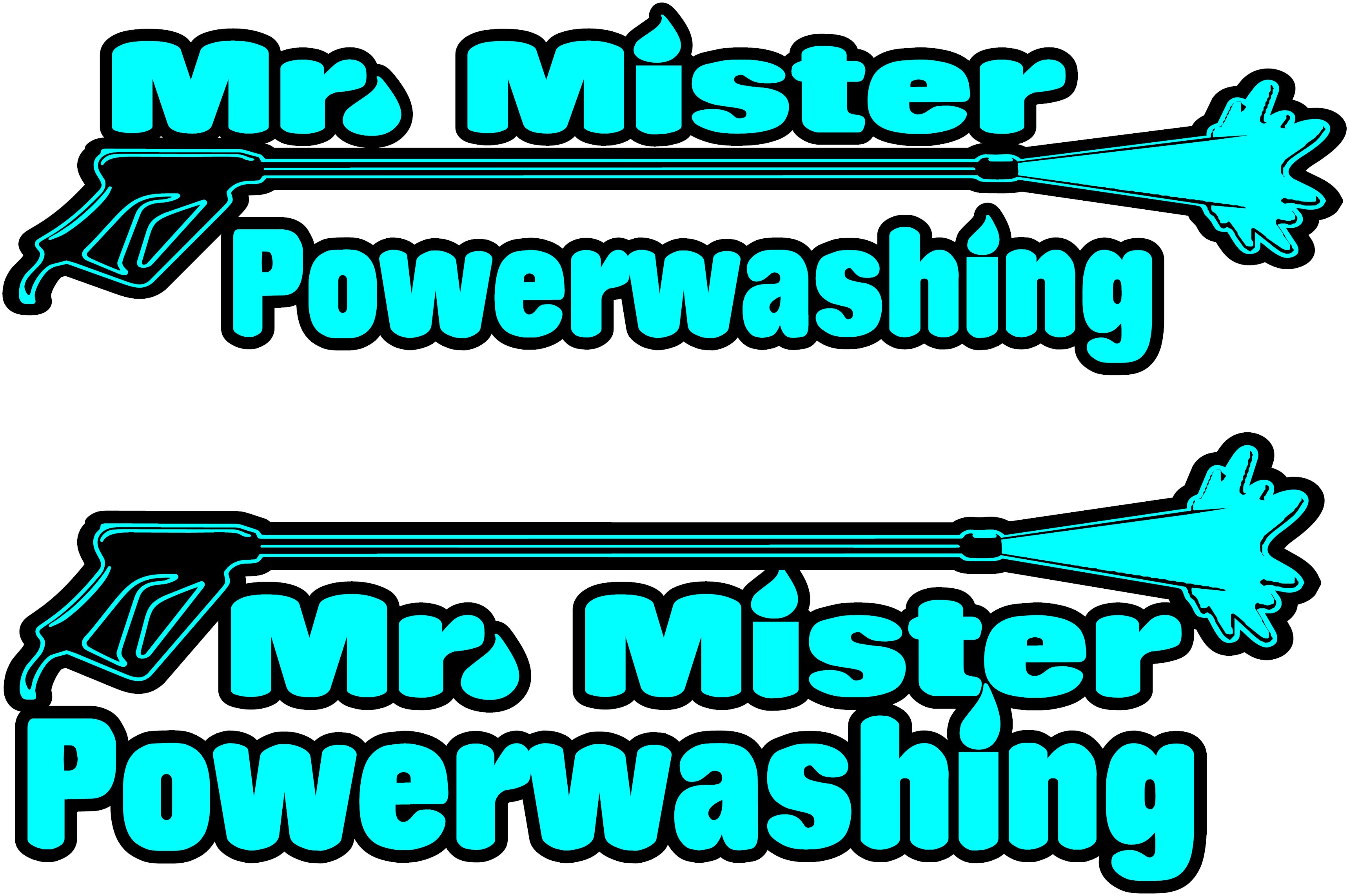
Took advice and not going with “softwash” in my name…also found out both “southern” and “mid-south” are both accounted for semi-locally. then as i was listening to the radio a song called “broken wings” came on and it hit me…Mr. Mister! my dad about lost it haha. surveying some friends and family they seem to agree its kind of catchy and fits the business. so once again im looking for your input. ive scoured the forum looking at logos and marketing ideas…and think i found myself a “starter”. something to put up on a facebook page, some business cards, and the side of my truck of course…until the ball really gets rolling and i can give it a designer makeover.
i will have my phone number, as well as services offered down the side of the truck as well. i have a 24" vinyl cutter so making all my own decals…hence why im not jumping into any gradients or color-shifts just yet, keeping it 2D.
Honestly, I don’t care for your font choice. The “w” is just weird and I thought it said power wasting at first glance. Just hard to read in my opinion. I don’t get the “Mr. Mister” either though, but to each their own on the name. If your happy with the name go for it, but I would suggest a different font.
It might be easier to just change your name to Off Duty Fireman LLC and send me 10% of all invoices as a royalty. Less stress all the way around. Just trying to help.
In my opinion it’s terrible. The whole thing. The name is confusing, the color is garish, the raindrops are making the lettering confusing, the font is too fat and the words are too close together.
I know, I know, “other than that Mrs. Lincoln, how did you like the play?”
Mine came from the first piece of clip art I could find for free on the internet. I’m still working on a logo, but it’s been 20 years and I haven’t got around to it yet