Great - thanks!
I tried a user search, but there’s millions of names similar. Is there a shortcut I’m missing?
Thanks ![]()

Got it. Doesn’t advertise logos though - I assume it’s your door hangers how did?
I’ll shoot him a message…
Thanks @squidskc
Yes, no one around here is going to call you. You got a weird phone number
2 Likes
Yeah, the quoting processes might be a little tricky if you did.
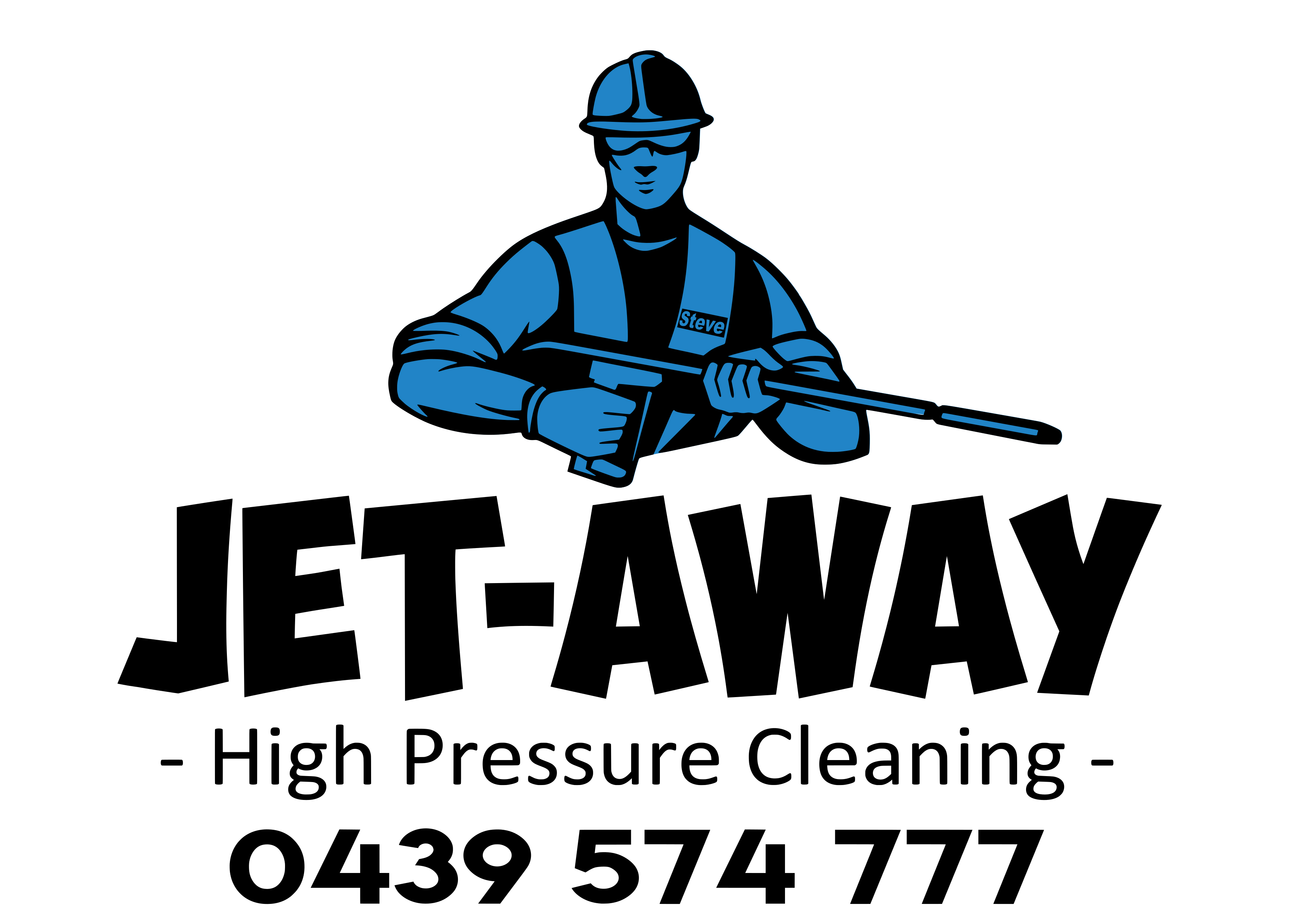
Lol. Looks like everybody has been using the same icon. Maybe differ a bit? And yup, I agree that you have to change the colors as well.
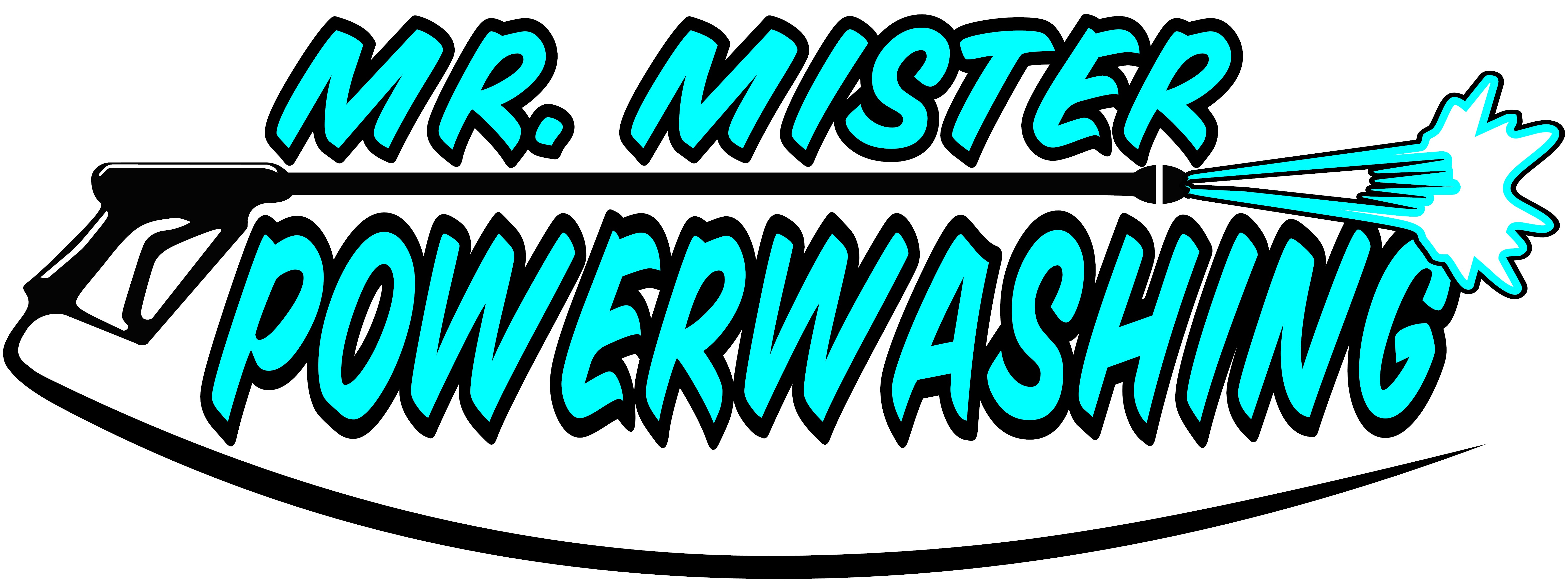
Changed it up a bit, got some more input on fonts and decided to ditch the raindrops altogether. Liked the swooping hose ive seen a few others do so added that…and changed the wand up a bit. Not sure why yall dislike the color so much, i just think regular blues are too dark for it. This isnt the exact color the decals will be, more of a turquoise…i just did some window decals for a storefront in this exact color scheme and it came out great. wanting the black outline to make it “pop” on the white truck. i appreciate everyones input on it thus far, but for now i think this will do just fine. i ordered all my equipment yesterday, so going to be working on getting my facebook page up, starting on my marketing materials, and maybe sleep a little bit if i get the time haha
Thanks!!
I guess “garrish” is the word I would use to describe that color scheme. But it is important that you pick a color you can live with. And a very slight change in print color could make it look much more appealing than it does on screen.
And hey, not everyone likes lime green, either. But that’s my color ![]()
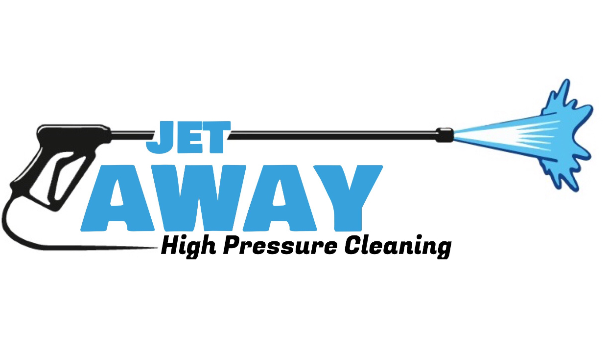
If it were me, I might go for something more like this:

1 Like
i see what youre saying. i may go with a lighter tone like that for business cards…my main concern is whats on my truck and trailer currently. as i said i have a small vinyl business, and there are only so many standard colors i have access to without going the route of outsourcing to someone with a printer…of which the cost difference is massive. i chose blue because to me that is a “clean” color…nothing against green, just about everything else i do is in green and black already lol (rat rods, vinyl company, and my old hot rod shop)…ill post a link to a pic to one of the color swatches i currently have. was thinking of the “turquoise” or maybe “light blue”. my worry with it being so “light” would be it wouldnt be as eye catching on the white truck.
What’s it look like with a gap between power and Washing
Or washing under power then ditching the hose
The roll of turquoise vinyl doesn’t look so bad in the pic. Personally, I’d opt for either Azure or Light Blue. But the turquoise could work.
@Hellbilly - I agree. It seems to me that it should be powerwash one word or power washing two words.
@Steve @Sharpe
Id like to keep the hose…even though i agree it is generic and overused i think its easily recognizable for most people. i do think i like it with the gap…i didnt think i would, but it matches the space from Mr Mister. one word “powerwash” makes it sound like im a superhero lol “its a bird, its a plane, its…mr mister powerwash” ![]() who knows it could catch on lol
who knows it could catch on lol

I would choose the middle one and call it good. 
1 Like
I used actualreviewnet
1 Like
I like the gap as well

