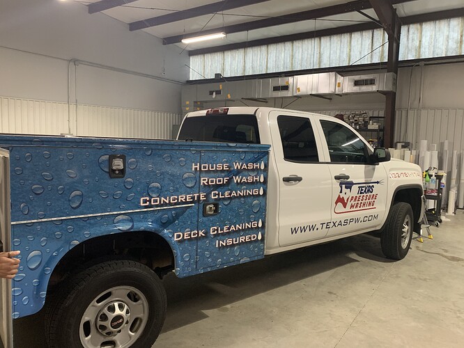
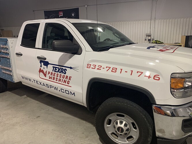
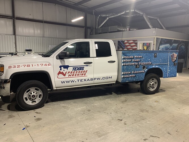
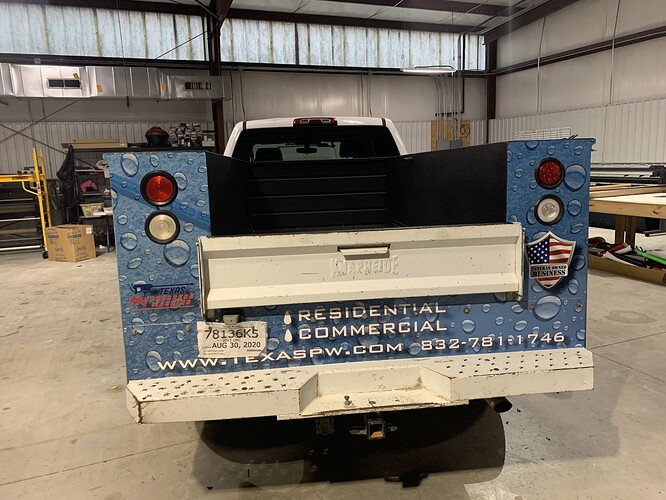
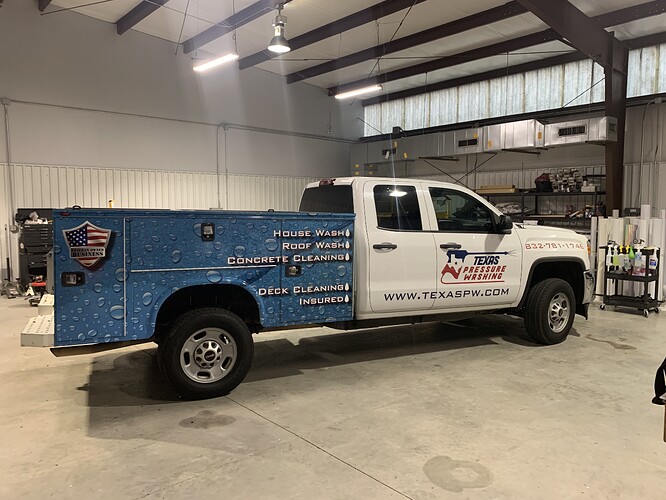
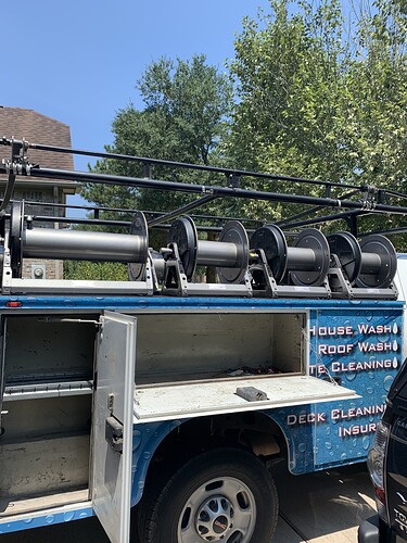
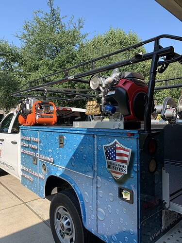
It looks chopped up and weird with the whole back half in bubbles. I’d fire that designer. Personally I’d just use the cab graphics and put the services on the bed in red vinyl and ditch the bubbles altogether.
The less distraction… the better it is for potential clients to capture your business name passing by. I get tons of clients driving by, wanting estimates while doing jobs. Most say, they google my company name to get my info as they drove by.
The bubbles are definitely distracting.
Simple and to the point. Who you are and how to contact you is the most important thing. All the rest of it is just fluff
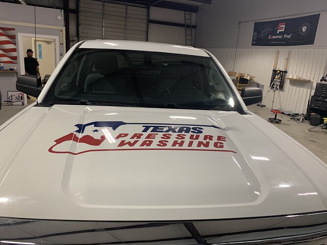
I think I would lose the phone number to clean it up, both the phone number and website lead to you and you would probably want them to check out your website for further services, the website is easier to remember than the number, you can almost guarantee they will check out your website anyway before calling. The hood one doesn’t need to be there you won’t be able to see that unless the local chopper pilot needs some concrete work done. Something like what @steve posted up is a good starting point. Something about that truck doesn’t suit vertical lettering.
I think I would limit the lettering on rear of the truck an put pictures that will draw attention to the truck.
I think i’m one of the few who actually likes the bubble wrap ( not a huge fan of the spray gun). II think the colors read well on the white portions of the truck, and I like the vibe the bubble wrap gives off as a business. With that said, I don’t particularly like the words on the bubbles (makes it look a little too busy) but i don’t hate it. I think the sweet spot might be removing the phone number off the front, and consolidating 1-3 bullets on the wrap portion? Kind of spitballing, obviously, but I think it has good bones just needs a little tweaking.
Does the back have to have that blue background? I dig the red text but harder to read against the blue. Maybe some kind of a wave design flowing into the back that’ll highlight the services better and still keep the blue/bubbles at the end
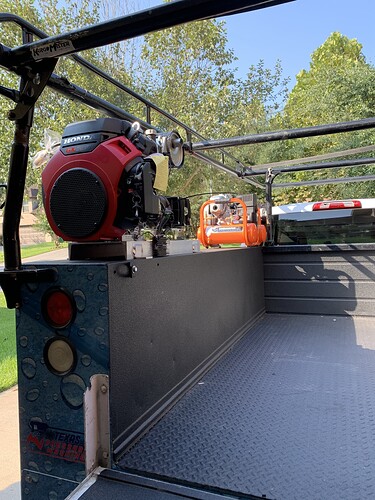
Picked up the truck today and I just want say I really appreciate everyone’s input and one of the reasons that I continued to stay with the current design is as I always recommend; I polled a ton of people and all of the women absolutely loved the design. Women also hold 70 to 80% of the current buying power based on consumer purchasing. I’m also lucky to be able to talk to three VPs of marketing all for nationwide firms, all of which were female and strongly recommended I keep the current design. I’m pretty pleased with how it turned out because I felt it would pop much better than the render, let me know what you think. The license plate location is moving.
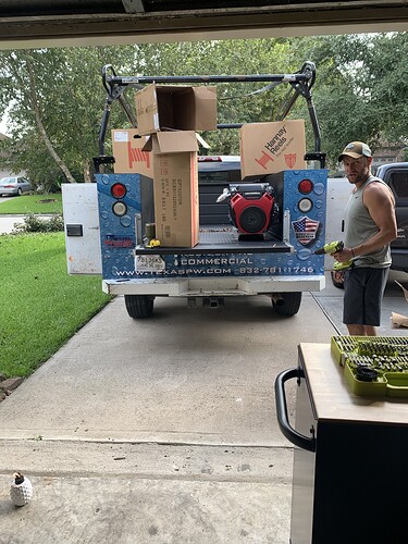
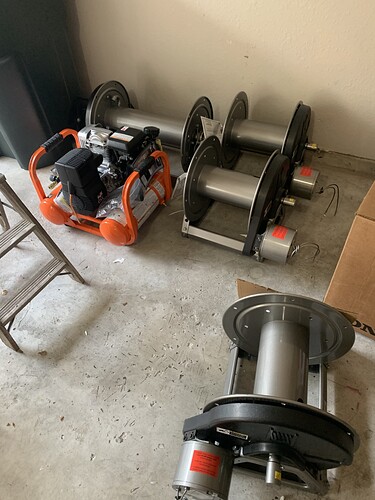
Lookin good, update us with pics once the equipment is on plz
Well done, it looks great!
Looks good.
Looks like Christmas in August! I cant wait to build mine
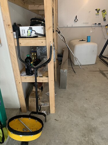
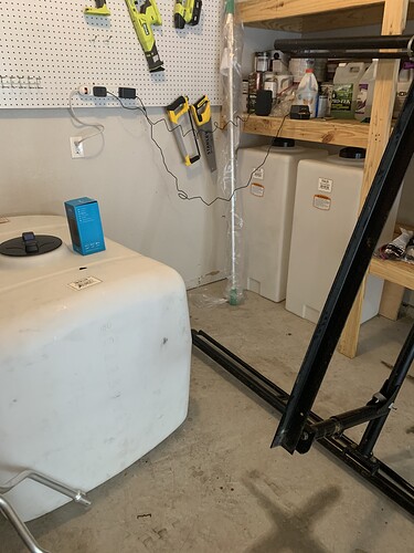
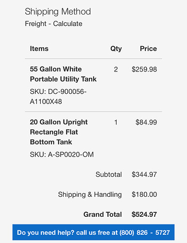
Do you know a good supplier for those 55 gallon vertical tanks. I tried ordering some but it ended up being almost $500 w shipping for 2 tanks. Just sticking with the ol’ 55 gallon drums till I can find a cheaper way to source them
I ordered mine from plasticwatertanks.com. I think they operate a couple other sites as well, like tankdepot.
Total with 3 tanks shipped to a commercial location came to around $525. I got two 55’s and a 20 gal vertical tank.
Yeah I was hoping to not pay that $180 for shipping but might just have to bite the bullet and do it. Tried sourcing them locally but can’t find anything
Tank depot is nationwide. See if they’re near you. Power Wash Store has several states covered as well. I picked up locally from tank depot.
