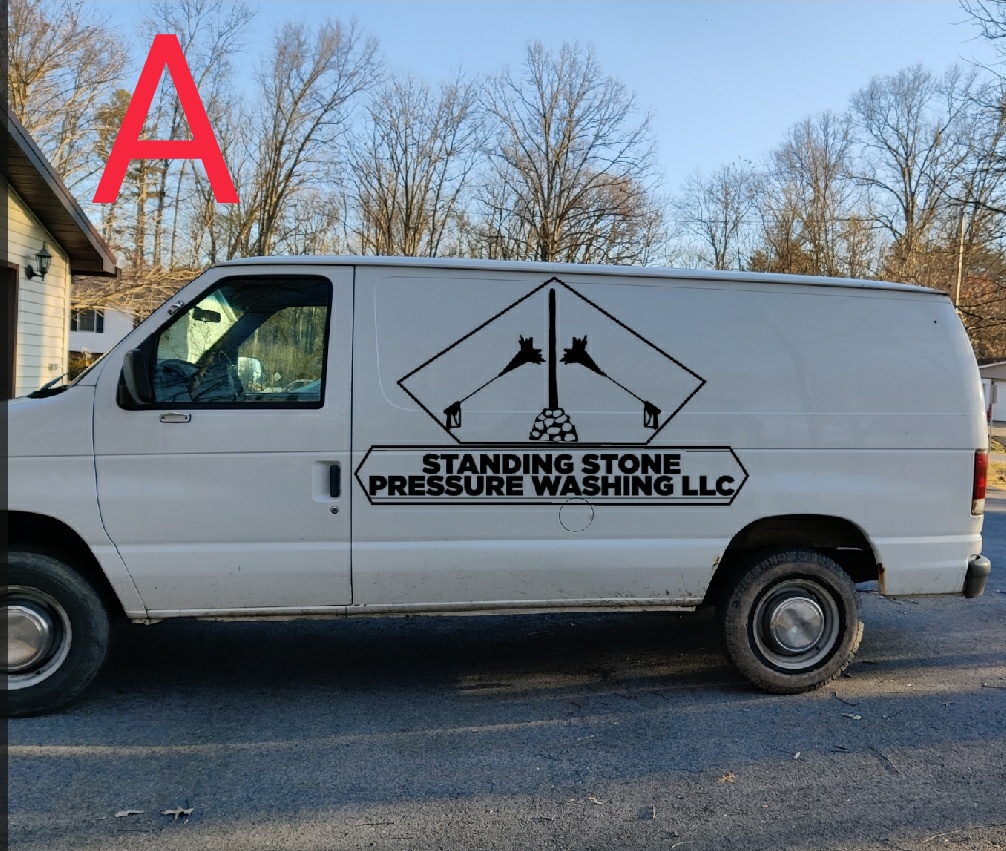
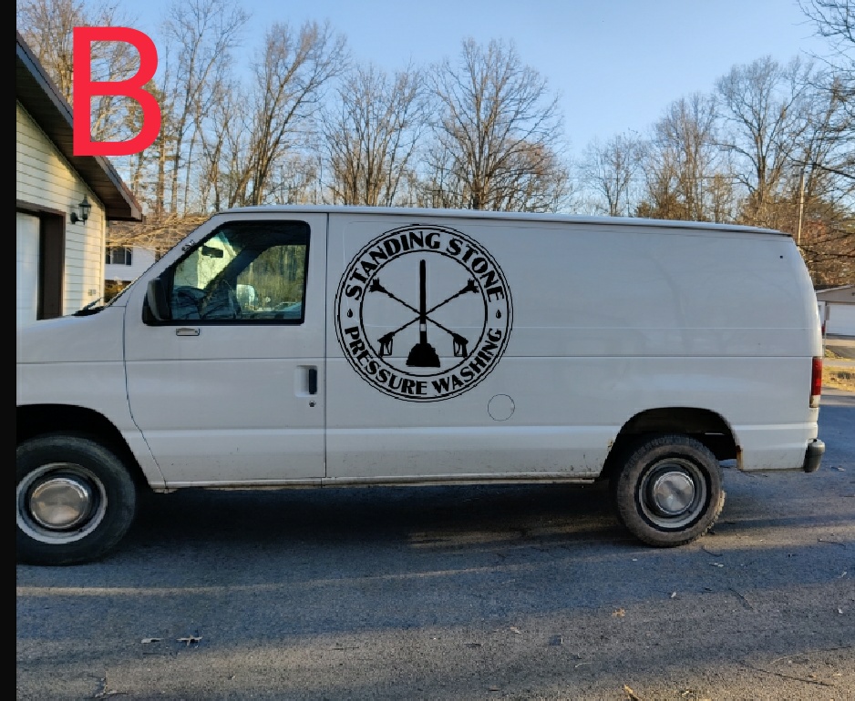
First thank you guys I’ve got a ton of info on this forum you have helped more than you could possibly know. Second some opinions on two rough draft logos. Maybe some tweaking ideas or what not. Got my llc paperwork back today for Standing Stone Pressure Washing and picked up a starter van so it’s been a pretty big day!!! Anyway here we go! A or B Here’s the history behind the standing Stone if anybody wants to check it out https://huntingdonboro.com/history/
Both look hard to read from a distance and seem to focus more on artwork than your actual company name. I’d go with neither
4 Likes
Phone number is biggest thing you should have on it. No one really cares about the name or logo, just the number.
4 Likes
Stoked for ya man! I’d agree with big bend though…doesn’t seem designed to engage a passerby or make it easy to read. You might consider adding some color. Another guy on here recommended a logo company called hatchwise I think it was called. You tell them how much you are willing to pay for a logo (a few hundred bucks or more usually for a good one) and multiple artists essentially compete for your business. They’ll give you a bunch of designs and you pick the one you like and that artist is the one who gets paid. Just one option to consider
1 Like
Good point. Phone number and services offered. Although company name can play a part too. On more than one occasion a customer has told me they hired me because “soft works power washing” indicated I do soft washing. I would’ve picked “I do a gooder job than the rest of them there folks” but it wouldn’t fit on my truck.
2 Likes
Yes the number and services will be on there as well I was just mainly looking at a logo my fault fellas I should have clarified. Mainly because it will be on everything invoices, flyers, shirts, hats whatever.
I don’t see a way for them to contact you, no number, email, or website.
1 Like
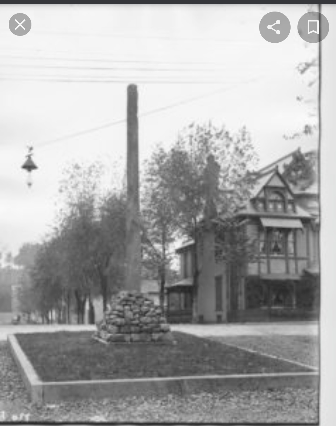
I’m not understanding the toilet plunger and crossed wands. What does that signify?
4 Likes
That’s freakin hilarious. I didn’t see that until now. I think it’s supposed to be a long stone set in a pile of stones. But now all I see is a toilet plunger 
2 Likes
I like the B personally
1 Like
![]() yes the toilet plunger will be the rock pile holding up the stone. It’s a monument well known around town.
yes the toilet plunger will be the rock pile holding up the stone. It’s a monument well known around town.
3 Likes
My rule of thumb, someone 50’ away needs to be able to read it in 1.5 seconds.
1 Like
I love the name of your company, but I would strongly recommend you go with neither logo option. Hire a professional logo designer and focus on something that is easy to read, easy to duplicate on a wide variety of applications (hats, coffee cups, etc) and and easy on the eyes. But at the end of the day, a logo doesn’t make or break you. Best of luck!
3 Likes
I would go with the text in pic A and delete all graphics and include a phone number in the same sized font.
1 Like
Thats so true , I always here from my customers saying that my phone number was easy to see at stop light because numbers are so big
+∞. I am a huge fan of really simple logos. Pepsi, Nike, and Apple are all great examples.
Within our genre, these two come to mind as being elegant in their simplicity:
2 Likes
I’m totally on the simple and professional logo train. I used a free lancer of fiverr.com, and paid maybe $125 for a logo I’m really happy with. Well worth it before you drop $500 on lettering a van. Incorporating the local monument is fine, but as currently designed, it does not catch the eye or help the logo. Look up logos for other tower style monuments on Google and find one that looks good, and send that to a professional. e.g Eifle Tower, Paris, Leaning Tower of Piza, Seattle Space Needle, Big Ben, etc.
1 Like
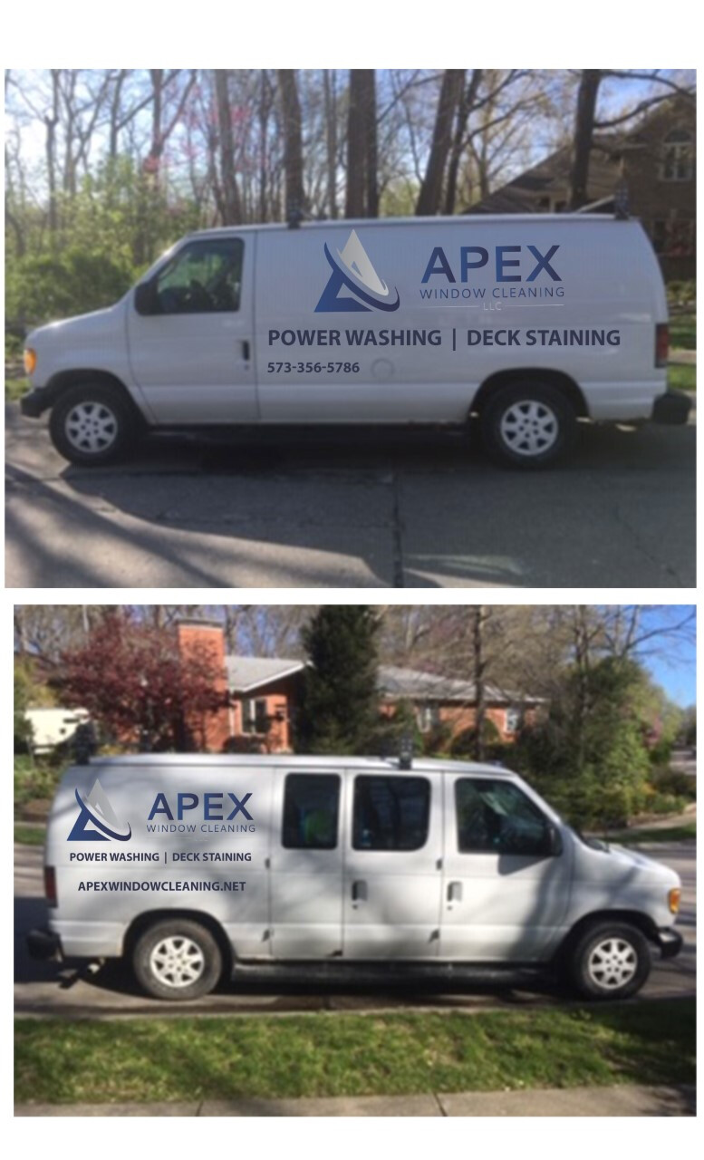
Here’s my logo on a similar style van. I want the eye drawn to my name and icon first, then what I do next. I don’t care much about having the phone number on their bc I’ve rarely seen results from it. Most people just walk up and ask for a quote, or I expect them to Google us.
2 Likes
Ditto. I’m not even going to bother with the website when I get around to having my truck re-lettered. (One caveat: I believe some jurisdictions require a phone number on a commercially lettered vehicle. Though I could be mistaken on that)
My ROI on yard signs went way up when I dropped all contact info, and put just the service, logo, and name. Forces people to google us, and the reviews do the selling for us.
4 Likes
