I guess that’s a pressure spike 

What’s the border for?
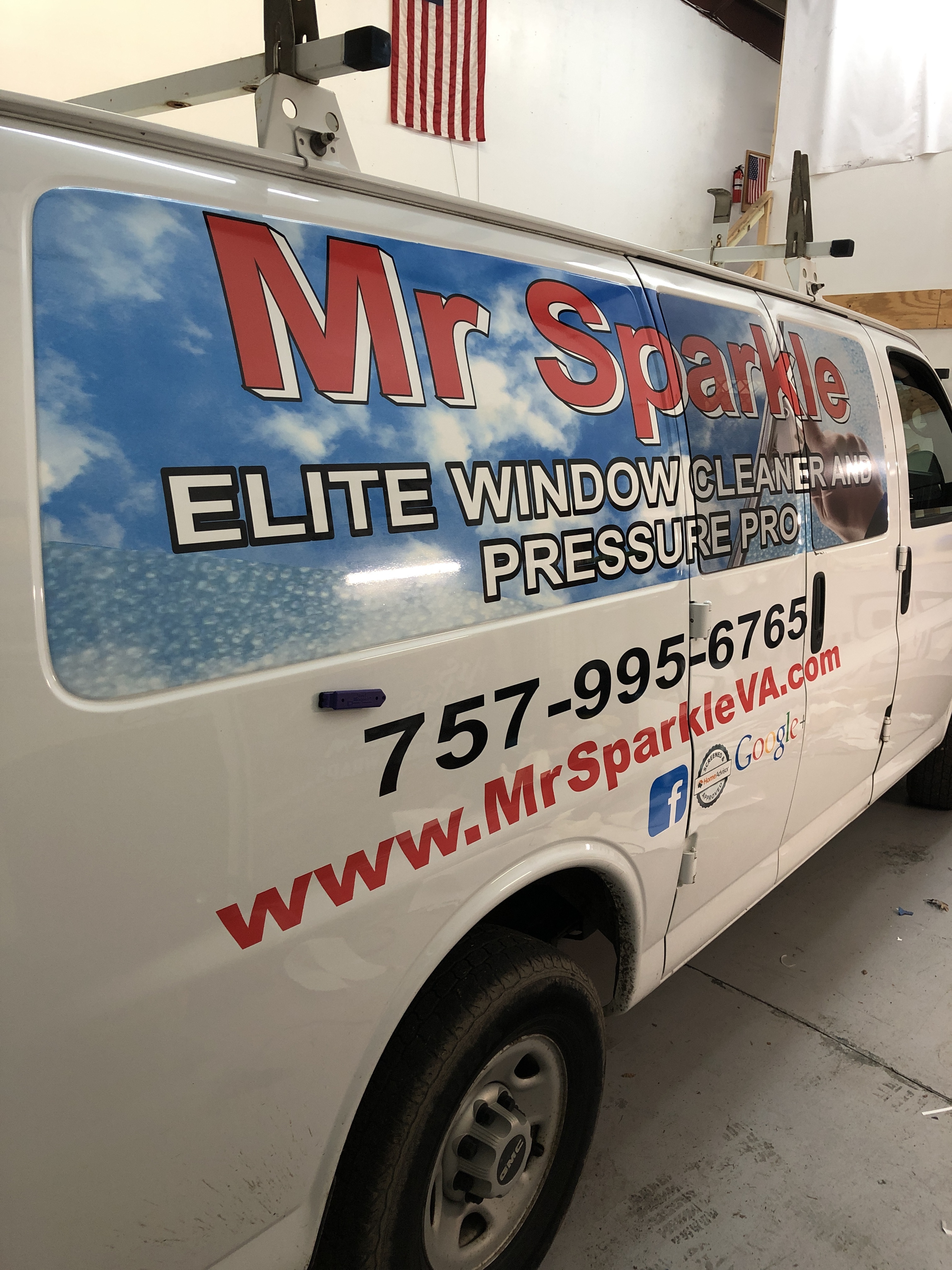
The Border gives it a better look. What are your thoughts? I’ve had a great feedback it… so I kept it and ran with it. Also, I just joined send Jim radius boom and sent my first mailers I was a couple days ago and getting great response from that too. We actually just scheduled 5 jobs
Most logos I’ve seen that have a border i think are ovals, but it’s different, you’ll probably tweak it over the years
Best name/slogan Ive ever seen, crackin up
2 Likes
Sir Wash A Lot is hilarious, also like guns & hoses but because I like the band lol
Kind of makes me wish I got more creative.
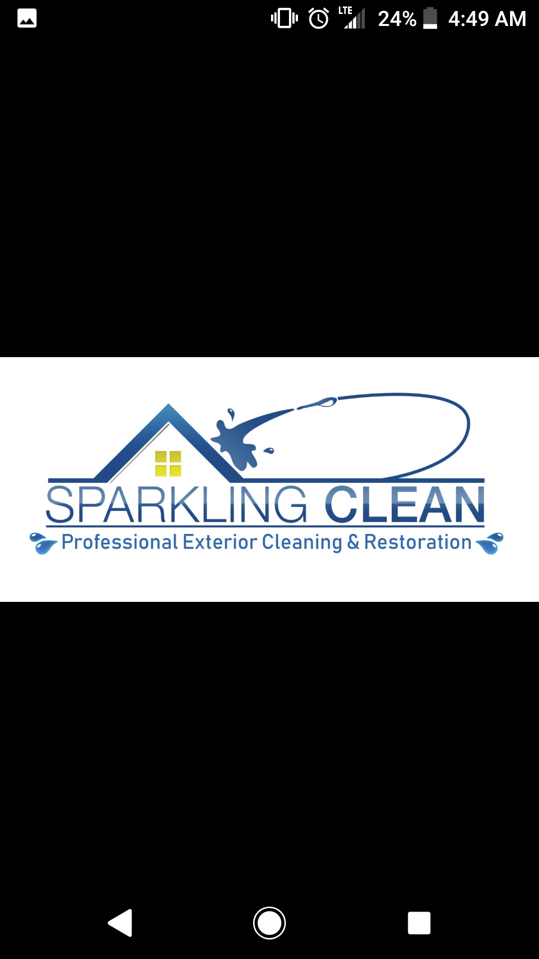
Here is mine
3 Likes
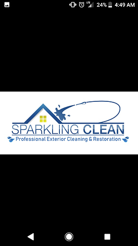
Love the logo. I think the water drops on either side of Professional and Restoration are probably a bit too busy for the logo that already has water. Also, they appear to be a different color?
I think he is playing with the shades to try to make it look 3D.
Originally I wanted green & a sparkle in it lol I’m supposed to get a couple more variations of it tomorrow. Hoprfully finish everything up this week.
1 Like
Ok, so I’ve been wondering about something ever since I saw a Crabby Joe’s restaurant the other day.
Has anyone in the cleaning field tried going the “anti-clean” logo and business branding? I’ll give an example:
“Filthy Phil’s Cleaning Services, We get dirty so you don’t have to!”
I haven’t seen anyone go this route yet, has anyone else?
2 Likes
Our Company logo is “We leave the competition in the mud!”
We are primarily an oilfield services company and it is intended as a play on the two most common products that must be cleaned out of frac tanks and vacuum trailers…Oil based mud and Water based mud.
1 Like