Ok, so I’m trying to put together a logo. Nothing earth shattering. But my wife is saying I should scrap them and start over. Maybe I should and maybe I shouldn’t - who knows?
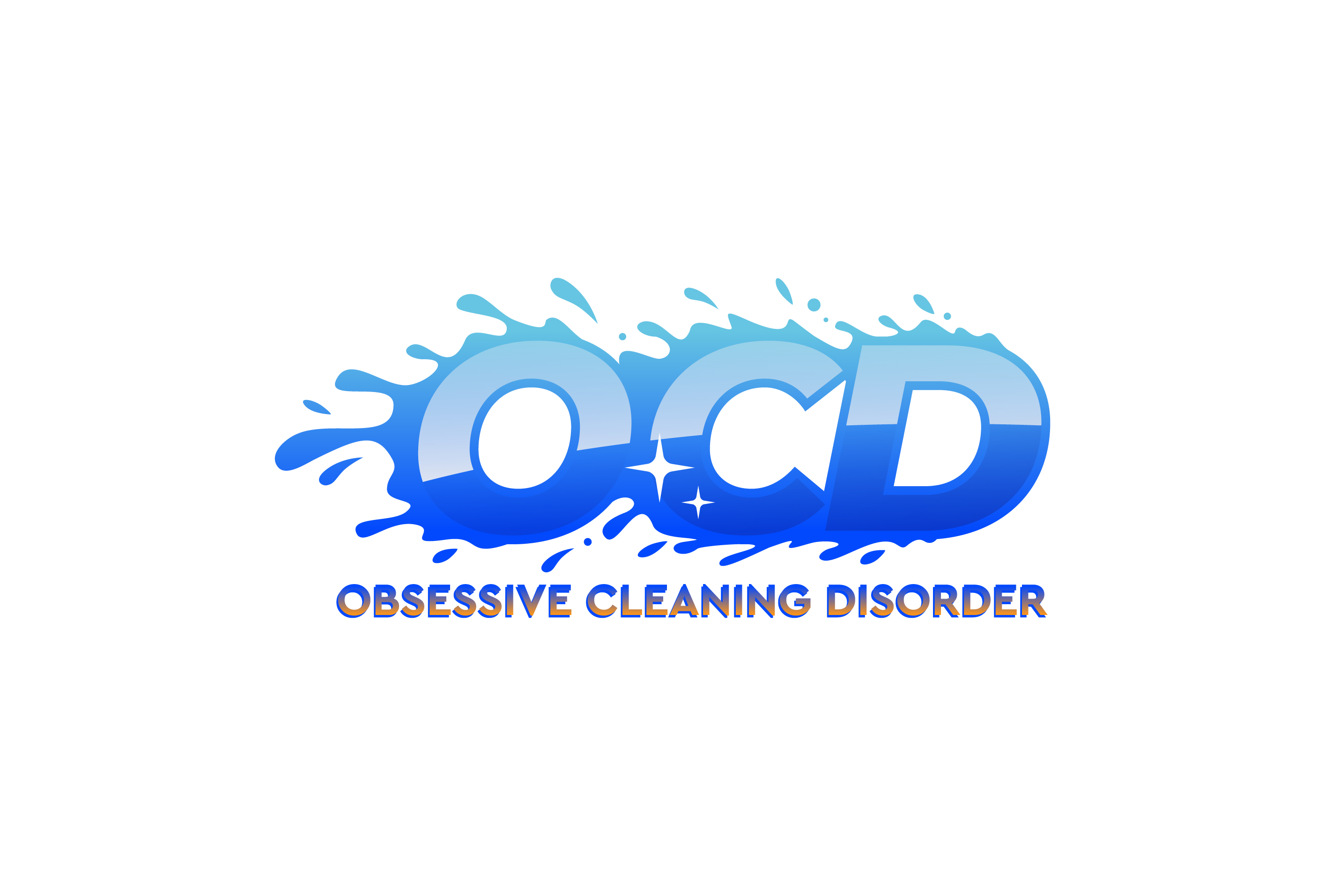
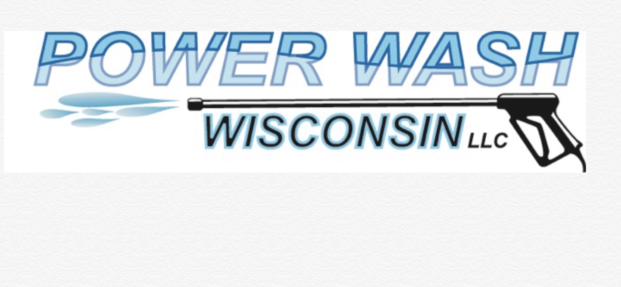
Does the first one look too much like paint? I kinda think so, but how do I make it look more like water?
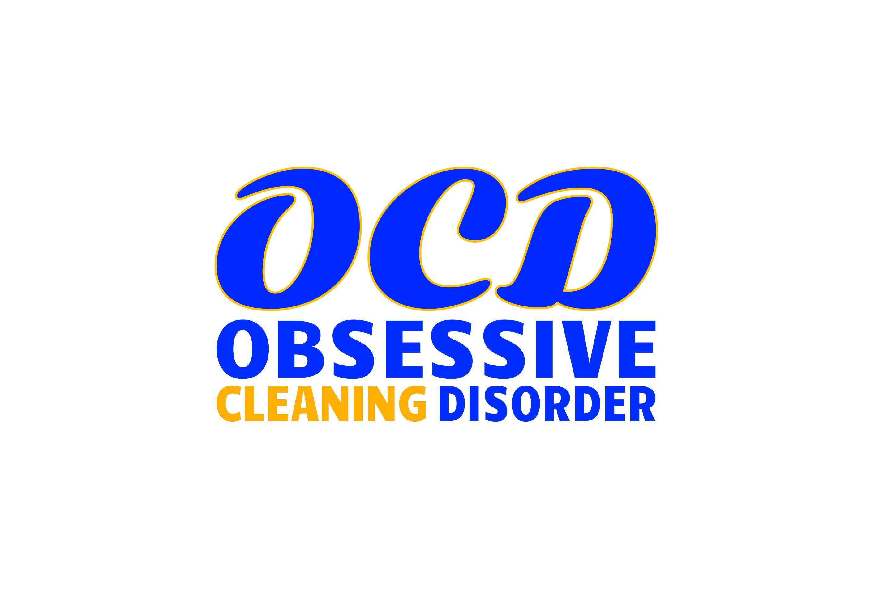
Can you tell the 2nd and 3rd say “OCD”? I think so, but is that because I know what it’s supposed to be?
I kinda like the blue and orange, but I’m not set on a specific blue (also kinda thinking about green).
Let me know guys. Suck? Doesn’t Suck? I know I don’t have to say this but… Be brutally honest.
That name is legendary! I’m tossing up between the first and second but personally I love the second one - I read a book back in my college days when I was studying Neuro-marketing that stated brand logos are most captivating when there’s a little puzzle in there (a logo to figure out almost) - people latch on to the logo for a longer period because they’re almost trying to solve it. They lock on to the logo for so long that they end up remembering it more than other easy ones.
Now I’m not saying your logo should be a huge “Where’s Wally” puzzle - but something to the right degree, such as yours.
I even wanna here from @Innocentbystander although he would probably just tell me, “walk away”. By the way, please come back, I’m dyin myself without your knowledge/comments/input/etc. - I can’t immagine how these other guys feel. There has been so much “that’s not how this works, that’s not how any of this works” since you left. And no one is telling them as only you know how.
P.S. I know I missed some people who have been instrumental in the knowledge I have accumulated here. I apologize and I thank you all
The first one would be my choice, with a slightly rounder font but not the font in the second two logos. (The O looks a little like a a lower case A.)
To answer the quoted question, try lowering the opacity on the drops of water and/or adding some highlights to the top splashes.
Adding a faint reflection to the three letters may also enhance the effect.
Adding dark shadow on the bottom will give a 3D illusion, making the logo pop out to the eye, if that is something you’re interested in.
I completely agree. I’ve only been here a week but feel like I’ve known these guys for a long time. I personally like the way he gets right to the point and doesn’t sugarcoat things. Every forum needs someone like that and most forums do. They help to keep the snowflakes in check! Maybe a forum vote will bring him back? What do you think @squidskc? Tell that grouch there are new guys here that need him!
I started typing a post last night and was originally sold on the first one but I think the water needs touched up. After you mentioned it kind of looked like paint it really started to look like paint. I also like the second logo. There was a post awhile back about how blue and orange are the best colors for a logo. Something about blue having a calming effect on people and then orange to grab attention. Brodie posted it so I’m sure he can correct me if I’m wrong but it was something like that.
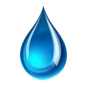
Bubble Guy gave some great tips! If I tried making a water droplet it would probably look more like a pile of bird crap! Nice job on the water droplet @Jordie!
Sorry for the delayed response. Got 2 of 3 sick dogs and I had to man a carpet cleaner all day yesterday. (Slight exaggeration)
Logos work best the simpler they are. Look at the logos of companies you can remember. 3 colors max. No shading. McDonalds, Exxon, Quiktrip, Home Depot, menards, Lowe’s, Amazon, etc etc.
Simple is best. Frankly, I don’t like any of them. The first one is best, but I’d swap out the water for bubbles, or take out the fill color so it looks more like water.
Or make a water drop with an O in it and leave the rest simple. Just my take.
My only problem with two and three is that my first thought when seeing them was “technology company”. I think you might see that some people are a little confused by your name in general and ask if you clean houses or what you clean? So if pressure washing and window cleaning aren’t the largest logos on your vehicle or marketing material it’s not really congruent. That’s why think you need to have something that ties in with pressure washing and window washing. I.e. water drop or bubbles. People need to connect the dots not put together thousand piece puzzle. Remember that people are only going to see what you put out in flashes at best.
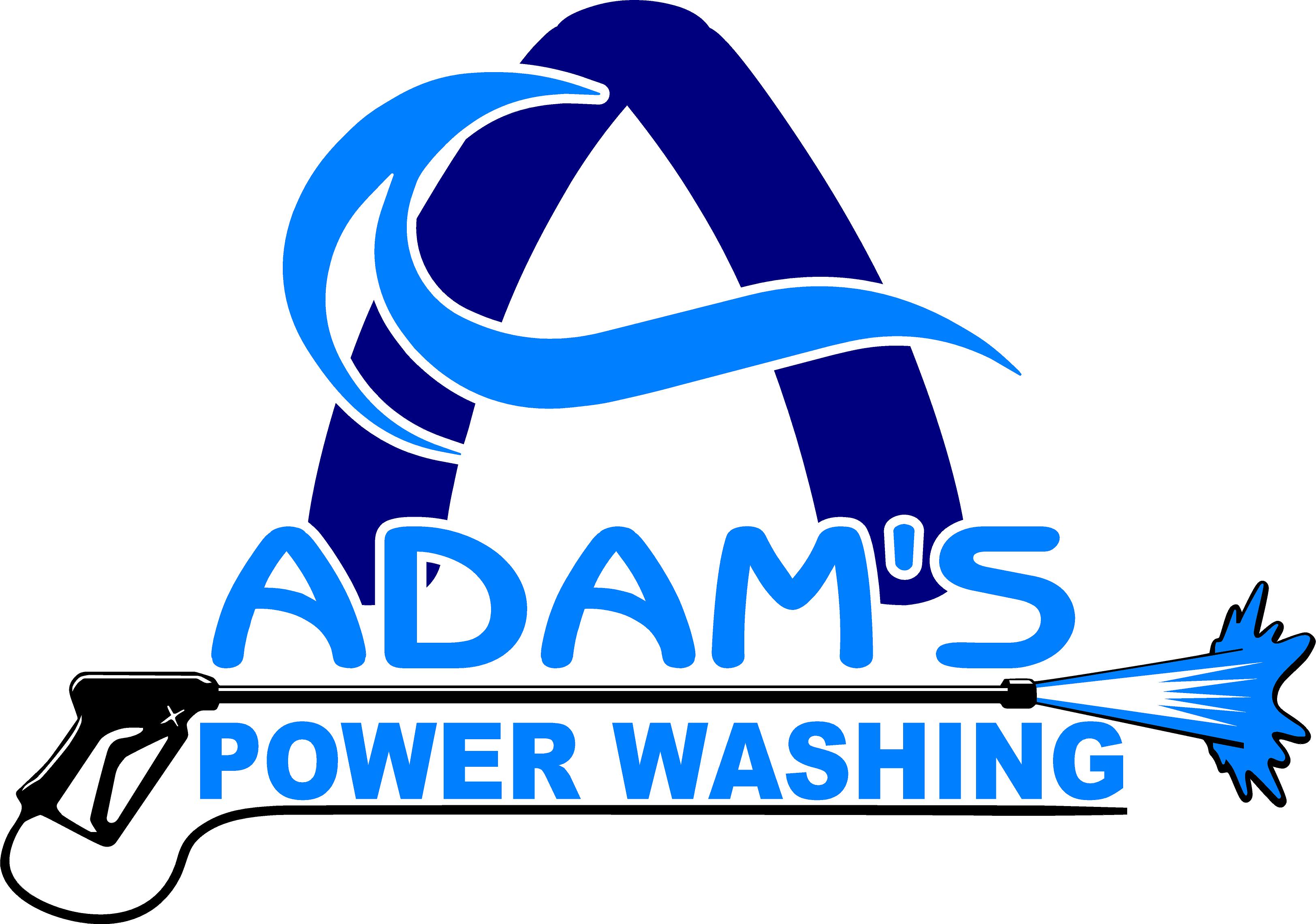
I think I’d make the A stand alone. Again, see MidwestWaterWays logo above. The logo is above the letters not mixed in. Make things clear and simple to read. Fonts good, just don’t let it blend together. It’s good though.
If I had to sacrifice the wash gun in exchange for a color on the opposite side of the color wheel I’d go with orange. I know it sounds crazy, but colors matter. You’re off to a good start with the blues. Blue inspires trust and are calming. Good for service companies.
We are an Interior & Exterior Cleaning service, so that is why it is cleaning in general. Just got the box truck today and now I’m looking to get it wrapped. The box truck will push power washing specifically. Logo will be on the truck, but on the smaller side (not a true focal point). Main thing on the truck will be WHAT WE DO (power wash) and HOW YOU CAN REACH US (phone number and website - but phone number biggest).
What do you think about this modification?? Getting there? Lose the stroke around OCD?
This last one I did make myself. The first ones were finalized by me, but the original idea was created by someone else. I have a hard time “getting to” a general design idea. But, once I see some specifics, I have a pretty good idea how to go about “bringing it home” (if that makes sense - long day - box truck and power washer in same day. I feel like I have already worked a ton, but I realize there is much work still to be done)
Get some rest. Tomorrow, if you can put a border around CLEANING or a background behind cleaning see what it looks like. I’m curious if it will help it stand out.
I shined my IBS light into the sky when I broke a pulley today like a dummy. He called in about 30 seconds. I let him know you guys were saying nice things about him which I’ve never seen before. Glad ya made a cameo appearance.