Yes, it’s a troll account
I figured, although it doesn’t change how I view him, seeing as he has sent letters out before. Apparently, he actually went on a warpath just like this about 8-9 years ago, and it got him banned from a few conventions and forums.
I’ve got a few years on you but I had my geek days myself. I used to scan for vulnerable computers within a range of ips and install ftp servers on them. Then on a forum that I was active on we would use the ftp servers to share media. I’m guessing this was before Napster.
1 Like
Do you mean livewire that then became limewire then frostwire not sure why they kept changing names.  i remember them days. Burning CDs on dail up connection hahahaha
Edit. Nevermind when we had dail up i used floppy disks to put typed up school projects on.
Lol, yep. Those days.
1 Like
Remember modem speeds doubling every 6-8 months? Renting SW? Wow, how time flies! 
2 Likes


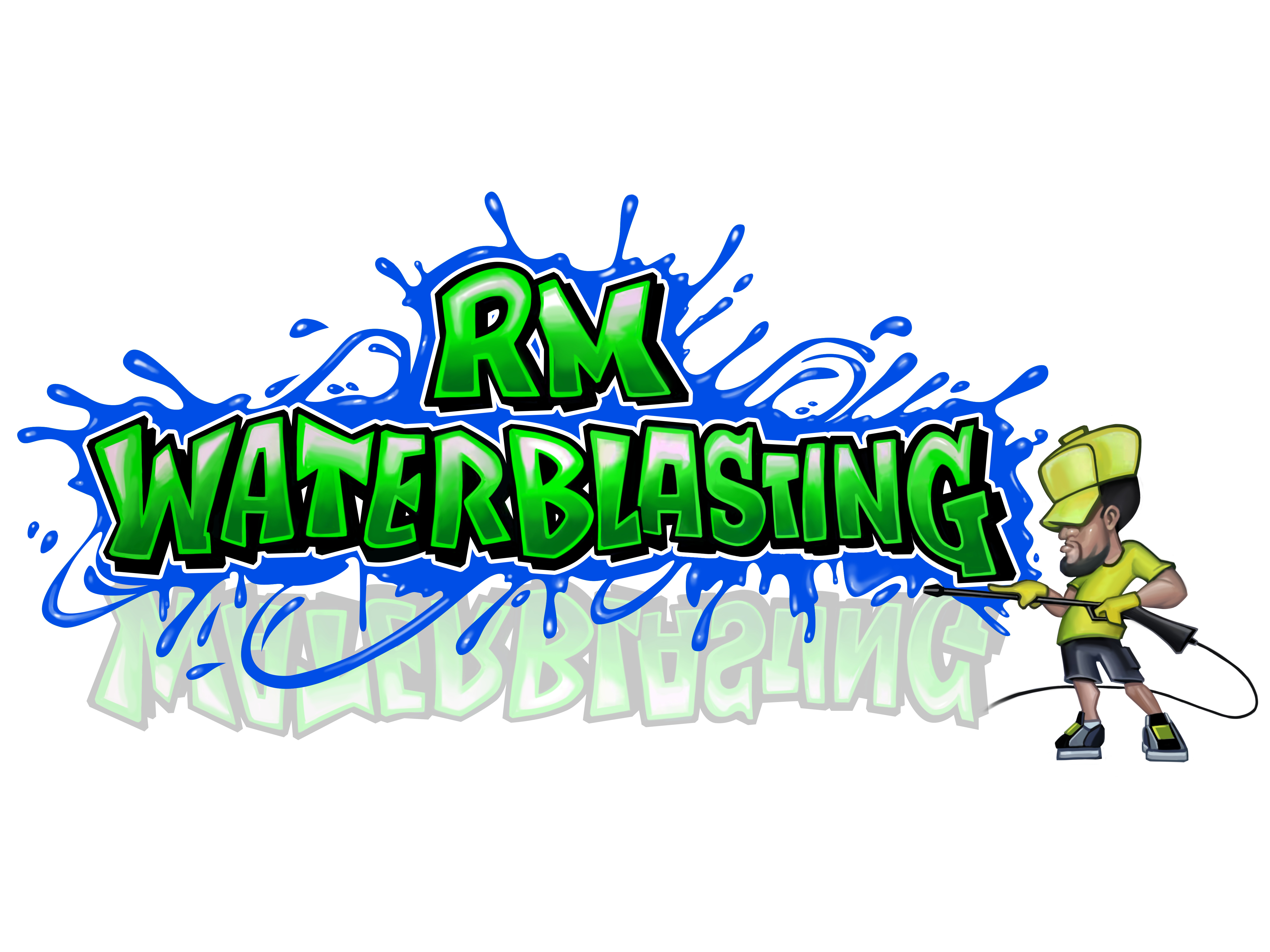
This is going off to print tomorrow. I designed everything myself except for the main part of the logo. I’d like to clean that logo up just a bit more but that exceeds my photoshop skills and I’ve already spent about 12 hours learning photoshop and tweeking this and my flyers. Last minute critiques are welcome.
2 Likes
@tnunez66… I like it. The font could be a bit thicker to make it easier to read on home exterior Solutions and residential and commercial pressure washing…thats all that I saw…nice cards though…looks like you spent some time on them😁
Looks good
It’s hard to read. I would put a thin stroke on the text to make it easier to read.
2 Likes
You mean remove the bold?
Experiment with different color combinations and stroke thickness until it looks good and easy to read.
I think it would look better if you completely remove the water droplet background. Just my opinion. Overall it’s looking good though.
3 Likes
I agree. It looks very busy with all the water droplets.
2 Likes

One tip a graphic design person gave me is limit your fonts to two different types on a graphic, three at the most of you have a title, sub heading, and regular text.
If I remember correctly, it had something to do with attention span and people more easily able to commit it to memory. The more different types of fonts, the more people adjust to reading it rather than remembering it.
I dunno if it’s true, but I have to agree that the fewer font choices and cleaner look to a graphic make it stand out in my own mind better.
1 Like
Where’d you order these for 1000 at 20$
I haven’t got my cards yet was waiting on my license number in CA and while waiting for that hired someone to complete my logo wanted it to pop and am happy with the product.
2 Likes
Great name @Washed_Up 
2 Likes