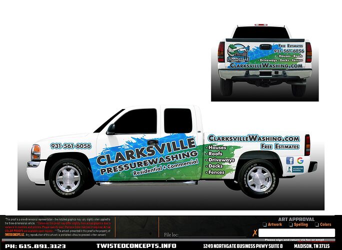
What do you dislike or would change? I may swap the phone number and website locations so the phone number is larger. I also plan on doing windshield banner and perforated window decals for the back and backsides. Thank you for the input
Maybe it’s my eyes or the pic but the tailgate is hard to read.
Of course…I like the gator!
Looks great to me
Has a lawn care feel to it, but I also like it.
The first thing I would do is get rid of that Raiders avatar. 
I think it looks good too. I agree it kind of has a lawn care look to it with all the green. Maybe turn some of the green more blue? Maybe just barely feather the edges with green?
I would add insured on there somewhere too. I like it.
Ehh I think people can assume anyone professional enough to get their truck wrapped will have step one of being a legitimate business checked off as well!
You do know what assuming means right? 

Theres still something I can add to the back window maybe my number very large and licensed and insured under it. thanks
Most shops can overlay vinyl easily. My words were overlaid over the background wrap. But that would work too. Can’t wait to see the finished product!
The design isn’t really speaking to me. I usually whip my head around anytime I see a nicely wrapped or lettered vehicle, just out of curiosity. This one, I would probably pass over.
Your logo with the gator is sweet, and memorable. I think it should be featured on the side doors somehow. The name text maybe could be enlarged/expanded for ease of reading. But the gator should get a spot.
The text on the sides of the bed is a bit hard to read. Just too many outlines and colors going on there.
I think a really nice lettering job could perform better than this wrap, from a marketing perspective.
Instead of thinking about what else could be added (like “fully insured”), try and figure out what can be subtracted (like “free estimates”, or some of your poorer performing services.
Less is more. Most people will only glance your truck for a couple of seconds. Every word should count.
Just my 3¢ (I always try and give 150%  )
)
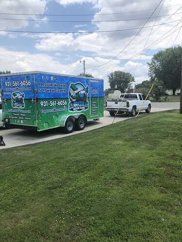
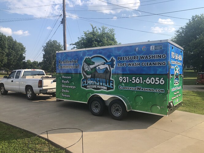
Edit: you just had to go and post pics of your trailer, seconds before I hit post 
For congruency, you might have to do a partial wrap on the truck. The trailer looks pretty good, imo. I would try and follow that design more closely.
Or, go ahead and just letter the truck, for some contrast, and to help the people who seem to need to set their computer screen on high contrast mode to be able to read anything 


Your right @Infinity ide wave him down for a quick lawn edge and shrub prune lol. Then ide feel bad for wasting his time 
Maybe with everyone needing their grass cut when they see my truck they will be like ■■■■ I guess i need to pressure was my house as well lol.
Like the fact that the truck scheme doesn’t exactly match the trailer. It allows for both to make their own statement, I’m assuming you don’t drag your trailer everywhere the truck goes? JMO
Right I didn’t want them to match and I also plan on getting another truck with only window vinyls so it’s not “too much”
I think it looks pretty good, except for the blue second outer outline around the phone number, website, and “free estimates”. It makes each of those difficult to read. The second outline is great for when it’s over another background as it helps to create separation from the background, making it easier to read then.
