Back side will just be business name and phone number.
I’m not sure how I feel about the font. Also considering changing the services spot to this:
House & Buildings
Roofs & Gutters
Concrete & Masonry
Fleet Vehicles & Heavy Equipment
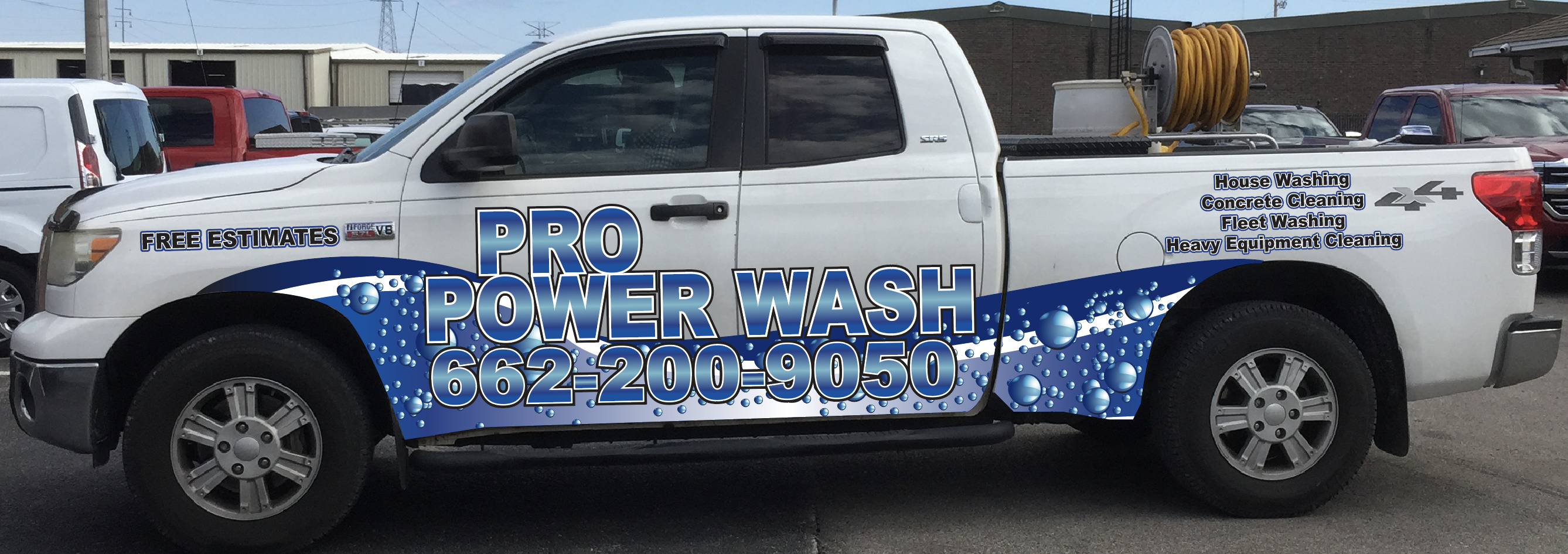
Definitely hard to read the name and phone number, I’m no designer but maybe white letters with a real thick black outline would work that way it would stand out on the water and still be seen on the white truck…and it would basicly be the opposite of your smaller wording
Im surprised they sent that to you. They should know about contrast. If your ok with different color wording, red would really pop. And i would change the way your services are listed.
Yeah I am too. Their first draft was laughable. I’m thinking get rid of the white gradient in the middle of the name and darken up the font and then make the background water stuff a much lighter blue.
I think I agree with Brodie about finding someone else. You want the number to pop out and it’s barely noticeable because your business name is so big. As others have mentioned there’s no contrast with the font and bubbles/water. The services on the side of the bed are so small they’re hard to notice. I think you’d be better off having two services side by side so they are bigger and can be seen.
Kind of like this.
HOUSE WASHING * CONRETE CLEANING
FLEET WASHING * HEAVY EQUIPMENT
Even the “free estimates” could be made larger by curving it from the headlight up towards the upper right of the fender.
I’m not good at graphic design stuff but they missed some basics that they shouldn’t have.
Yeah if I’m honest the more I’ve looked at it today the more I dislike it. The color gradient puts a white line right through the text and makes it unreadable. The background is darker than the text and I feel like it should be the other way around. Wheelbase text doesn’t match the main text. It’s waaaaaaaay too busy Just looks amateur. I feel like I shouldn’t be explaining the concepts of color, contrast, readability, to a professional designer.
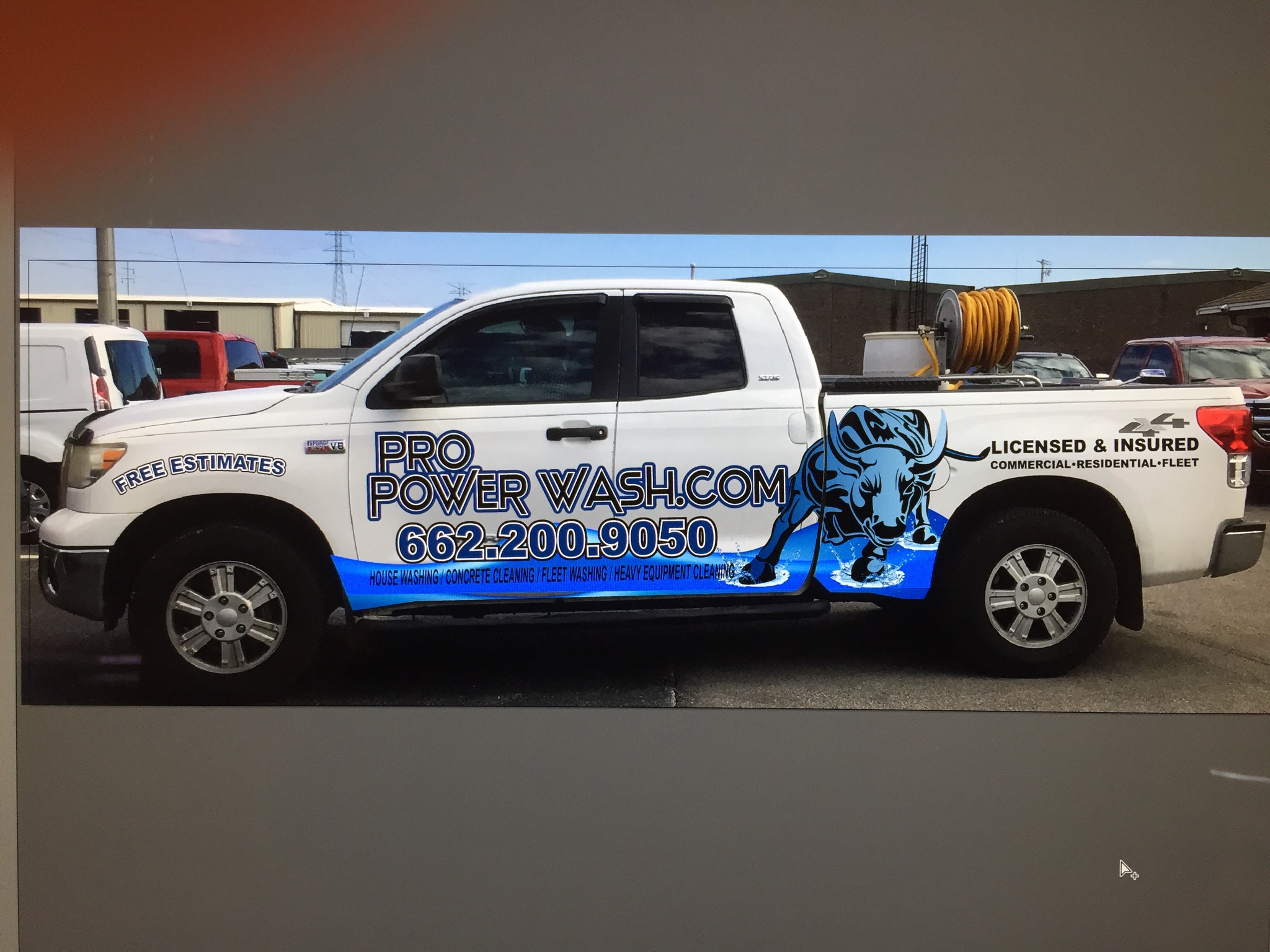
I actually like the bull, it looks cool. But unless thats apart of your current marketing pieces or want it to be would scrap it. Do you have a logo or website?
If you paid a deposit for them to do the design, like most companies do. If its wasn’t too much i would take that loss and look elsewhere. But you will face similar problems everywhere you go when doing a half wrap. Theres a reason most power washing half wraps look the same with a small wave with your logo on it. Theres not much to really do.
Well that’s the thing it’s not and I don’t want it to be. Completely unrelated to the service and I don’t like it or think it represents me or what I do. No logo, have a website but just a simple one made on Wix. Paid $150 deposit for the design, but the biggest issue is that the next nearest place that does truck wraps is 3 hours away. Which I guess is fine but my point is I don’t have a lot of options.
Here is my feedback…what’s your market? Houses and fleet washing are pretty dang diverse…who is your market that will see this truck and go “dang, I’ve got to call them”? Focus on them
2nd draft is worse than the first, imo. But they’re both horrible. I’d ask for my deposit back, and find a vinyl shop that knows what they’re doing. Straight vinyl lettering will look better than either of their designs, and will cost a lot less.