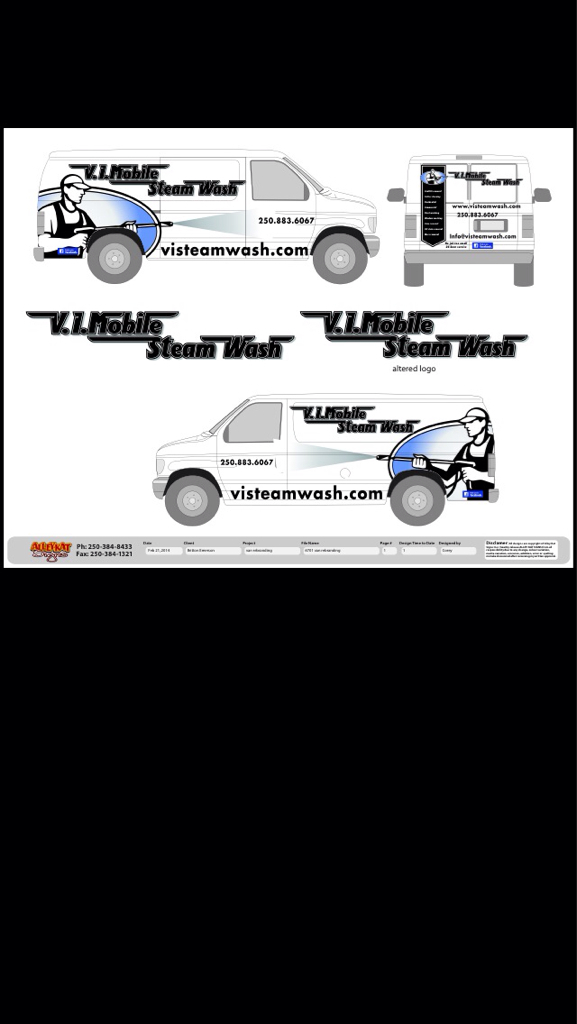
Here are some pictures of our truck after graphics were applied yesterday.
Nice! Did you have them cut and install yourself or did someone local do it for you? If you don’t mind me asking, what does something like that cost?
Thank you!
How did you decide on the name Heros? Are you a Veteran or is that your last name. Nice looking graphics by the way!
Sent from my iPhone using Pressure Washing Resource
The graphics were done locally, and installed for us. I had requested 4 quotes and the average quote was for $375 installed. We got is for less than that because we also ordered a bunch of T-Shirts from them as well.
The name was one of those things, started out as Grime Fighers then we came up with the tagline and because we had seen other companies named grime fighters we wanted to be different and it lead us to Heroes
Everything fell together, plus it doesnt hurt when you have friends that work for a marketing agency that helped create the whole thing as a brand and concept.
Those look pretty good. I just got my van measured for decals, this is what it will look like but it’s going to be EMERSON EXTERIORS since I’m doing only residential work and got out of heavy equipment I needed a name change. What do you think of the lay out?
Sent from my iPhone using Pressure Washing Resource
If we’re keeping it real… Drop the clip art soldier boy. Have a professional design or at least use a typeset/font that is readable.
Keep it straightforward and simple or else pull all the stops and go all out.
The business name is completely unreadable… I just stared at it for 15 seconds and i’m still not sure what it says, just imagine how difficult it will be to read when your truck is going down the road at 50mph…
Soldier boy? This is my old company lay out and font. The new one will be better and more readable. And this is from one of the best graphics guys in town. It’s just a quick lay out idea. Not final yet.
Sent from my iPhone using Pressure Washing Resource
What is unique about the brand? and what is the concept?
Yea font is all wrong, super hard to make out. Why every time I see these designs…is the telephone number the smallest part of the design? Makes no sense. Keep working on it, or get a pro.
Did my thread just get hijacked? 
Like I said this is just a lay out idea/brain storming ideas and this took the graphics guy 15 mins without even seeing my van yet. and your input helps and much appreciated. The font will be different (readable for sure) and the phone number will be in the same spot as PRESSURE KLEENS placement and size. I will post another picture just before I get them printed for more feed back from all you pros!
Sent from my iPhone using Pressure Washing Resource
Oops sorry…your phone number is too small also…lol!
LOL GuyB. I had the graphics put on last evening and it was raining when I took the pictures so they are not the best pics. In actuallity the phone number is the largest font on the truck
I am going to take better pics when the sun is shining.
Nice graphics, although I’m with guy. Id have a hard time identifying your number while driving.
Interesting thread indeed, so many things to consider with starting up…yikes.
I think it looks clean. I hate big letters an i think its over rated. If I saw your truck riding down the street all i need to remember is the name an i would just google it. Who has time to take your number down while driving. I honestly think it looks perfect an neat.
BermudaOne Pressure Washing & Restorations
Richmond, VA
804-617-1488
Looks good heroes.
Thanks, I really appreciate it, it has a lot going for it, but improvements can always be made.
I was scouting a few neighborhoods the other day and saw a ton of landscapers and a few power washers and it just totally blew my mind that about 90% did not have any signage at all.
I just do not know how you can run a business without investing on signage for your vehicle or trailer. It just does not make any sense at all.
