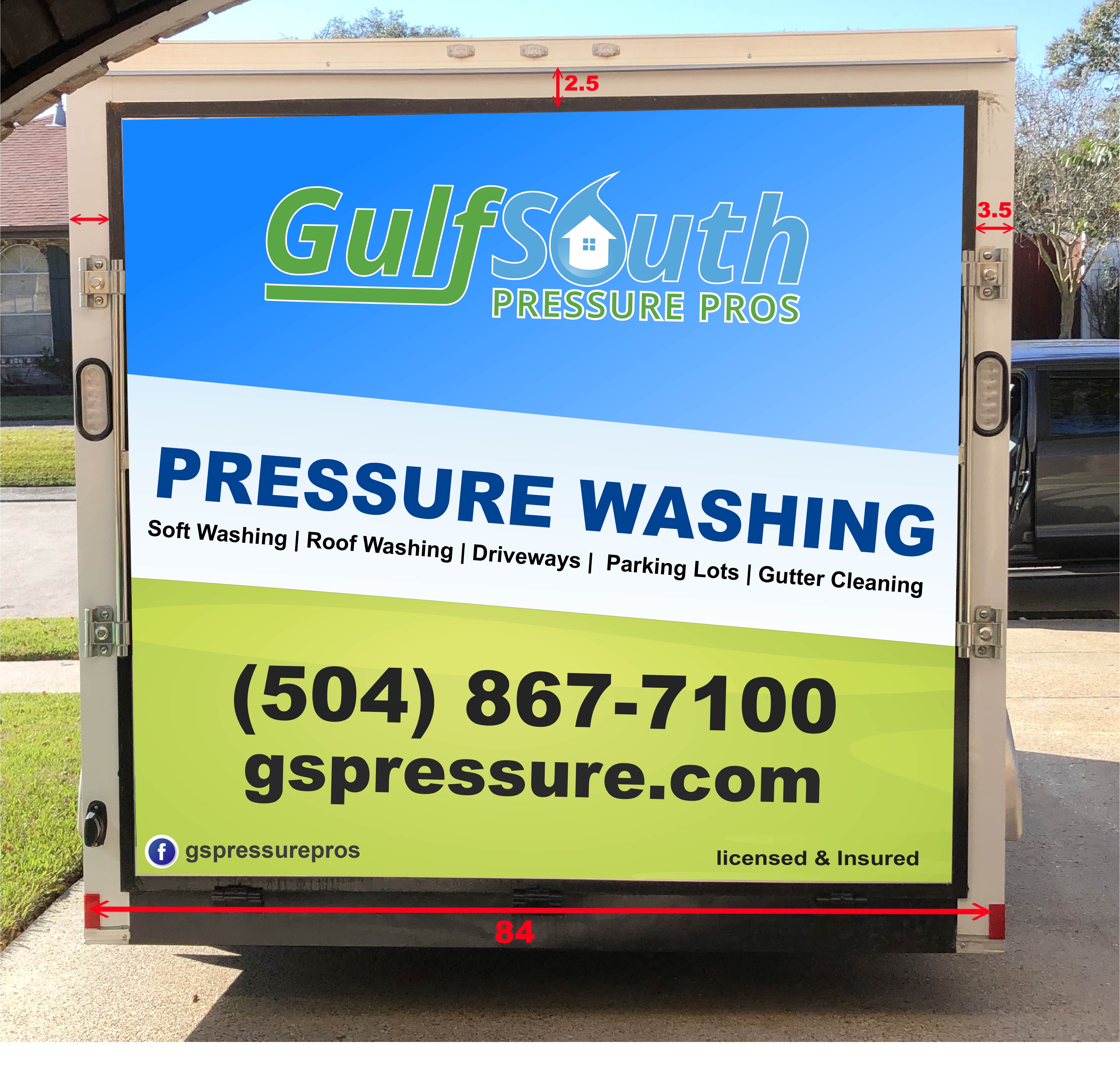
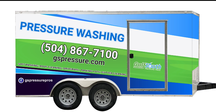
This is bugging me. The URL isn’t aligned correctly with the rest of it…
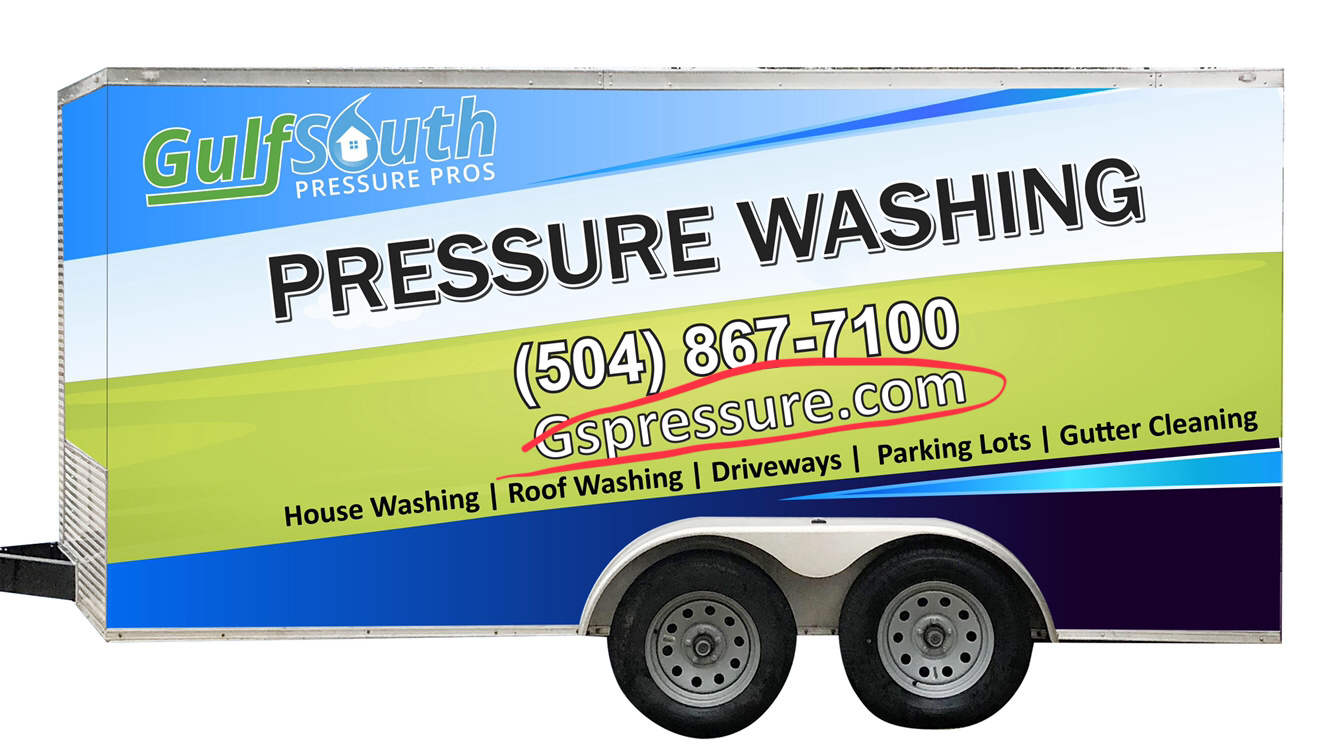
(Neither is the logo, upon closer inspection)
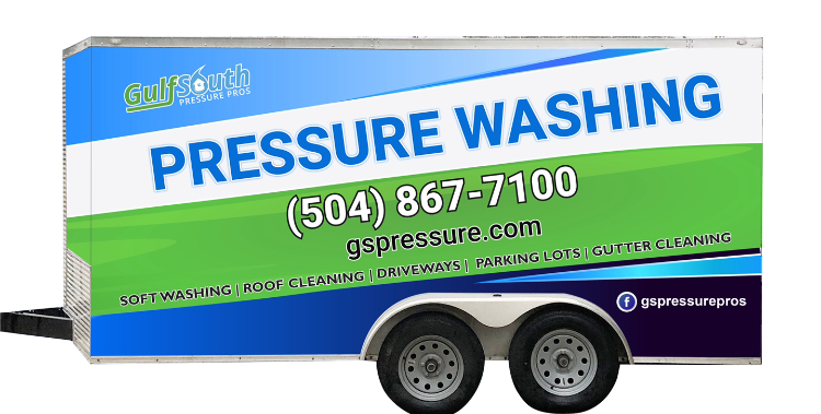
This is bugging me. The URL isn’t aligned correctly with the rest of it…
(Neither is the logo, upon closer inspection)
It’s alright. I spent a few thousand on a wrap and only looked at the driver side and then when I got home realized the passenger side was a few inches to high… logo literally was on the bend at the top. Lesson learned lol
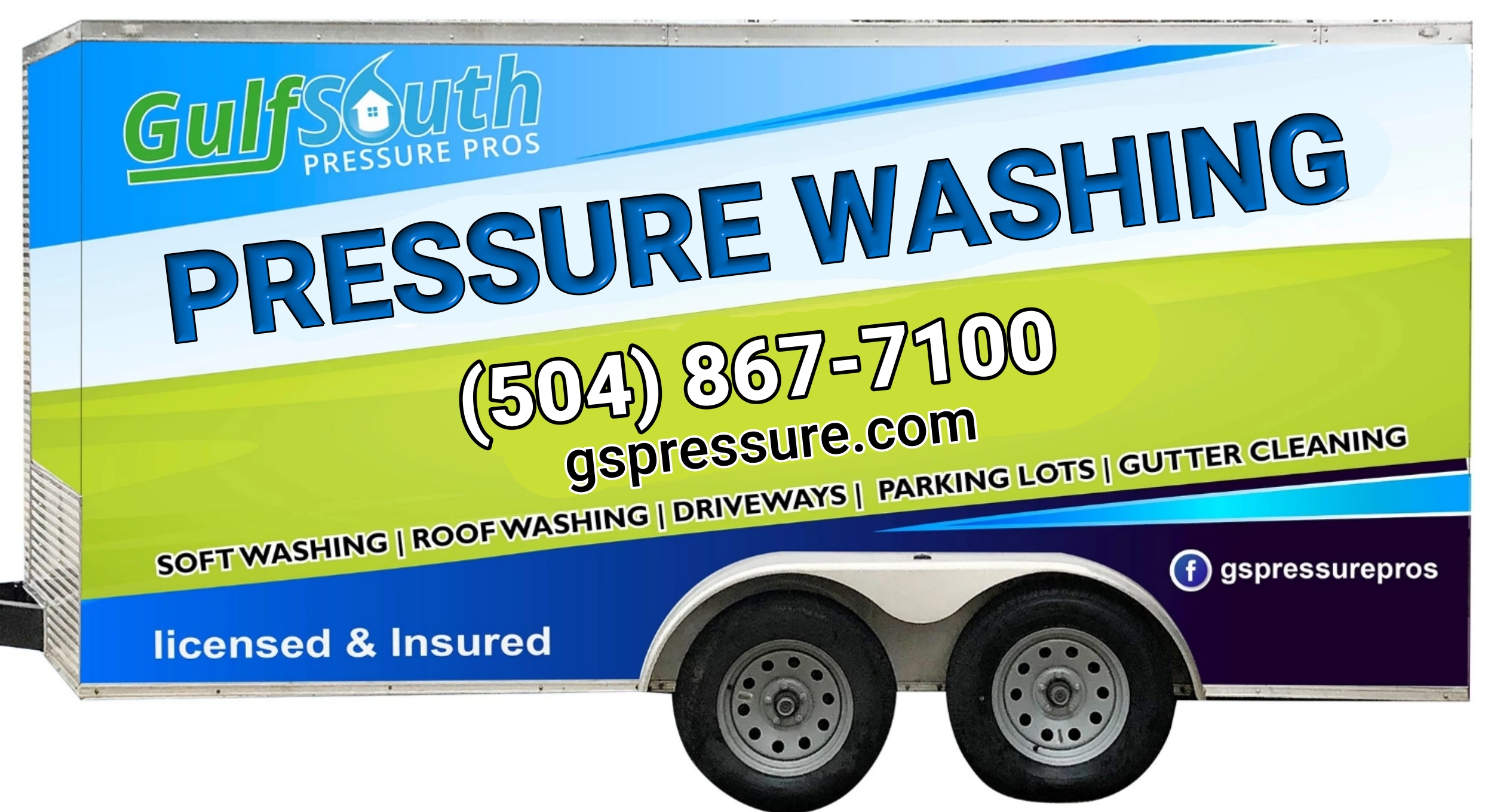
Least favorite of any of the options you’ve posted. I see what your saying about the green one at the top looking a little to much like lawn care with the color scheme. But I definitely don’t like the last one. And I agree with Alex, things need to be lined up correctly. I like the path your taking with the wrap though. I think you will be much happier with it than the lettering.
Great eye
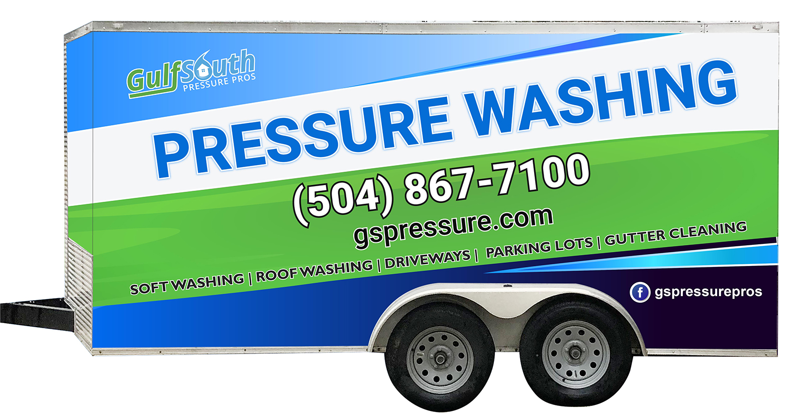
Liked your non wrapped version better.
I’m getting him to remove licensed & insured, but this is pretty close to what I’m considering approving. I think this designer can’t wait to get rid of me.
I’ll probally let whoever I hire to do the physical wrap do an alternate design and pick one.
I considered this, but I imagine myself sitting in traffic. I’m numb to vinyl lettering. I rarely pay it any attention. Wraps on the other hand catch my eye from a distance. Even the bad wraps. It could be just because I’m interested in them atm. But if I’m remembering correctly I paid more attention to them before I had a reason to.
I would like it more if that lime color was more like the green in your logo used on the word “gulf”.
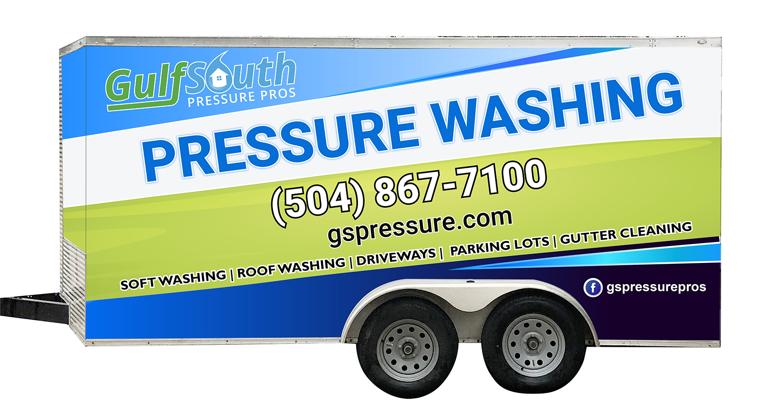
I actually like the other version you posted with more blue and the bigger logo better.
I like the second one. Hands down.
It really makes it easy to read your number too. Makes it stand out.
I’m kinda indifferent but, the darker green is easier to read the phone number
I’ve never been a fan of angled lettering…MHO.
Okay, as the average homeowner that you are targeting I’d say:
I don’t know what soft wash is
You don’t do steps, railings, or any wood
Weird that your name and facebook are gspressurepros, but not your website.
i can’t tell you how many times I’ve read an add on the nextdoor neighbor app asking for licensed and insured professionals. No idea why you took that part off.
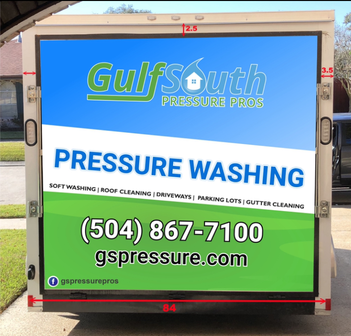
the white block saying pressure washing is different on the front and back, as are the greens used.
You logo is inside the green stripe on one side, but not the other, it’s in the blue up top.
the tilted white on the side looks like it should wrap around to your back, but it’s at the wrong angle compared to the back picture…it’s like the exact opposite for one of those sides.
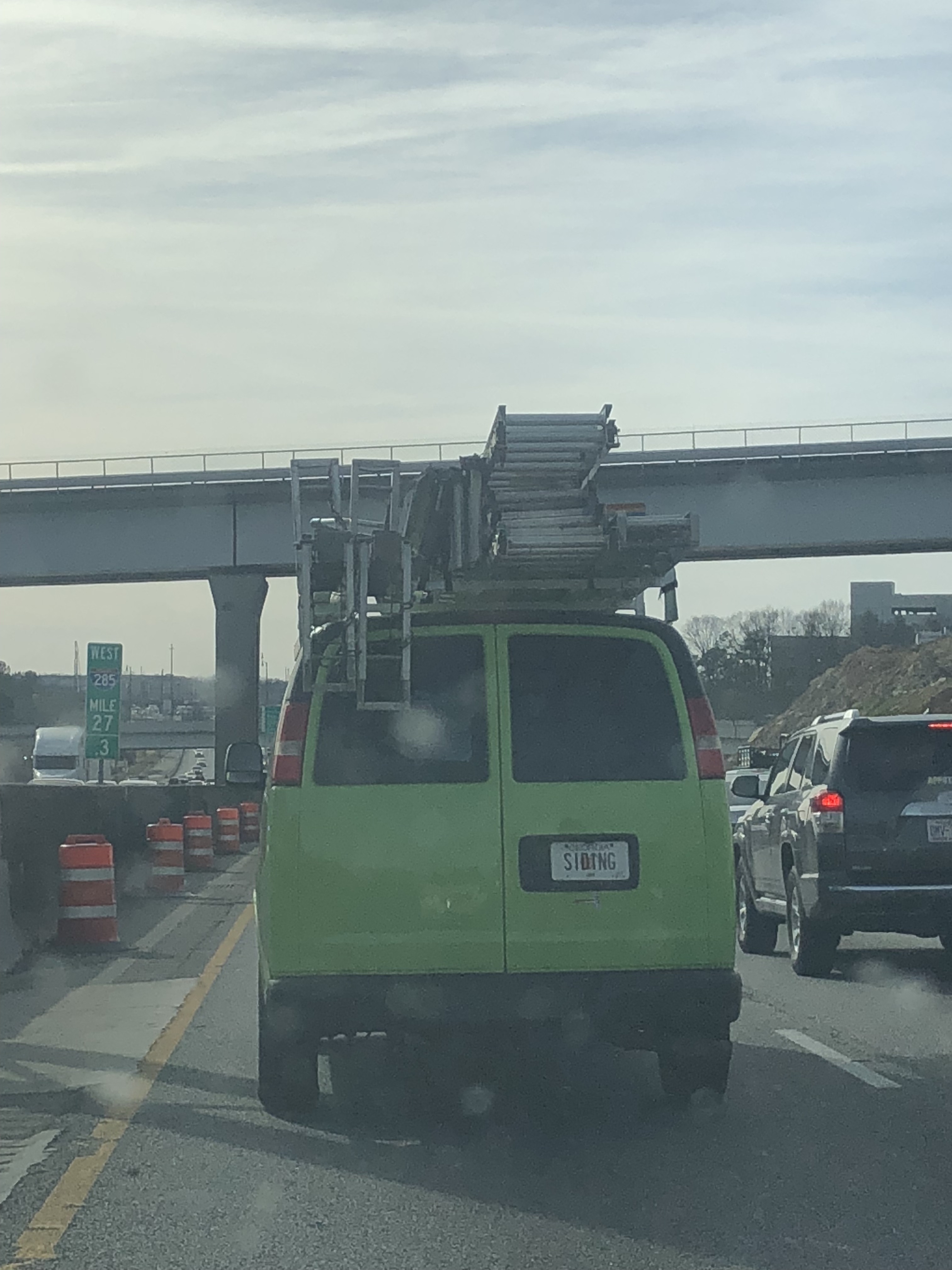
So I’m sitting in Atlanta traffic on a Friday. If you haven’t been in it, you just don’t get it.
Thought of y’all when I saw this license plate:
Looks awesome!! Setting yourself apart from the competition by increasing perceived value = $$$$$
I’m getting him to switch up the back so all lines and colors are continuous
Looks good but i don’t like the website font, also i feel like the logo/company name in the back could be straightened out, and not tilted, it might look better like that
With your services under the “pressure washing”
I would change soft washing to house washing. Most wont know what soft washing is. Also driveways and parking lots, i would just change to concrete cleaning. to cover them both.
On my wrap i listed my as so: House washing, Roof Cleaning, Concrete Cleaning, Rust Removal
Also have you talked to the people who will be doing the wrap? It would suck to go through all this and then the wrap people still have to re-design it on their software to be able to print it.
And just one more thing, have who ever wraps it print a very small scale version of the wrap to see the true colors. What on the screen and what prints are totally different. We had to go up a few shades in our blue to get what we wanted.