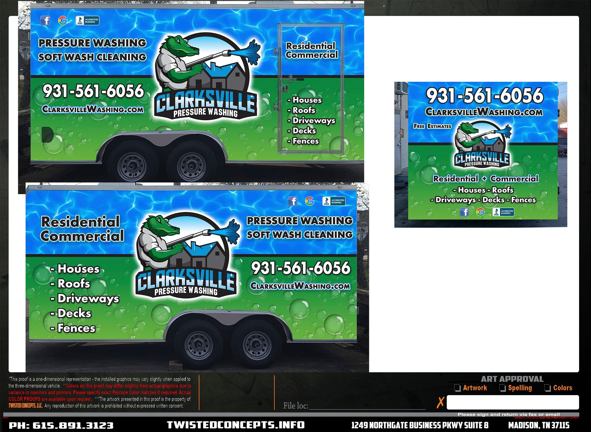
Can you guys give me your opinions on this? What would you change?
2 Likes
I’d make the website the same colors and font as the services on the door. Just easier for older folk to read in my opinion. It all looks sharp though
1 Like
I wouldn’t change a thing. It’s eye catching and gets the point across. Hurry up and get it on your trailer so it’s a mobile billboard. It will make you money, guaranteed.
1 Like
Looks awesome ! I totally dig it.
1 Like
Too busy IMO, hard to read against the background. People walking/driving by need to see your logo and info within 2-3 seconds.
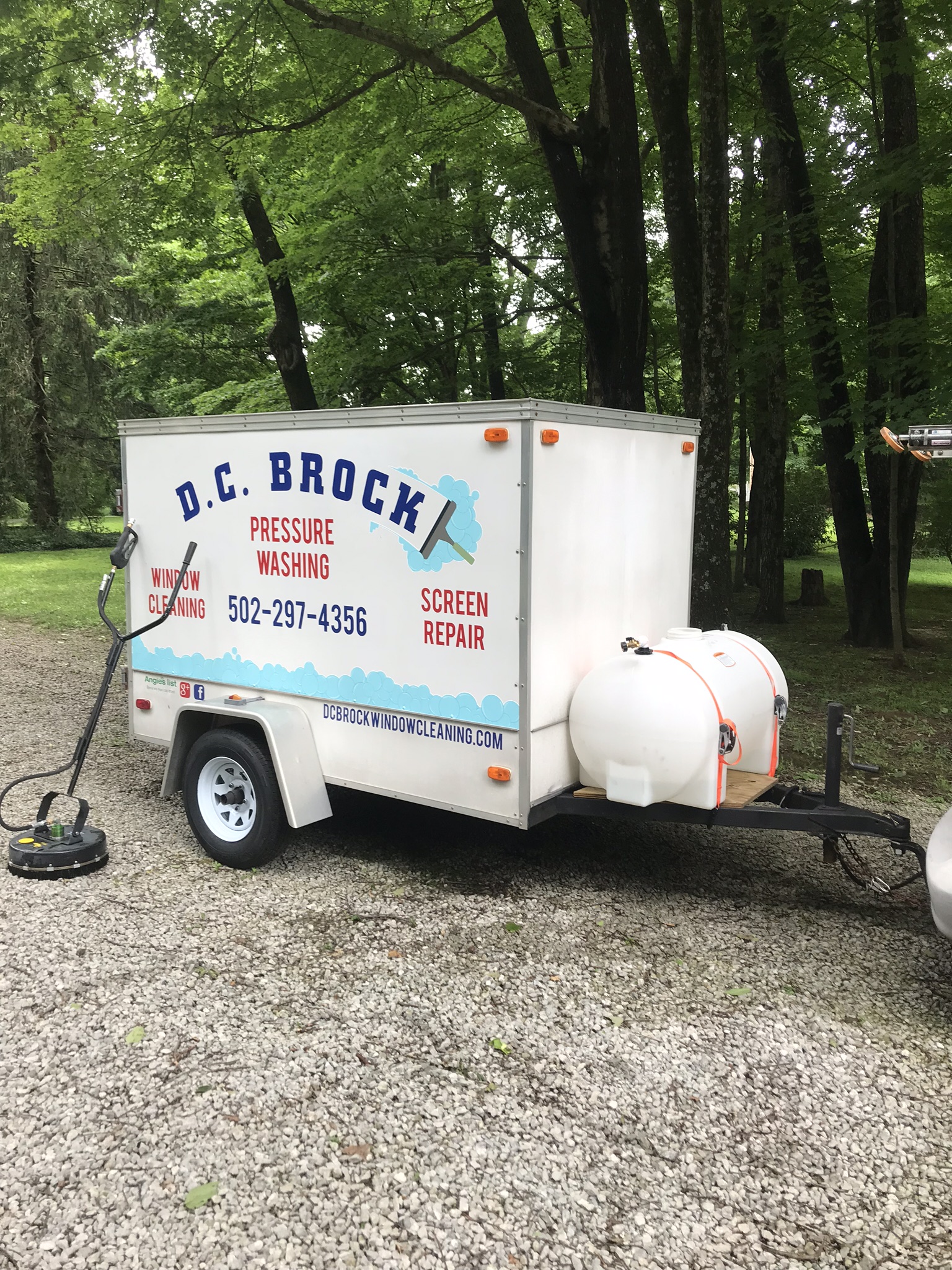
Here’s mine, had lots of people compliment on it’s design.
Maybe if you made the black lettering white it would pop more. My eyes are jiggling just trying to read the black font, but then again I have astigmatism so…
2 Likes
Black font might be hard to pick up from a distance as it blends in a bit with the other colors. Otherwise it looks good. I’d probably keep all the lettering one color if I did something like that and maybe pick a brighter color for the tele# so it pops out and such
