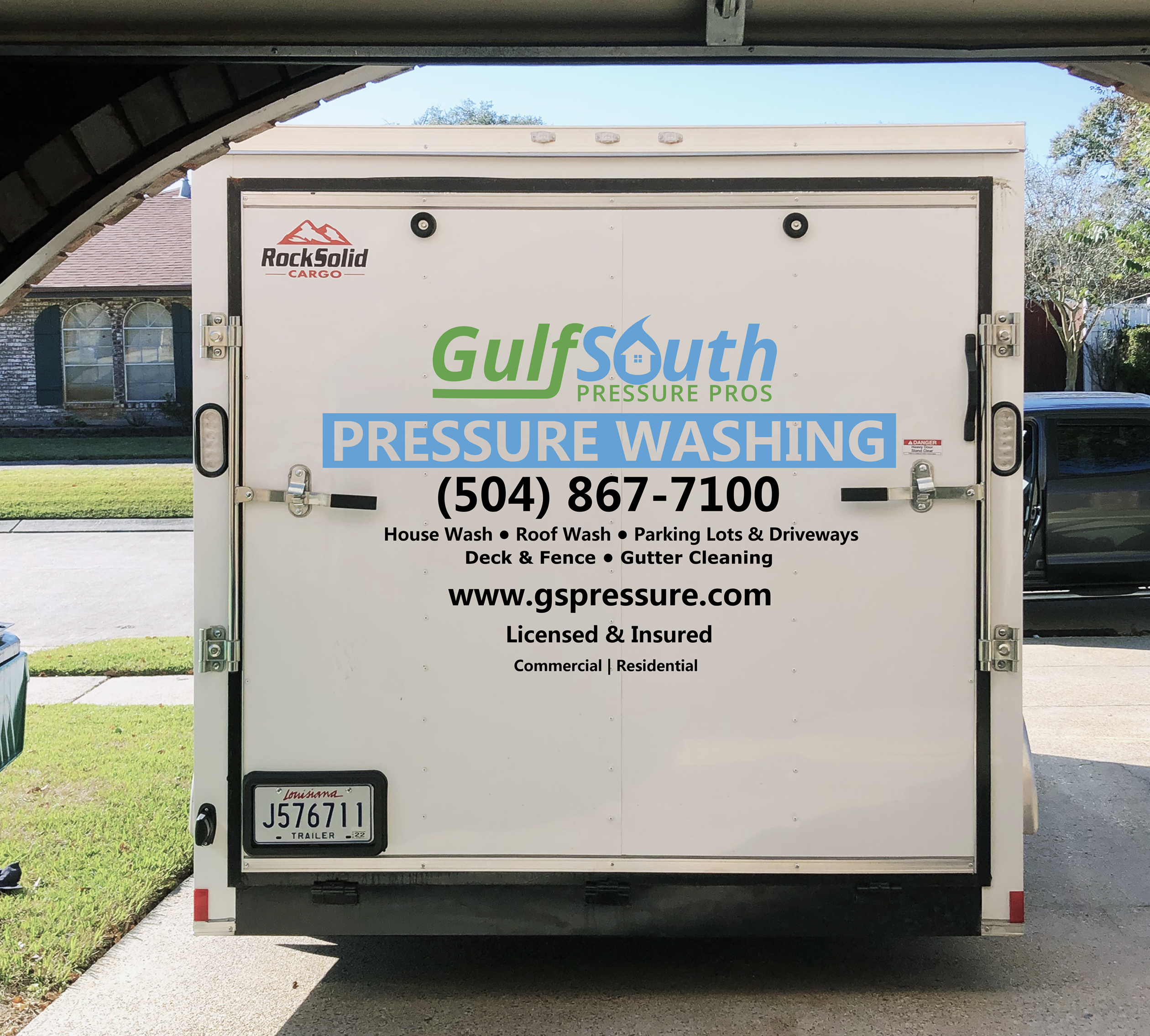
I’m about to get my trailer lettered. Attached are proofs. I’m looking for suggestions from you all before I approve.
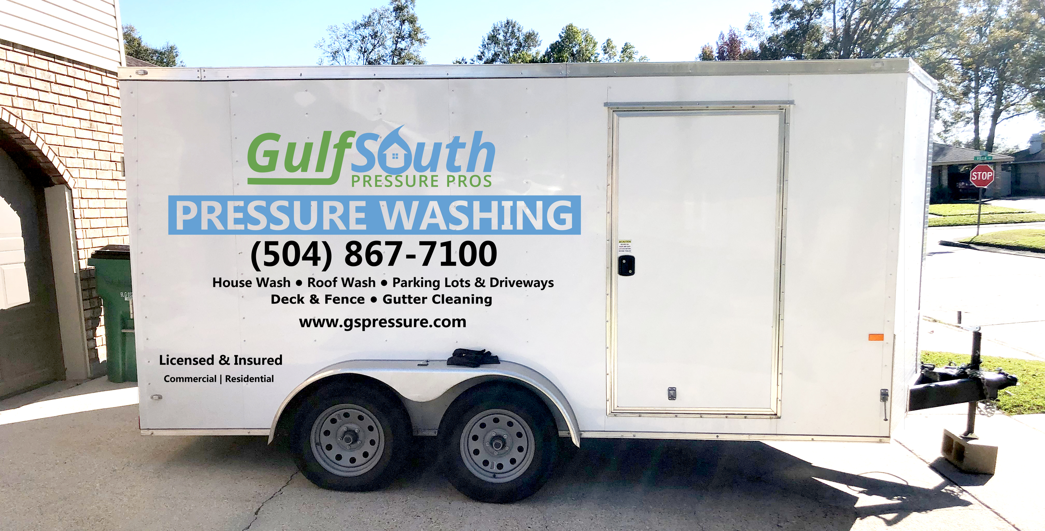
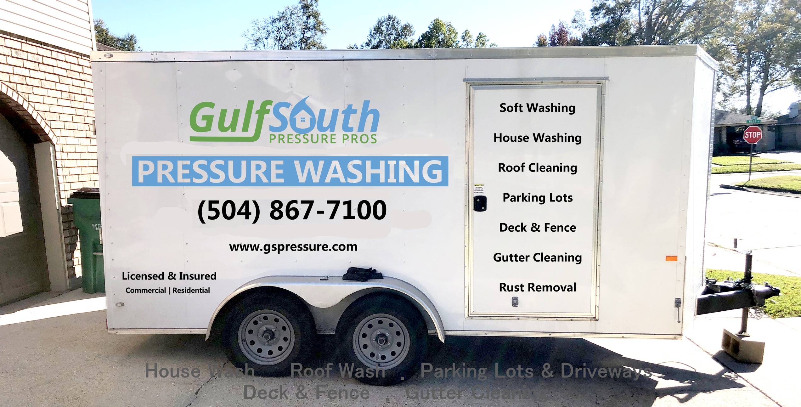
My two changes atm are on the door side. Instead of listing services under the pressure washing, I think it will fill in some of the empty space on the door.
My other thought is the back ramp door, all of the letters and images look jumbled together. I think they should be spaced out and/or something removed.
I might be nit picking, but “Deck & Fence” reads funny to me. My mind wants it to read “Decks & Fences” - Again, just nitpicking. I think it looks great though
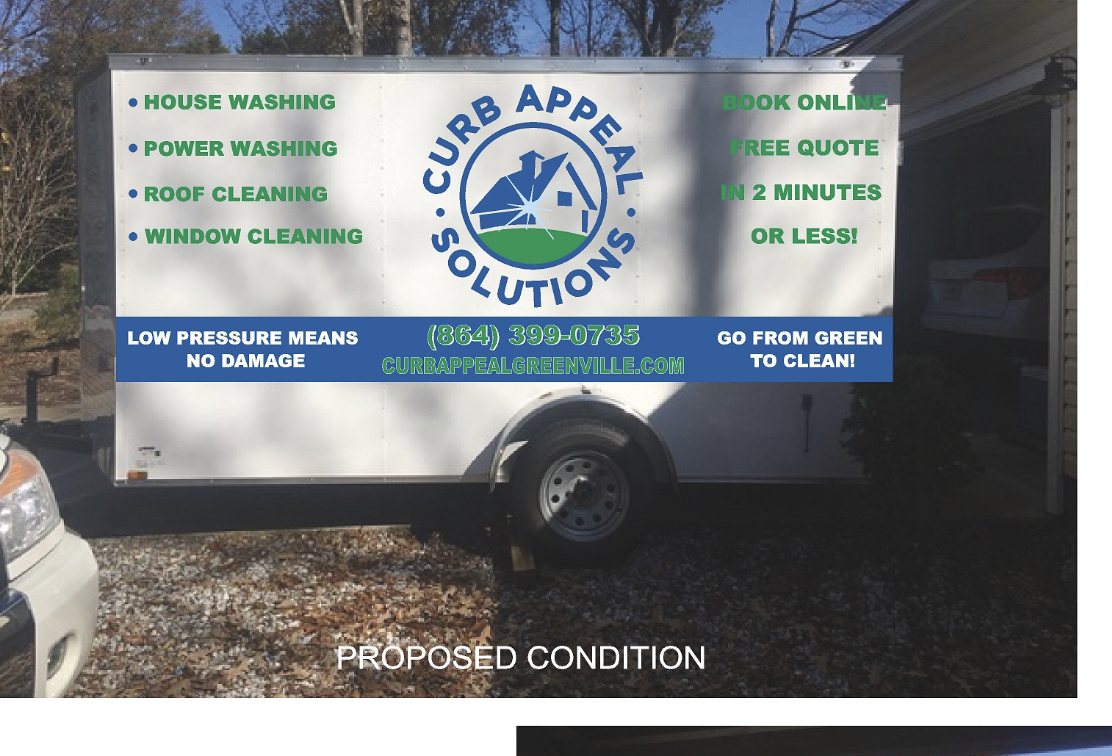
Curb Appeal means little to someone that is just glancing at your trailer. I really think ‘power washing’ or the like should be in big, bold letters to give the uninitiated a first idea of what you do.
I can’t tell you how many times I pass (or get passed) by a guy in a vehicle and still have NO idea what they do because the company name is rather vague or cryptic.
How do you think it would look if you moved the whole thing on the back up and then list your 5 services in vertical column with larger letters? It would be easier to read without having to read side to side when you get to services.
I love the idea of moving the services to the side door. I think it would help if it had a thin line between each service with large words on each line. You can then make your website bigger.
On the full side try a variation of the door side. List services in a vertical column behind the rear wheel and make everything else bigger.
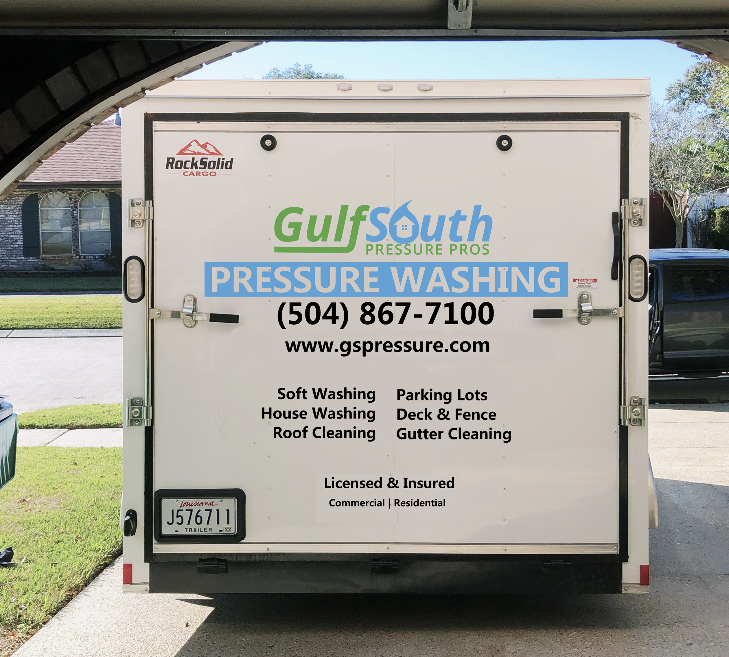
I kind of liked the first layout better actually. But either way looks good. I see what your saying about the door looking blank, but I still like the first layout. Just my 2 cents.
This is the latest proof. I’m close to okaying it. I’m torn between having both sides the same. Or the full side like the original and the door side with it listed vertically.
Or both sides with services listed vertically.
I think it looks more full with it listed vertically. My only concern is that the vertical listing takes away from the main thing. Pressure Washing
I think I would just put the main logo like you have now centered on the wheels and leave off the verticals on both sides. Then have the other services listed on just the back door as shown. I kind of agree with you, I think the verticals are distracting on the sides, plus looks a little too busy for my taste.