Plenty of threads like this; now it’s our turn. Do you like Concept 1, 2 or 3? Keep in mind, we don’t do residential work, just larger commercial work. Thanks in advance
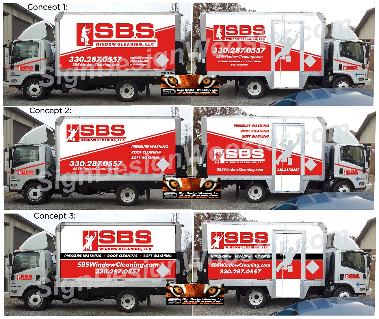
Number 3
Concept 3
yea 3 reads better to see stands out
#3 the third color (black) makes everything stand out better. Don’t know what you have planned for the back of the truck but my staining trailer has Fence Staining the phone number in big letters. I get a fair number of calls sitting at stop lights. You could do something similar with Commercial Pressure Washing and the phone number big font easy to read and act on while driving.
Concept 3
I like the black line around the middle.
Number 1
Option 4 redesign . No one cares about the name of your company that much to take up 50%+ of the whole wrap. phonenumber website services should all be bigger. i cant see anything on that. and now think about driving by it at 30 mph… just my opinion tho
truck itself is awesome tho
1 Like
People do care about the names of companies. Why do you buy nike over walmart brand?
And he only does commercial work, so it works
did you just just compare a service business to a shoe company and how they market and advertise? do you understand how much money those companies put into branding?
3 Likes
I did, same thing but they are on a bigger scale. True green is in multiple states and the biggest thing they have on the side of their truck is their logo (albeit it just says “truegreen”) People call them because they are known, liked, and trusted. Same thing with Terminix (a pest company)
Who you are is can be just as important as what you do.
People like seeing that a company has been around for 25 years. Every time they see your name you are branding, so when they do need some work done your the company who pops in their mind. If everyone just had PRESSURE WASHING on their truck, how do you stand out as the “professional” vs the guy with home depot machine and no insurance. You want people to get familiar with your brand and you cant always do that if your logo is just a small dot on your marketing. What you do should usually be in the forefront, but this also depends on how you logo is structured. What i do is in my logo, so i could put my logo as big as i wanted and get the best of both (what i do/who i am). So it really just depends on what you are going for, and what works for your area.
2 Likes
Number three
3, for sure
I prefer the slanted red line, but that black service menu does look great. Tough choice.
But, I think 1 and 2 look more modern, 3 looks like what it would or should look like, but that’s old looking.
I like these trucks I’ve seen around here:
https://goo.gl/images/sALjfA
I agree with cleanunderpressure on featuring the services over the name. I dont know diddly about marketing strategies, but since i started this i have been paying closer attention to wrapped vehicles, billboards, and stuff. So many times i will see a nice truck with a nice logo, and I have to get right up next to it to find out what they do. I feel like your main service should be the biggest thing on the vehicle… people should immediately be able to see what it is you do… then name/logo, website… all the other stuff.
For instance, in the pictures above, i feel like on a typical glance, all i would notice would be the SBS, unless i was actively scanning the vehicle trying to see what it is they do. I think people should be able to easily read the service on a casual glance, and then scan for the rest if they are interested. I would take the top 8-10 inches across (or more if it needs it) and write WINDOW CLEANING in big bold block letters (or roof cleaning, house washing, whatever your specialty).
You can still have your name logo be prominent, just dont let it overshadow what you do.
Just my opinion, im not saying those wraps are bad… they look good. This is just my current thoughts on advertising.
3 Likes
Business name is to big on all and the services you offer are to small, guy on the door looks like a monkey. He should be outlined in the same color red in the white areas and white in the red areas to make him pop. Otherwise he is wasted space.
As for the second concept. Why the hell they would put black bullet points on a red background is beyond me. They aren’t even padded correctly. On the other side the phone number is so small and gray. No contrast at all.
The third concept is best only because it shows your services more. I dislike the black color, but to each their own.
You seem like a big window cleaning company, why is it easier to see other services that I am assuming are not your main focus?
Congrats on getting your truck wrapped by the way. I am sure it is a big milestone.
#3 The wrap looks awesome! Most impoortant is you have to be happy with. Its good to get others opinions but the negative ones are haters… Great job!
#1 looks the best to me because it has a modern look. But it doesn’t easily show what you do. #3 shows your services well but I do not like the layout. It looks boring to me. I think number 2 is a happy medium because it has a modern feel and you can see the services easily.
His logo does look nice and professional