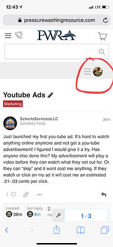
The desktop version where the store opens up when being hovered over is a giant pain. Feel like I’m always working around that to make it go away. I’m digging the quick access to browse the store but would prefer it to be a drop down initiated vs hovering over.
+1
The second you scroll over the category bar to move down to the threads it floods the whole screen and keeps you from seeing the topics. You then have to move your cursor all the way to the bottom to make it disappear. It’s not a big deal but it’s easy to accidentally scroll over the category bar time and again when viewing the forum and then it floods the whole screen again.
Thanks for the feedback. I agree with you its a tad frustrating. Ill see if we can adjust the sensitivity of the hover function.
Amen!
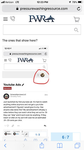
Can you see about getting our icon back on mobile devices? When you are clicked on a thread you can’t see notifications or your icon. You have to click back to the home screen to see it.
Yep! I can’t see it unless I’m on the home page.
You have to either scroll to the top of the thread or go to home page to see your icon. It’s a pain I agree. First world problems!
@Chris another bug I just realized. So when I go to my account and sign in it brings me to the WCRA site\store. I have an open order through them right now. When I go back to the PWRA site and hover over My Account and click “My Orders” I get (Oops! That page dont exist) the logins should translate between both locations.
Are you getting that on mobile or desktop?
Happens on desktop.
On mobile when I go to “My Orders” it brings me to the sign in page at WCRA and then displays my orders. Once I go back to the PWRA page and then click “My Orders” it goes right to the WCRA my orders page since i’m already logged in.
Ok I understand now. Its added to our development list to check out.
thanks
