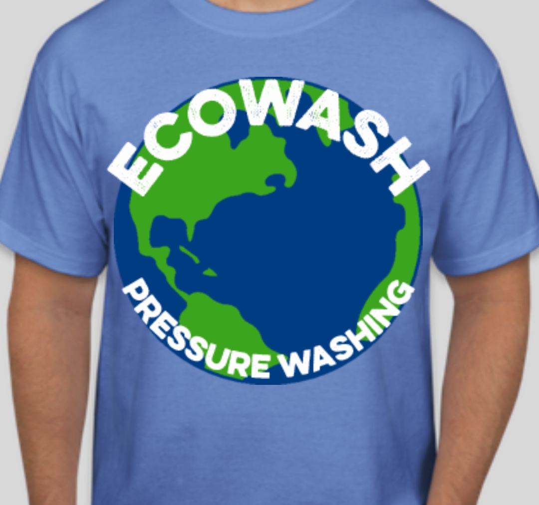
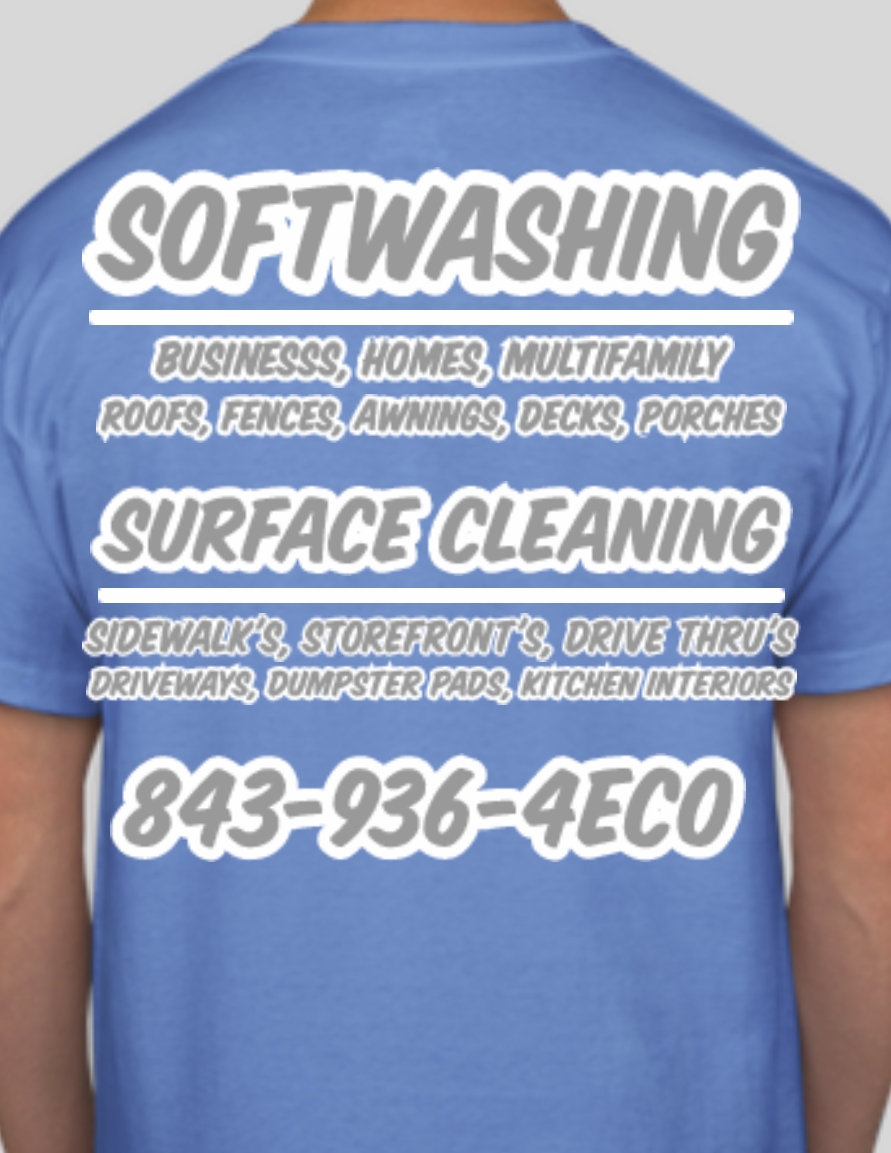
I like having company shirts looks professional and neat and has become a point of conversation and has gotten me enough random jobs that im looking at getting some more…I like the front but I’m not sure about the back it’s pretty busy but you can see the main points at a glance and if I’m standing in a line or at a resturant you have time to read the smaller services too…any opinions or better ideas for the back are appreciated!
1 Like
Small logo on the front. Consider your name too. Front is only seen when in shops or the like.
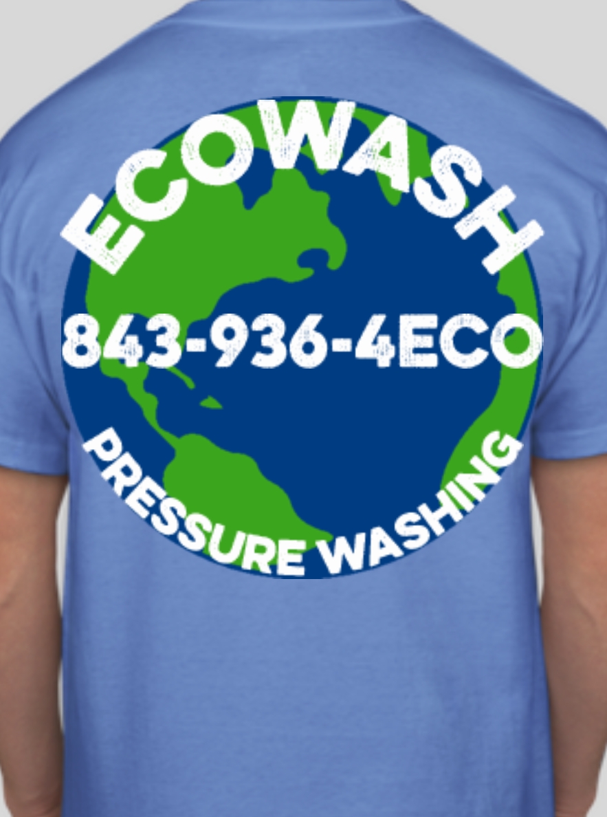
The back has too much info. If I see you across my street working - I just want to know WHO you are so I can call you.
I’d go with big logo back, small logo and name on the front underneath. If you get coffee, fuel - whatever, it’s funny how many people will use your name if it’s there 
3 Likes
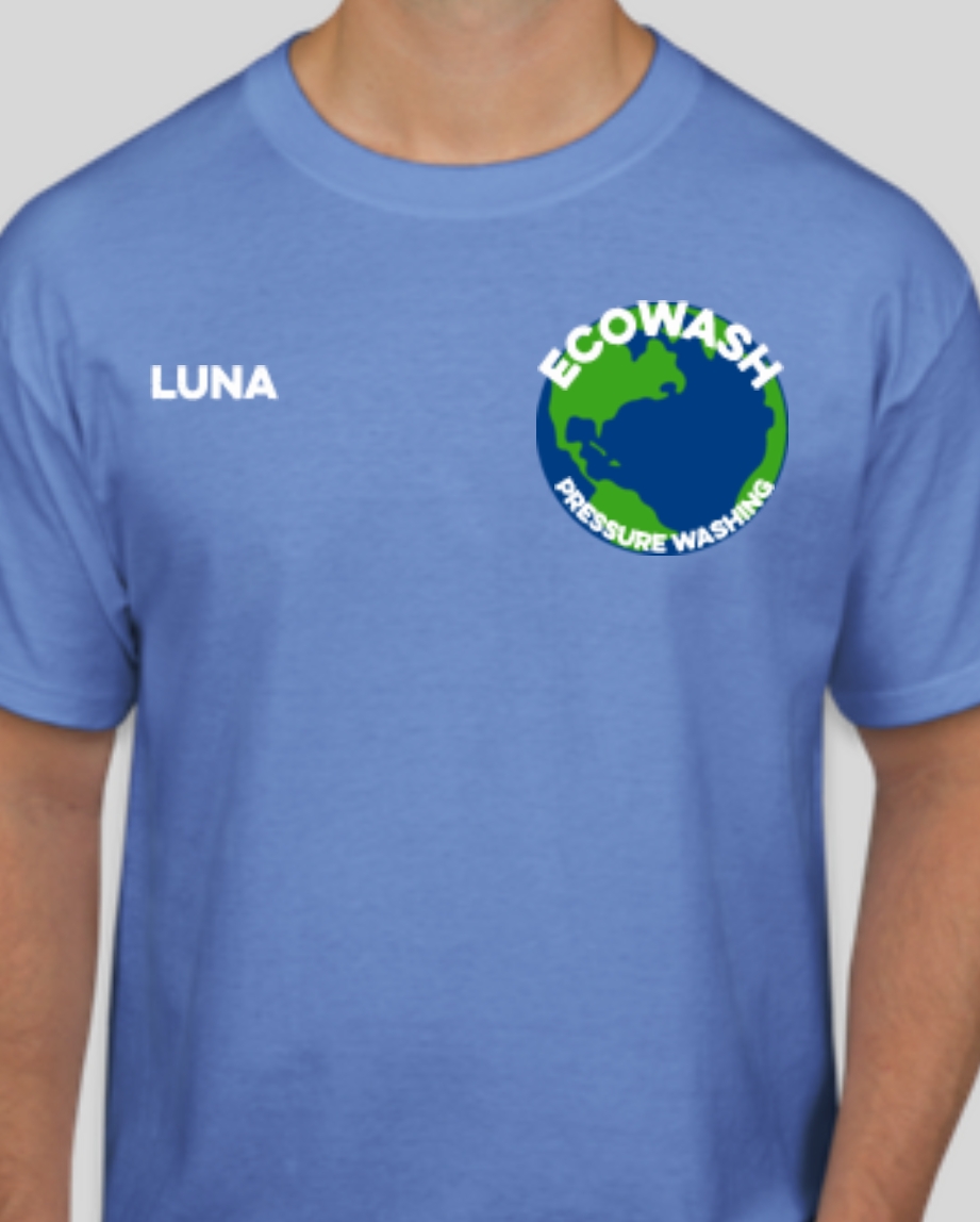
That’s where I’d be with it. Looks neat and informative 
Lol I knew the other design was just way to busy…but sometimes you can’t see the forest because the trees are in the way…thanks for the input…
1 Like
Have you tried the number in the middle of the globe on the back?
1 Like
@anon26752184 lol I have now
2 Likes
Hmmm not sure. It just looked out of place at the bottom
Maybe try making the logo a little smaller on the back and have the number up top and web address at the bottom? I’m not that good at design so just an idea. I’m just thinking it will balance things out.
Shirts will hardly get you non referral business.
But what they do is create a better customer experience mentally which increases perceived value = more money and less complaints
We just do black polos (polyester so they don’t bleach out) with our logo on the chest. Paired with Ben Hogan blue golf shorts.
4 Likes
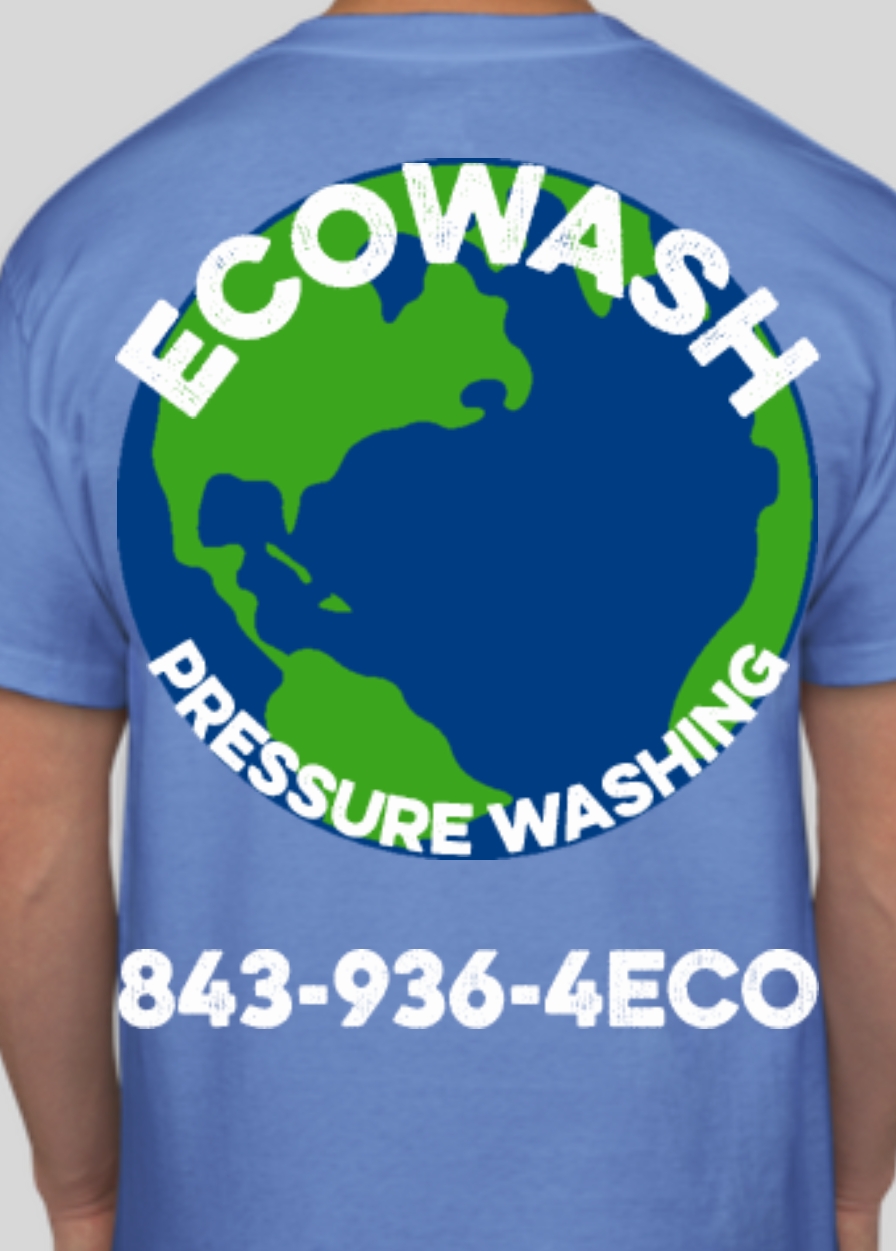
So that large earth you have on the back is going to be an iron on type material. And It will not breath at all. That area of your back is gonna be sweat city! Would recommend something smaller for sure.
4 Likes
@SchertzServicesLLC lol I thought about that but here in Charleston in the spring and summer it’s like 79% humidity from 9am on… I literally bring 5 shirts with me to work just so I don’t look like a big sweaty sloppy mess… so used to sweating here I could wear a trash bag to work and it wouldn’t bother me…you can sweat through a shirt walking to your truck and waiting for the AC to Kick on lol…
1 Like
The last logo looks good with all the info in the earth.
1 Like
I guess I am saying that it will likely really stick to you.
1 Like
Can you find a different global picture? the Atlantic ocean is nice and all but I’m not sure why it should be the focus of your logo.
2 Likes
Sounds like you’ve had experience where at the end of the day you can’t get your shirt off ?
Me to man…me to
1 Like
like peeling off a fruit rollup lol
2 Likes
@CaCO3Girl not sure but good point.
how bout this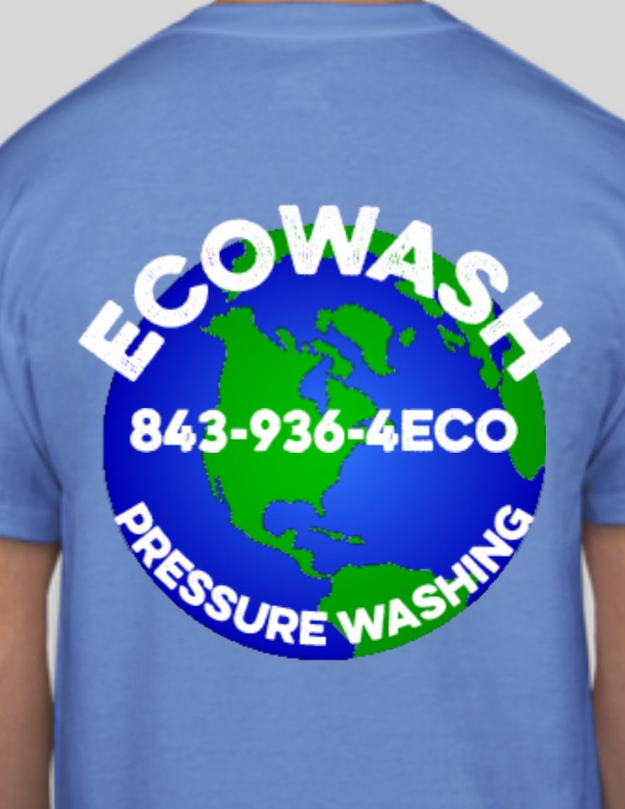
100% correct
Shirts don’t drive sales. Shirts build brands.
I prefer horizontal text. I find the arch wrap text hard to read at a glance. It does look good with the globe though. I like bright safety colors. People see you working from a mile away. The yellow bleaches out less noticeably too.
2 Likes
