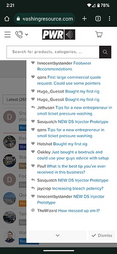
The new format now blocks the ability to view the most recent notifications on the drop-down menu. It’s a minor annoyance but is there anything that can be done with that? Almost seems like the icons at the top are too big and running over. This is on mobile. I’ve attached a screenshot below. There’s a notification at the top that is cut off and un-clickable.
3 Likes
Same with the icon next to it.
Chris is aware of the prob.
1 Like
I made such a stink about the blue button a few years ago I figured I would just suck this one up lol
2 Likes
Haha. That was good times.


