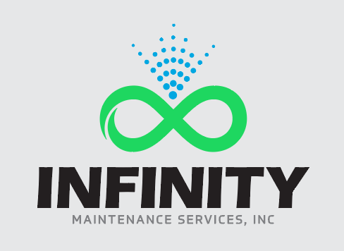
I like the other logos better. Without a squeegee, it leaves me guessing what area of maintenance your in. And I also think it won’t work with any black vehicle, shirt or hat.
Had I the forethought, I might have registered Infinity Soft Wash, Inc.
It would be such a pain to change it at this point.
And I am kinda nostalgic because of my dad’s biz name, which he bought from my late uncle-in-law many moons ago. That uncle continued to operate as a window cleaner in KY under the same name, Awake Maintenance, for many years afterward.
1 Like
Some examples Lincoln gave on different backgrounds:

I’ll personally never put it on a gray background, though.
2 Likes
I like the first of the two, but I’d prefer the term “cleaning” over maintenance, but I know you’re partial to it. I would also play with a wand running through the infinity symbol. But that’s my 2 cents.
You could always go with the green-eyed monster lol, I keed I keed… ![]()
5 Likes
played around with Lincoln’s spray pattern a bit. What do y’all think?
tbh, I’m feeling like the first spray pattern is still a little too close to the PWR logo…

I still like the left one.
Still playing with it (sorry for the “screenshot”, it’s sort of a pain to export images from inkscape)

This raises a question: I wonder how many dots are really required for a recognizable spray pattern?
Sort of like, how many people does it take to do the wave?
Or, how many licks does it take to get to the tootsie roll center of a tootsie roll tootsie pop?
I’m still liking the first one. I don’t think you have to worry about it being close to the PWR logo just because the two logos are so much different. Even with the spray pattern they look nothing alike. Might not hurt to run it by Chris but I just don’t see how it could be an issue. Take one dot away and it won’t be an exact copy.
The one on the right almost has a 3D look with the dots—like it’s forming a circular ball—maybe because of the curvature of the outside dots.
It does have a bit of a 3d illusion. I guess that doesn’t really fit with the flatness of the rest of the logo.
It’s flat in a design aspect. How it is perceived is more important. Spraying has movement and expanding outside of the infinity symbol was meant to represent that.
I would recommend asking several people, such as your significant other, or your mother or father, or your best friend, and a couple of other people who aren’t in the business or “have skin in the game” and get their feedback on the two - “regular joes” that is. More advisors is best. Sometimes, those out of the box viewpoints are exactly what you need.
So, finally working on re-doing the lettering on Truck Norris. This is how it looks now:

And this is what I’m currently contemplating:

2 Likes
Your current font is way stronger than the new one on the rear doors. Have you done a mock-up with the current font, but in bold type?
It could also be the italics throwing me off. I’m a big fan of serifs, but my lettering and cards combine both
1 Like
At this point, I’m going for instant readability. I think the bold sans serif with lowercase letters accomplishes that. But I’m open to suggestions.
I’m also considering DC Brock Services, LLC now that I’m trying to focus more on screen repair and PW.
1 Like
How’s it look sans serif and non-italicised?
Not as good, imo. But whenever I get in front of the computer, I’ll go ahead and share that.
In the meantime, anyone who feels like coming up with something better, here you go… ![]()


1 Like

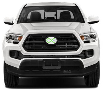
also working on a way to replace the front grill emblem with one of my own design…
2 Likes
