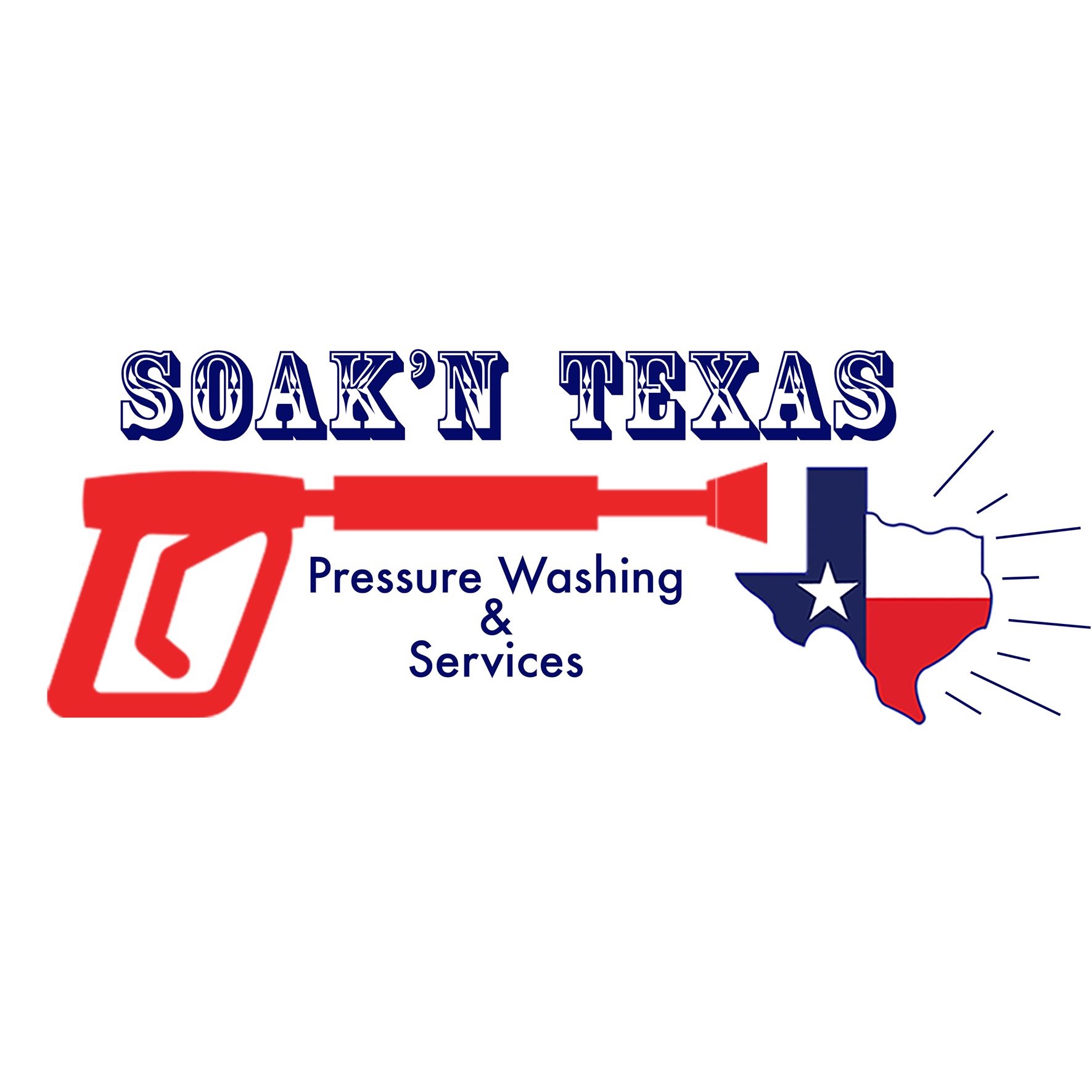
Check it out, let me know. But be easy, it was made with love (wife). I feel like it’s simple (Tx) precise and to the point. I dig it!
4 Likes
Do you want an honest opinion or a feel good forum opinion? I can cater to both.
1 Like
Lay it on me brother. 
1 Like
I think it looks crap. It’s too square and the gun takes up too much real estate. Your lettering looks too different from top and bottom and I can’t understand the lines coming off the Texas map. Blazing heat maybe?. Nothing to do with your wife’s work, everything to do with my personal taste. Hope it helps.
3 Likes
Please dont show your Wife but I hate it I’m with @MuscleMyHustle on this one. I do like the company name letters maybe put them in a arch and work from that point. Also can you explain pressure washing and services it just reads wrong
3 Likes
I would do it simpler, in reductions the letters on top and for ex the lines on the right are going to be unreadable and look very bad. While you are investing a lot on materials I keep not understanding why you can not pay $10 to a guy in Bangladesh or India through fiverr who is a goat on making logos.
1 Like
A+ for effort. But I think hiring someone for a logo is a cheap way to make a very professional impact. Talk to this girl, https://filizturangraphics.com/ she’s a professional graphic artist that did my logo and a few others I know. She’s awesome! Maybe $200-$300.
3 Likes
Did she do yours?
2 Likes
Yeah she did mine and my in-laws and she did a label for a friend of mine who makes salsa
1 Like
There is an online portal packed with very low priced / high quality graphic designers from all over the world, I get lots of stuff done there for literally peanuts ! its called Fiverr. very fast turnaround also.
2 Likes
Great effort! Better than I would have done. Since you have Texas in your business name I don’t see a reason to add the Texas map as well. I would definitely dial back on the size of the wand. The main business name at the top is kind of hard to read with the added effects. Also, get rid of “& services” and just go with “Soak’N Texas - Pressure Washing”
Like others have said, Fiverr is a great resource when it comes to making quality logos at an affordable price. I used them last week and was happy with the results. 24 hours turn around time from most sellers. And as low as $10-$15 with unlimited revisions. It’s worth giving it a look.
1 Like
I disagree with this based on psychology and association. Texas has a STRONG brand and resonates with the residents. You don’t HAVE to use the state, colors, or a star but man it helps. Being a Texan and bouncing these things of Texans and non Texans there is a dramatic difference in reaction to my logo and website (Texans are MUCH more into it). Just my take being a Texan but living outside of Texas for 20 years gives me a little perspective (not much haha).
For instance you being in California incorporating a bear and your state colors might go well.
3 Likes
That’s actually a great point. I’m not a graphic designer at all lol. My above statement was mostly based off how much is going on in the logo overall and said that with a “less is more” thought process. I can totally see it from your perspective and completely agree with you, when taking the strong branding and state pride factors into consideration.
Great insight @TexasPressureWashing!
2 Likes
I would forgo a logo.
1 Like
I totally agree. I worked in oil and gas in Houston And EVERYTHING has a Texas outline on it.
2 Likes
Could be an opportunity to stand out and be different, just saying.
2 Likes
You understand.
1 Like
Texas is TEXAS. Different is frowned upon.
DIFFERENT is how marketing works! Lol
All I’m saying is different in Texas, isn’t easy. I guess if you’ve lived there you’d understand.
1 Like
