@Derholyfield sorry for hijacking your thread there. I like the third one the best, it’s strong
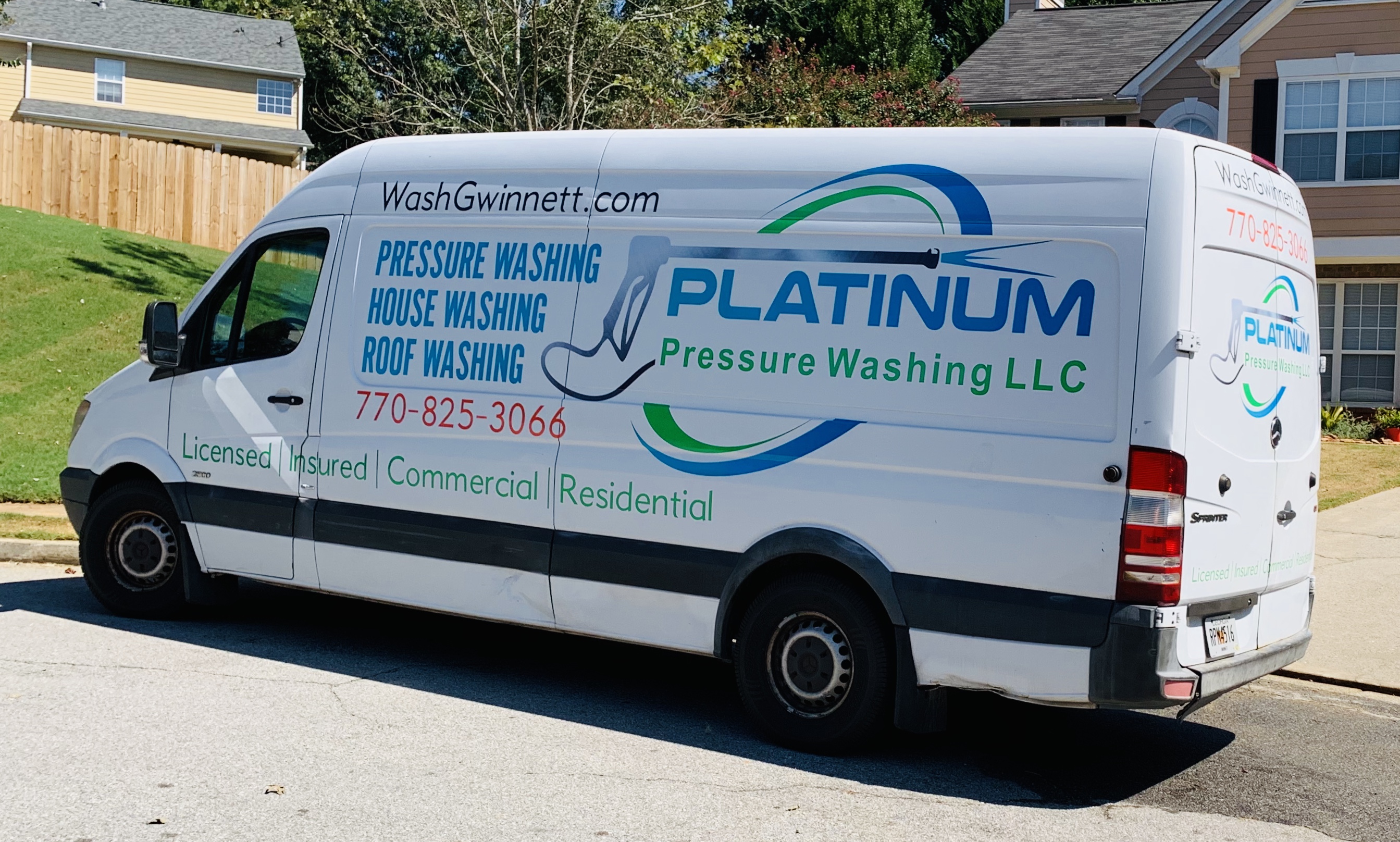
I went the designhill route. Similar to 99 designs. Chose the cheap package that was supposed to net about 20 logo designs to choose from, coming from about 4-5 mediocre designers. Ended up having to choose one design out of, no lie, about 200. Picked my top faves, then screen shot and pasted each one onto a photo of my van using canva. That helped tremendously in trying to envision what would work best. Designed the layout of the lettering for the van myself through adobe spark, then had the sign company tweak it and put it on the van. Pretty happy with the end results, and super stoked about people not calling the cops on a plain white van creeping the neighborhood lol!
4 Likes
I think i did on my truck lettering post but ill send you a picture when i get off work. Dont really have a good one on my phone.
I’m Steve. I have been the one running the At Cost Printing program for the WCRA and PWRA since about 2014. Just recently we officially merged the printing program into Printing Services - Postcards, Fliers, Yard Signs, Brochures, and more – WindowCleaner.com.
I’ve been on these forums for a while as a lurker. Now that we are even more involved your guy’s industry, I plan to be here alot more. I’m a good personal friend of Chris Lambo and Chris Cartwright
My right hand woman Jillian has been posting on these forums under the At Cost Printing account for a while.
He’s our personal security watch dog . His deputies ,@Displacedtexan and @anon37135677 do a good job as well. ![]()
3 Likes
Welcome.
I don’t advertise, but I’d be willing to buy something if you can persuade Chris to get rid of the big blue ANNOYING button.
4 Likes
Hell, I’ll buy something to get rid of this dang button. Maybe they can have some buttons made up that say “I got rid of the big blue button and all I got for it was this stupid small blue button.”
5 Likes
I’m new to the forum, but I have to say it’s gotten in the way of closing out text fields on mobile more than once. It also blocks what you are typing at times. I think it’s great you all want to be easily contacted, but ide shrink that puppy down and post it up by the check out cart so it’s out of the way. Just my 2 cents.

3 Likes
I just played a little bit with it on mobile. Yea…annoying.
2 Likes
LOL what the heck did I just watch. I looked up the original and it’s hilarious. Those folks from down undah have been in the Sun too long. Is this guy related to @AUSSIE or @anon26752184? How does his wife keep a straight face? How long did he rehearse for this? The world needs answers.


You should know that I’ve trademarked the use of the lemniscate (infinity sign) for anything cleaning or washing related.
… just kidding. But I wish
2 Likes
Just become one with the button lol…
4 Likes
1 Like
Check out Fiverr. I like the service I got there. However, the wife wasn’t too impressed. E wanted to spend $350 and I only wanted to spend $35 lol

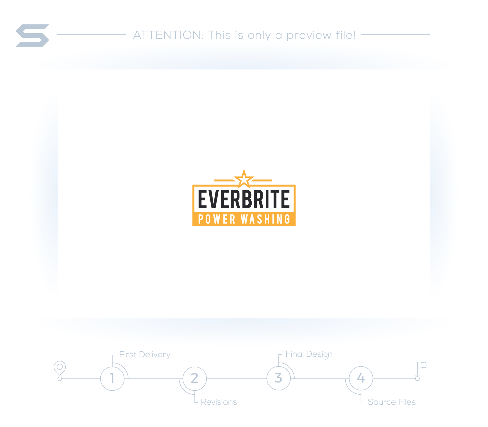
The designer you hired doesn’t seem to know what “power washing” is. The logos look clean and sophisticated but it tells nothing about the industry.
When choosing the colors for your logo, it would be good idea to research your competitors in the area first. Other established companies may already have been associated with certain color schemes.