just looking for some feedback from you guys that have your company branded
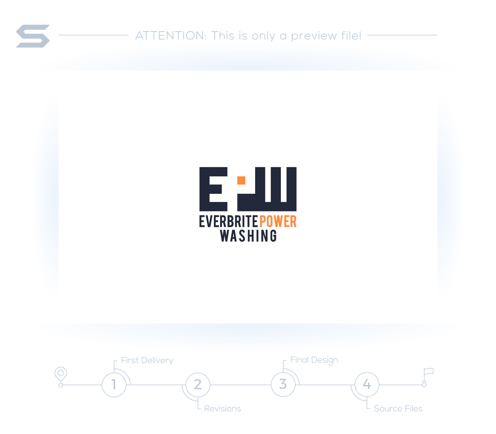
The subliminal P took me over thirty seconds to find. Making the E the only thing that stood out. I couldn’t even make sense of the last letter. It looked like towers then it looked like a E on it’s back. Way too much going on there that doesn’t make any sense for someone that’s going to look at that for 2 seconds.
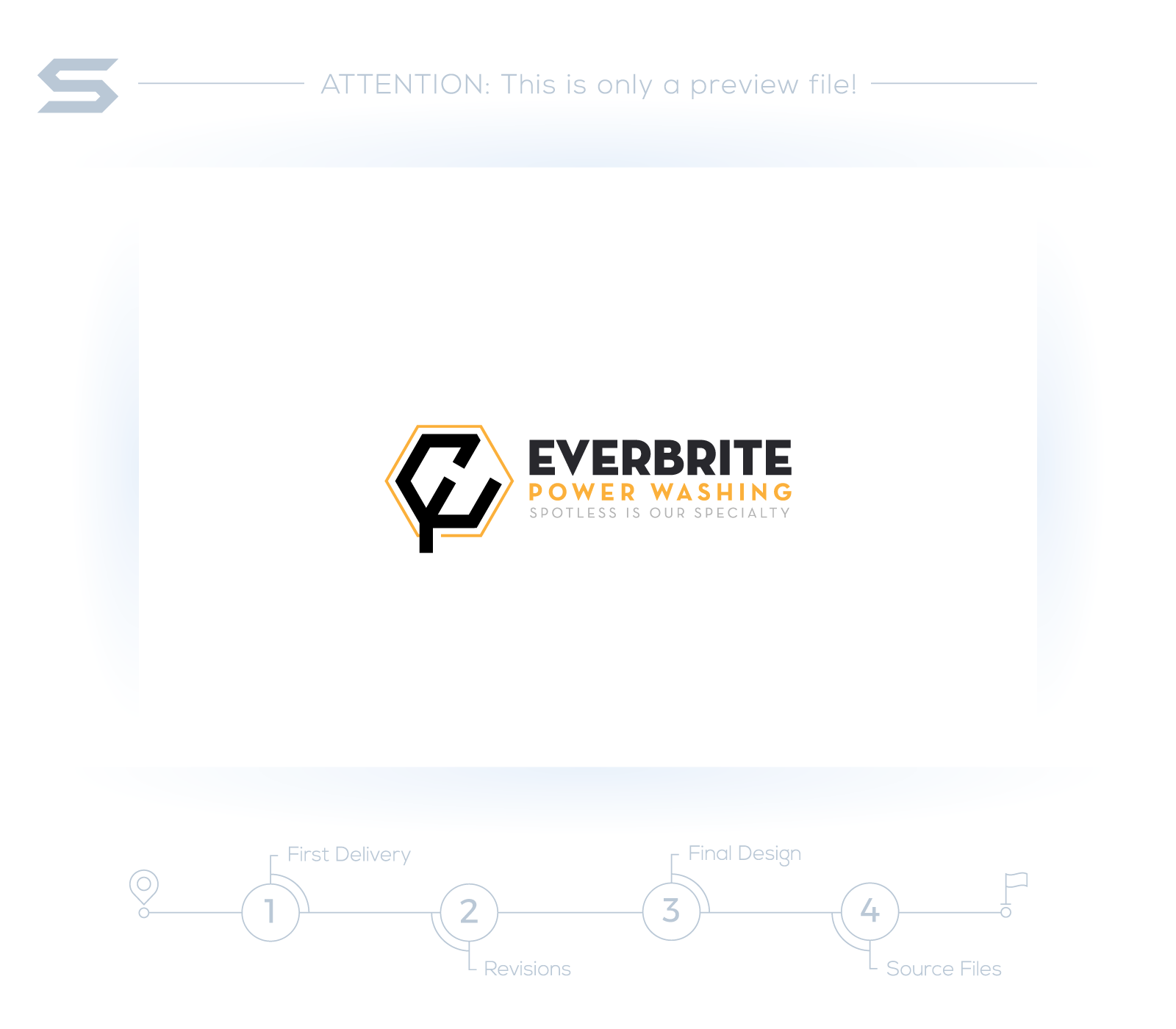
I do like the colors and font choice on the second revision.
1 Like
I agree, keep it simple, something easy to recognize 3 cars away at a light. I’d rather folks see what we do and our # then our name & logo.
2 Likes
Terrible. First one you have to stare at for a second to understand what’s going on. Second one I still can’t figure out. Looks like a claw from one of those toy-grabbing games at a Chuck E Cheese.
Second one sans logo.
1 Like
I am not a fan of either of them. #2 is definitely better than number one, but still not very good.
We do branding for a living, and I make sure to not sugar coat stuff as it is a waste of your time and mine. My apologize if I come off strong.
#1. Nothing about this is ok. I would ditch it completely.
#2. The word mark is ok. (Everbrite Power Washing). It isn’t great, but it is fair. It looks like the font is Posterama, but slightly different. The Es and the R are sorta upsetting me (I have OCD)
I would ditch the tagline, its meaningless and distracts from the name.
Colors are good. I dig it. The Icon itself is no good. I still can’t figure out what it means?
I see “E” “H”, pentagon, drip.
1 Like
I just noticed the third one. That one is, ok. It doesn’t do much for me though. Condensed fonts are also very hard for people to read. It is recommended to stay away from them.
1 Like
I agree with everything you just said Fiverr the website I used for the logo was not worth the money. I made the 3rd logo myself playing around on my computer just need to match the oranges and change the fonts.
with that being said do you think that the third logo is useable as far as branding? the marketing and graphics of branding my power washing is more challenging the getting work lol. the feedback really helps me out thanks.
That’s the thing man. Fiverr is garbage sometimes and really great other times. It depends on what you are getting. For logos, we used to outsource to them when I started my printing business, but stopped using them a long time ago. I also felt very guilty about crapping on the design industry by using Fiverr. There are so many fantastic designers out there that have a hard time eating because places like Fiverr exist.
I think you can get away with #3 if you had too. But if it were me, I wouldn’t. We are working on rebranding my core business (printing company). This has been a 5 month process. I have my designer working on logos in her downtime and we have no joke, about 100 concepts. LOL. I crowd test them and everything. We are like…right there.
If you have a few sheckles to spend, I would definitely recommend working with an expert. I can recommend a guy who is actually technically a competitor of mine, but he does nice work for people in the industry and at the end of the day, we are all here to help each other.
If you need something fast and don’t feel like spending the money, I would follow the Word mark format of #2 and translate it over to #3 maybe. Mess with the Kerning of “Power Washing”. Kerning is “the spacing between characters (letters).”
Maybe ditch that box around power washing and go with a Semibold font.
2 Likes
I tried fiverr also sent it back three times finally gave up @Scox does logos maybe he can help
1 Like
Fiverr is definitely hit or miss. I hired like 6 different people and numerous edits before I got something I liked. You almost have to have an idea of what you want and then try and explain it to them. It then takes numerous edits and the right designer to make something. I don’t think I’d use then again though. It’s almost like some of them do the opposite of what you ask…lol
1 Like
for 70 dollars I thought this guy would have at least made something descent but as soon as I saw them I was appalled that those are what he thought was a good idea.
I don’t mind spending the money if I know the quality is there, some of these designers cost 350 and you don’t even technically know who they are other then reviews from other random people. do you feel that company colors are important for branding? I wanted to have a black and white color scheme as all my trucks and trailers are white but felt that either orange or blue would add a little pizaz LOL.
I can’t remember why but they say orange and blue are perfect colors for logos. Something like people trust the company more. Something to do with color psychology.
The thing about Fiverr is a lot of people are from different countries. Their style is completely different than ours. This is a bad example because there aren’t that many Japanese people on there but if you asked someone from Japan to design a candy wrapper it’s not going to look anything like you want it to. Nothing against them they just have a different style when it comes to candy wrappers. Look at logos of places in India. They just have a different style than here so it’s hard for someone over there to picture what we’re looking for. Country of origin makes a big difference when choosing someone.
Yup, orange and blue are perfect colors…go Gators!
1 Like
Purple and Gold! Go Tigers.
1 Like
Didn’t know they were still around… Hahahaha
2 Likes
The gators are looking for the first time since tebow left
1 Like
Amen, as Tim would say 
1 Like