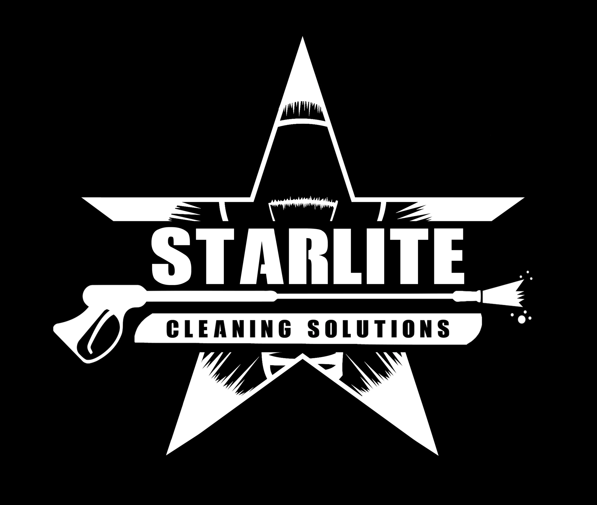
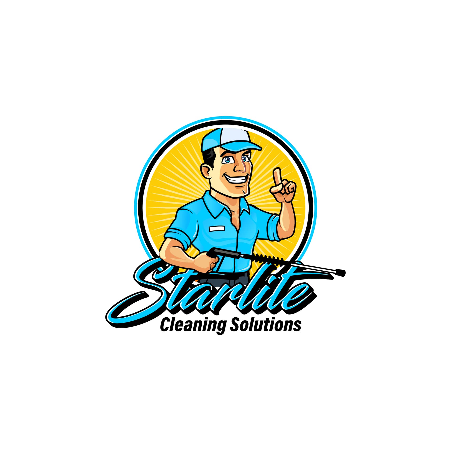
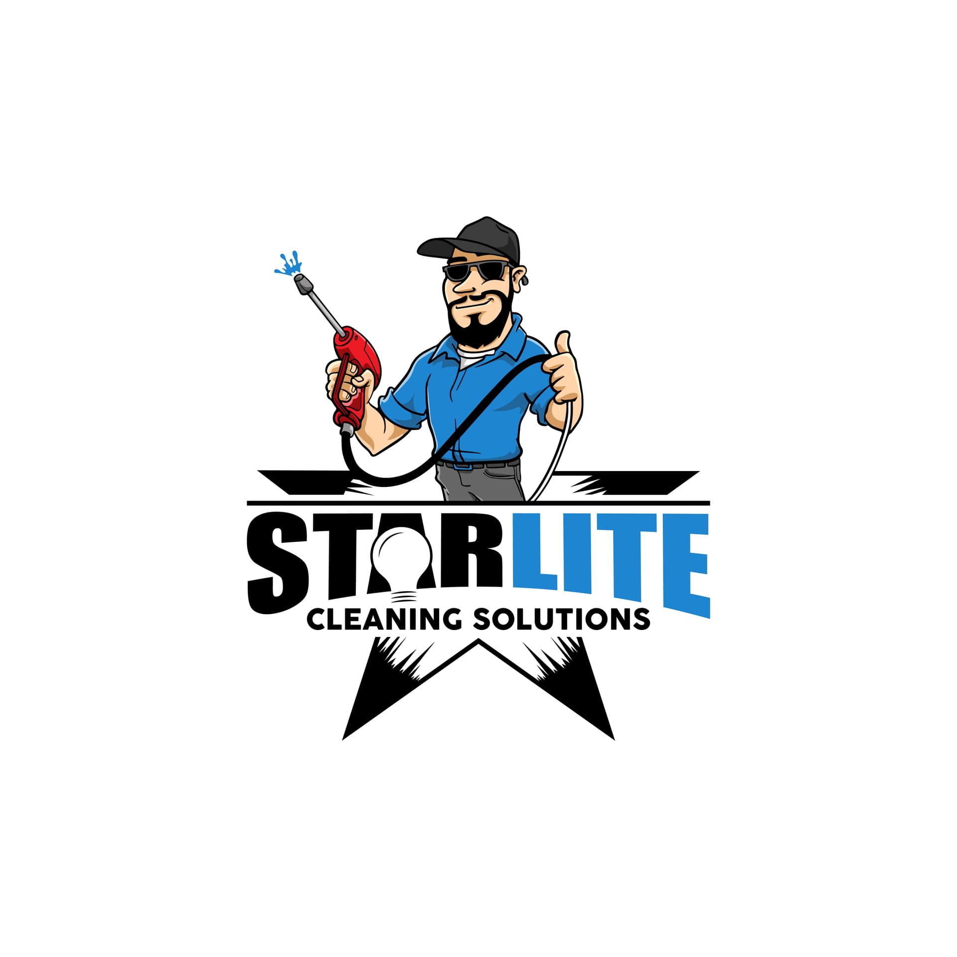
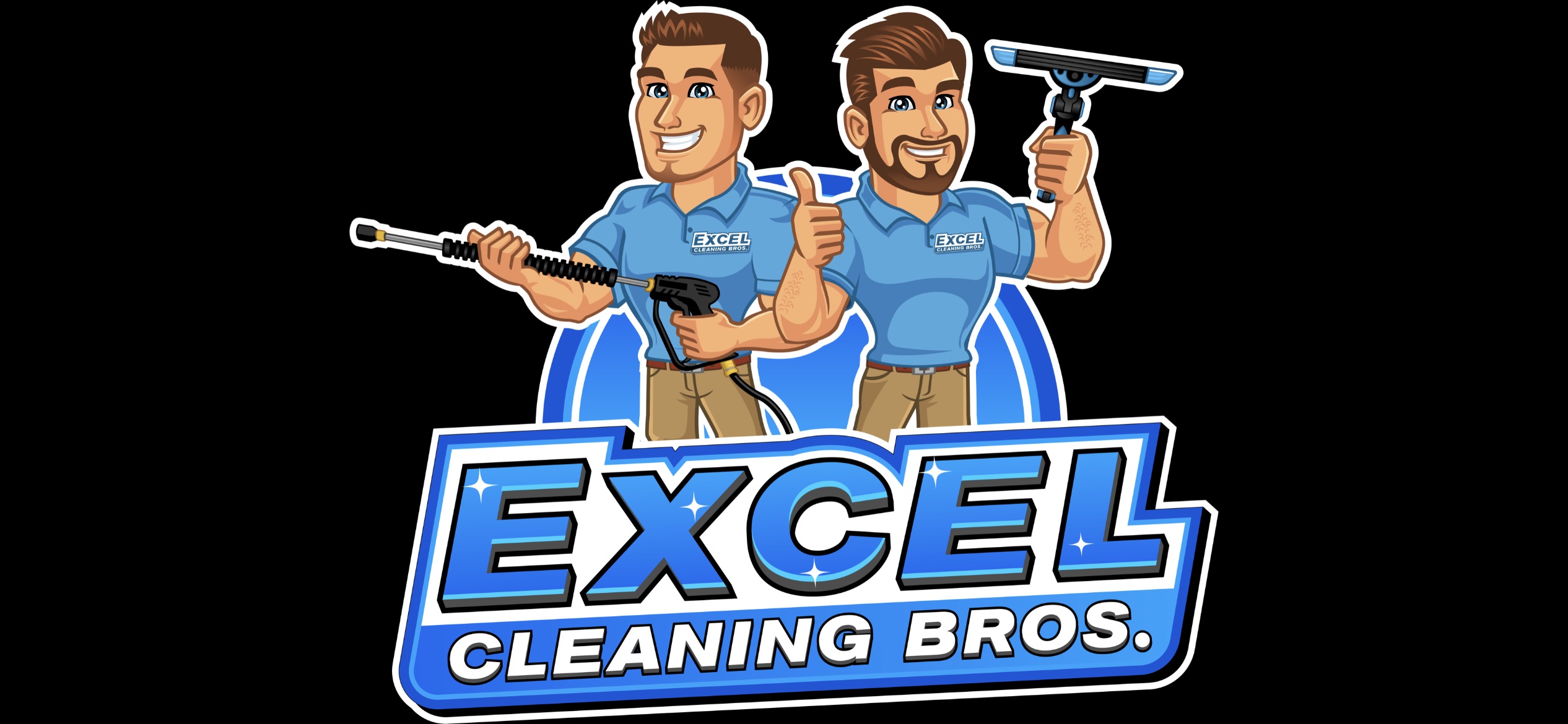
Ugh. So I have a cool logo that i like but in preparation for wrapping my (future) box truck i want to create a more colorful logo. I am going from this…
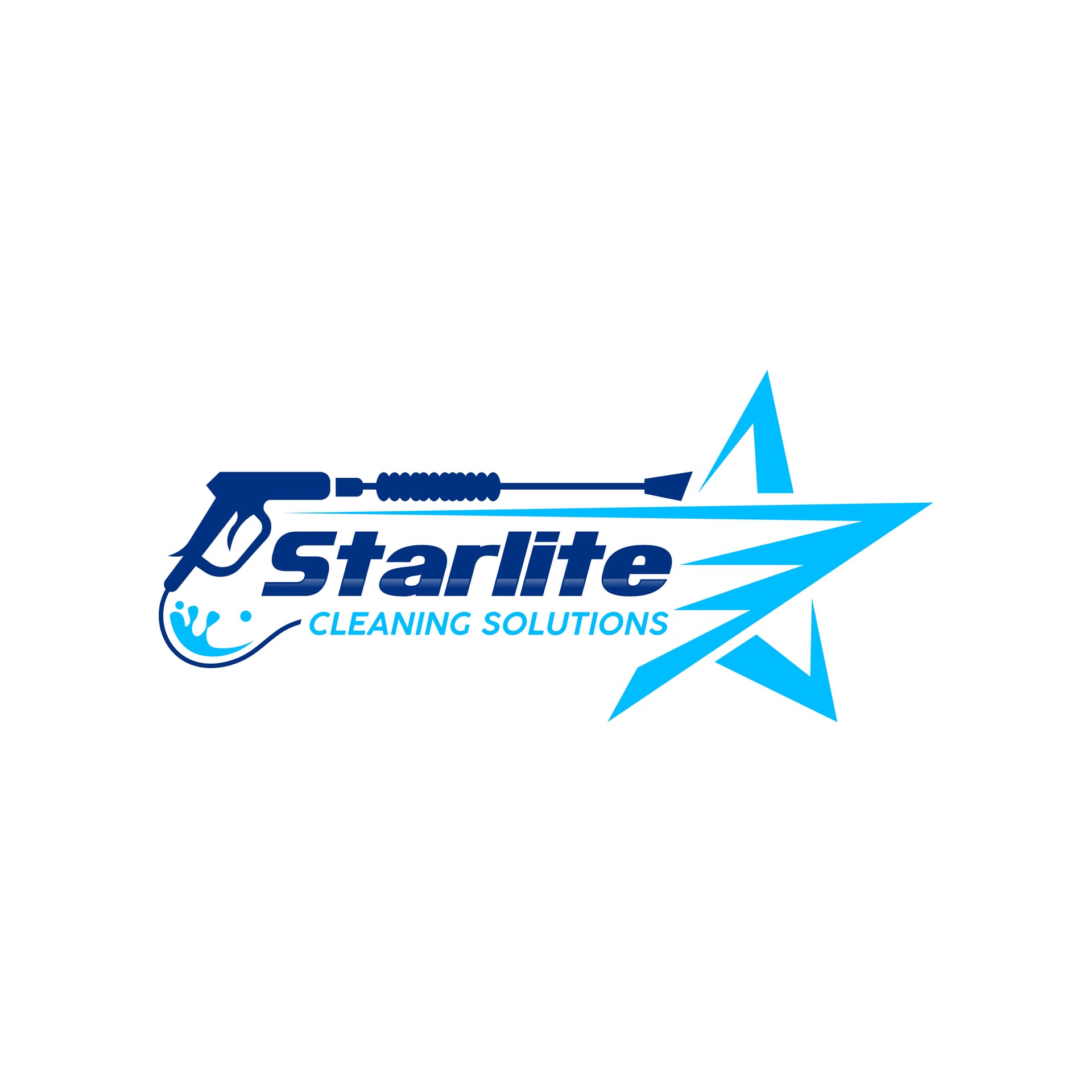
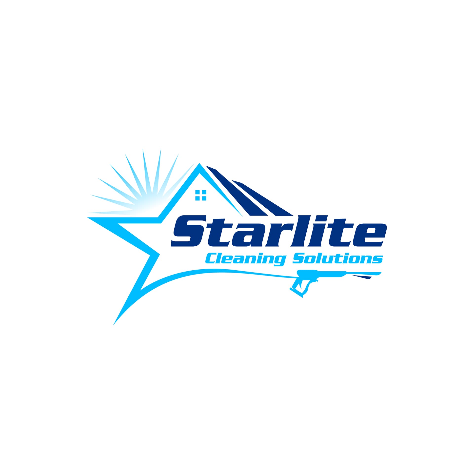
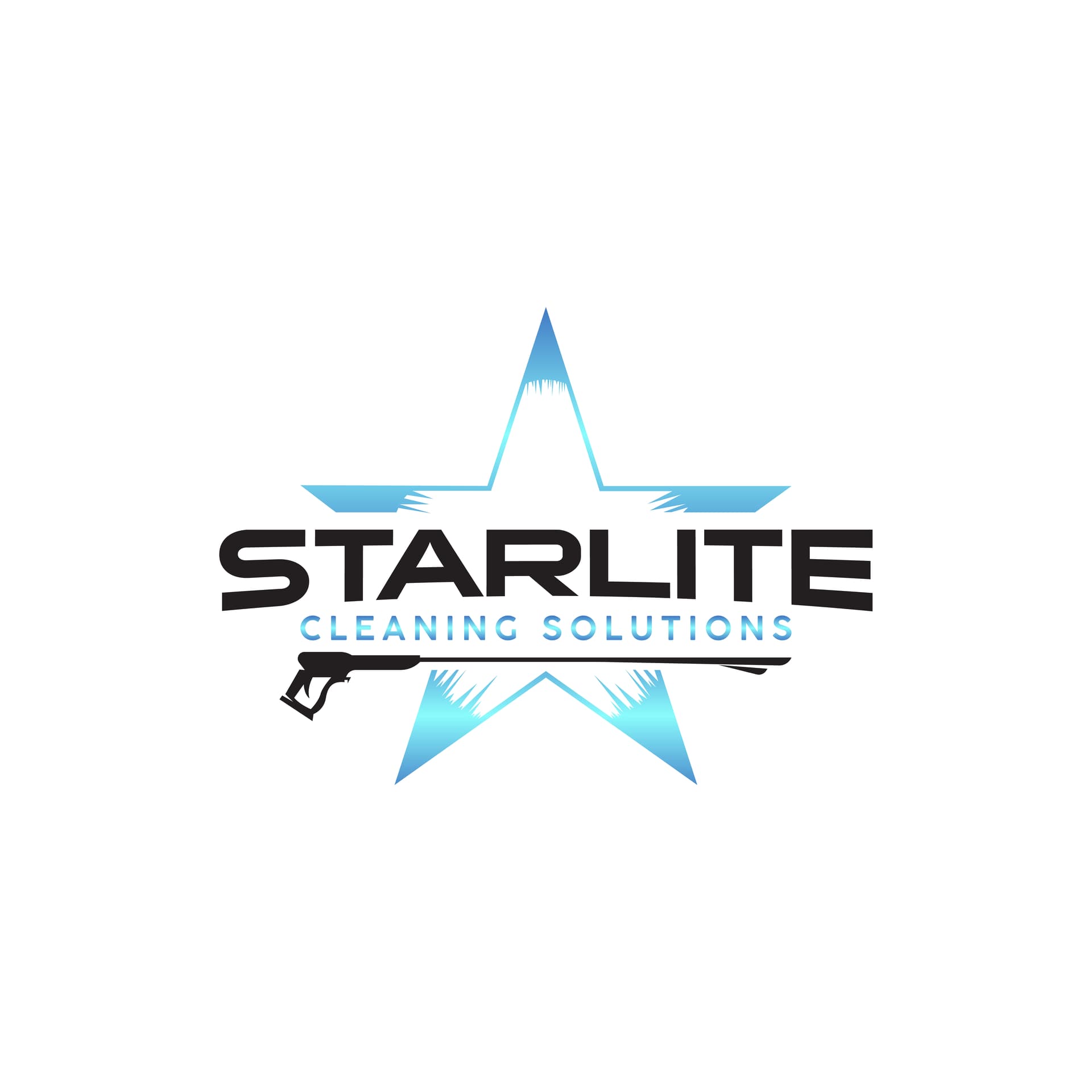
I like #2 the best and #4 is second. probably because the guy looks batsh__ insane. I was thinking taking the spray gun in #2 and reversing it to spray into the star. What are your guys thoughts? I know you hate generic ones with houses especially and these are probably pretty generic as they came off fiverr so recommendations for someone or somewhere else that could work with me I would appreciate as well.
Pick the one that you like. With that being said, none of this moves the needle or makes the phone ring. You’ll see what I mean later on in your journey.
We had ours designed on 99designs.com. If you choose a good designer they can make you a great logo just how you want it with all the revisions you need. If you want I can send you the name who did ours.
I was super impressed with Fin-Print after throwing money in the toilet with Fivver. Fin-Print had a phone number they answered, spoke English, and their designs are off the charts imo.
Like @MuscleMyHustle said, just pick whichever one you like best because I can guarantee you no one else will notice or care. I’ve been running with the same cheesy logo for over three years now and I would bet anything that not one of my customers could even tell me what my logo looks like. Literally all anyone cares about is if you do good work and charge a fair price. It’s that simple.
I agree that the logo will not move the needle, but consistency in branding is a real thing so choose one you can live with for years. Changing logos/color schemes are often a problem for people rememberting who it was that did the good work the last time. People will remember you, and your great work, but if they don’t have some way of remembering your company (name/logo/etc.) then they will never find you the next time around (or when their friend wants a referral).
#4 could be memorable. #3 is too much like every other contractor out there (they all use the same house graphic). #2 is a simpler design (and I agree it would be cool to flip it around so the gun sprays out the overlaid triangle of the star). You’re on the right track with the 2-3 color scheme, just know what they are and stay with them for flyers, shirts, etc.