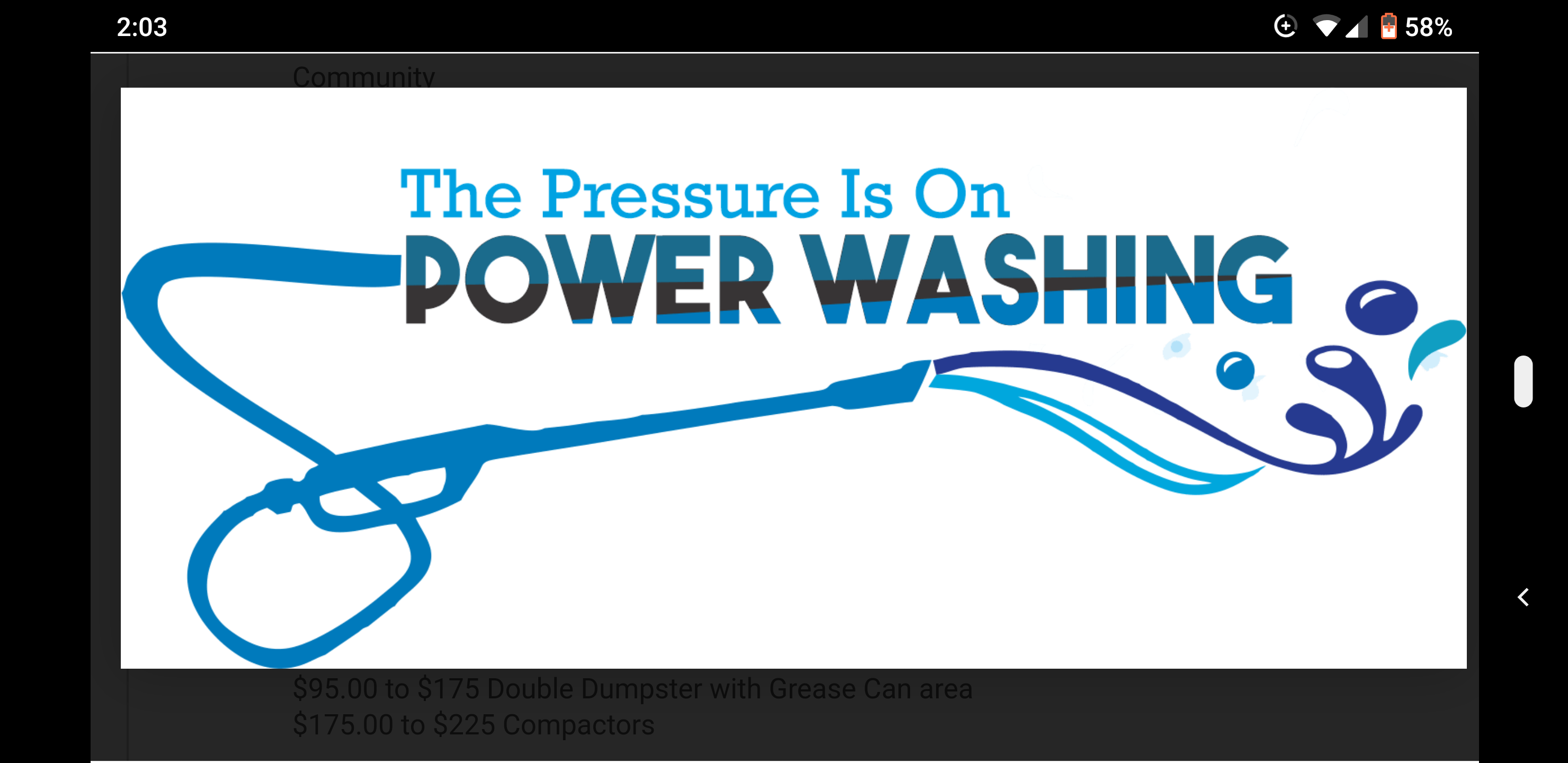
Hey all. So I reached out to Fiverr to design a couple of logo concepts. Here are 6 concepts!
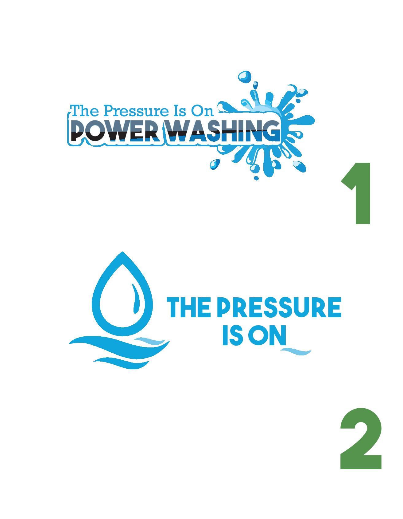
Curious what you guys think and any feedback is greatly appreciated
Hey all. So I reached out to Fiverr to design a couple of logo concepts. Here are 6 concepts!
Curious what you guys think and any feedback is greatly appreciated
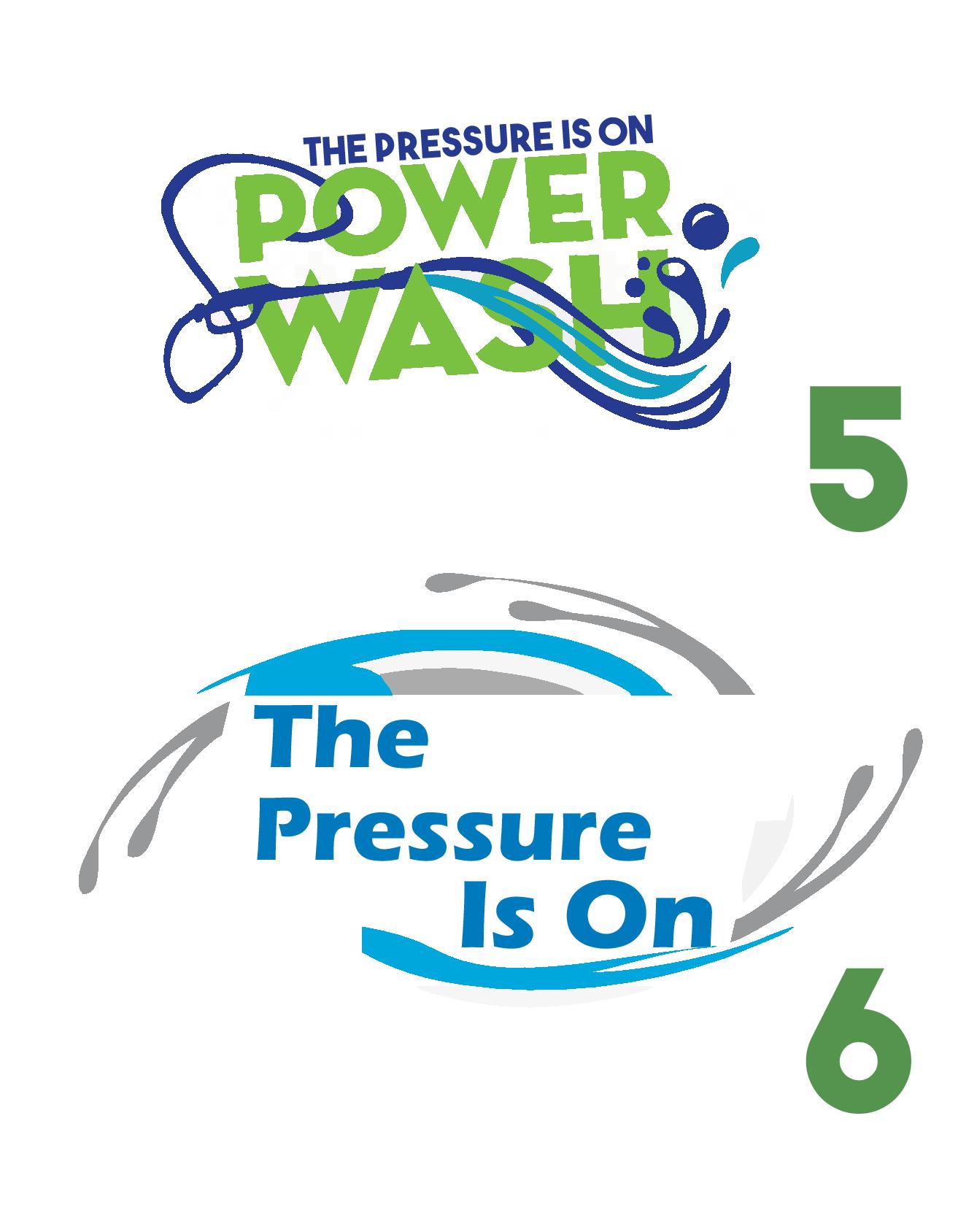
I think 1,4 and 5 are something to pursue on first glance. Need to figure out what order though.
#1 def.
Just add the wand right underneath “power washing”.
#1 is the most professional looking and eye-catching IMO. And most importantly, it has what you do (power washing) more prominent than your company name. I also like #5 for the same reason
That is what I like about #5 (the wand).
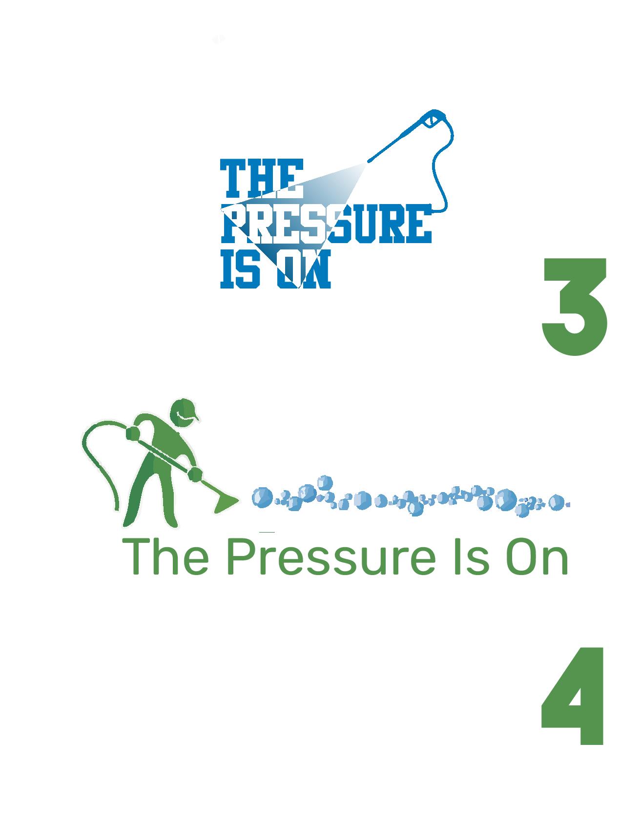
The guy in #4 is something I’d love to incorporate into my plastic business cards. Where he is “spraying” have that part completely see thru. The guy doing up my logo design is doing my business card. Do you think that would be too much on a business card?
I’m also a vote for #1. I like @KMP 's idea of adding a wand beneath it. I like #5 too but I’d maybe make a couple more of the water lines go behind the “S” so it’s not too washed out. Same with the “H”. I’m not a fan of #4 unless it has some minor changes. To me it looks more like he’s vacuuming instead of spraying. I’d have them change the spray pattern. Maybe don’t have the spray pattern so wide and make it blue.
I think I went through like 4 different designers on Fiverr before I found one that finally started going in the direction I wanted them too. I kind of had a basic idea of what I wanted but needed help with the design side. The first few designers were awful and made the logo look like something out of a girly fairy tale…lol
Yours are looking good George!
I think this is the route to go. Told the guy to show me #1 with a wand like in 5. And to show me #5 with some of those sprays behind the S and H
I like #5 but the water going through the S is done up a bit. Makes it hard to see it clearly.
Yes, pretty sure I’ve seen that clipart dude in some carpet cleaning logos ![]()
No.1. Keep it simple. I hate to say it but…Nobody cares what the name of the company is.
Kinda like getting my asphalt driveway sealed…I don’t care what you are calling yourself, just do a good job. Just don’t look or act shady or I won’t hire you. That’s my take.
No.1 without the “bubble” outline around Power Washing.
Haha…That’s funny
Don’t mind the logo. Told him that is not what I was looking for. Going to go with #5 with some modifications. Where can I improve this flyer to hand out to businesses with my business card? Should I add that I also do drive thru and entrance ways as well or should I just focus on one thing per flyer?
Probably going with #5 with the advice that @SchertzServicesLLC gave. But also said to give me #1 without the splatter on the end. The wand from #5 underneath the words of #1. We shall see