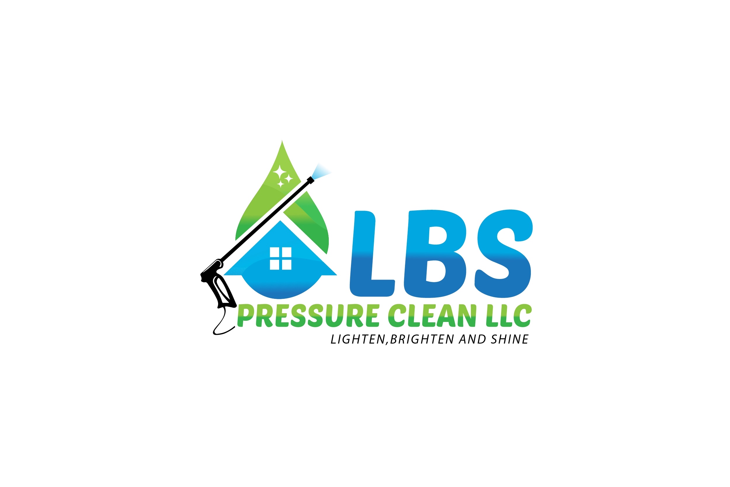
Hello all just wanted to throw up the new logo and see what y’all think I did a huge 4 person survey before settling on it probably should have put up here first.
12 Likes
That’s awesome. Clean, gets the point across, and the colors work great.
Thanks @squidskc I think it hits the mark. I just hope future customers think so too.
I like it…Clean, Professional, To The Point. Also, no one had to guess why your company goes…one look at the logo and they know you’re a Power Washing service. Very nice!
Thank you for the kind words @Atlas1. You said exactly what I was hoping to hear I really wanted to be self explanatory.
I like it nice and bright, gets to the point, easy to remember and I like the colors!
Much appreciated @Ecowashpressurewash.
I like it a lot. Great colors and crystal clear what you do. One note you’re probably already aware of, you’ll want a space between the comma and “Brighten” 
Dang it I knew I should’ve came here first I never noticed that @nopressure now it’s gonna bug the crap out of me being as I already approved it can’t get revisions now. Also thank you
1 Like
By the way if anyone wants to know it was a person who goes by dexignflow on fiverr who did it.
2 Likes
haha, do you have the native/editable file? If so, I could edit it for you (assuming it’s in Adobe Illustrator or Photoshop)
Or just ask them to fix it. It would take them 3 seconds, so I’d imagine they’d do it for you. Would be pretty ridiculous not to.
I would change the font on the tag line, use upper and lowercase and delete the “AND” and replace it with “&” instead.

2 Likes
I agree 100%
Im waiting to receive the files now, that is a good look @Steve I’ll message them and see what they say the ship may have sailed but I’ll see.
1 Like
very cool! love the attention to the logo (house/waterdrop) 
Thanks @Hellbilly I thought about swapping the green and blue around on the waterdrop but I think it’s good like it is
By the way the LBS has dual meaning of course its for the tag line and those letters are my three daughters first name initials thought about hiding three little stick figure girls in the window not sure if that would be wise though
The color arrangement you have now really flows well. I don’t think it would look as good if you changed it.
Also, the stick figures idea is not a good one. It would look way too busy, and you’d have to explain it to almost every customer, cutting into your time and production. Plus, people don’t care that much about you and your family, they care about what you can do for them. (I don’t mean to sound cynical, but that’s really the way it is…Your service, courtesy, and professionalism are all that really count with potential customers, and you’re wise to project a purely professional image)
Personally, it think it looks awesome with @Steve edit…I wish my logo looked half as good. (I’m serious when I say that…I usually don’t get into logo discussions, but yours really caught my eye, and I thought it deserved a compliment, so I got involved)
1 Like
Yeah I agree with you it was just one of those things that popped into my head. Thinking about it now, I’d hate to have to explain that concept to every person like I did a couple post ago. I’m trying to get the suggestions @Steve made done. I think it gives it a little something more. Thanks again for the input everyone.
2 Likes
