I like the second one better, the name stands out. The more people see your name around town often the better. And I like the hood graphic, will look nice on aereal photos and such.
I personally don’t like cluttered graphics so I don’t even list services. Chances are if they’re curious about roof cleaning or pressure washing related things they will check out your website
I totally dig the first one man. I do agree with @Harold on the blue line going threw roof and exterior cleaning, it’s a lil hard to read , Can it go under that then sweep up by the tail light ? , If you keep it like it is, it still rocks , Nice looking rig.
3 Likes

Think you got a winner! Loven the frog btw
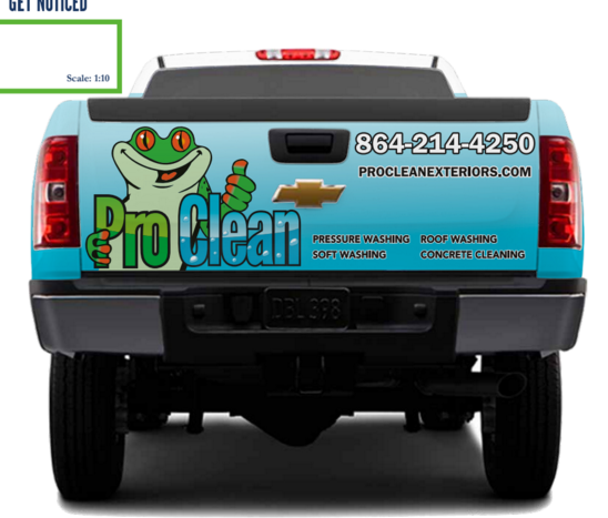
Awesome! And you still have room to add fleet washing on the tailgate  . Looks really nice man, well thought out.
Should I bother putting ‘Licensed - Insured’ somewhere? Have some room a couple of places on side now. Either bottom of rear door or above domain.
I would sir, you got plenty of room on the tailgate, door or under fuel door
Anyone with a truck like that I’m assuming has all the licenses and insurance they need. It’s the guy in the civic I’m asking for paperwork.
8 Likes
You have a point. I rarely get asked about but then I send a COI out with all my quotes
3 Likes
I wouldn’t bother. Your truck is a moving advertisment, keep it simple so people see what you want them to read. Your company name, your services or most popular service, and your contact info. It looks great as is. The only thing I’d consider adjusting at this point is the size of the services listed in the bottom right of the tailgate. They fit nice there but just seem a bit small.
1 Like
Same… it makes some customer question the other guys.
that looks great!
This is the only thing, for me, that could make it hard for someone at a distance, circled in blue). And only other thing would be is in addition to the name you may consider a simple description of the service for example “power washing” also in big font. Potential customers may think your a carpet cleaner or something, don’t want that. Edit: forgot to add pic, added pic.

1 Like
I like the much larger lettering on number 2. Just has more impact imo. 
I think it’s perfect. You could probably go either way with the licensed and insured. As Greenman said anyone who sees your truck knows they’re dealing with a professional. I doubt adding it would make any difference on who calls you. Although, I do see Patriots point in that it could make people question the other guys. I see Max’s point with keeping it simple is best. When driving down the road people only have a few seconds to look so you don’t want too much text to where they’re just kind of looking over the whole thing. You want them to focus in on your name, contact info, and maybe services. In other words I’d just flip a coin on whether or not to add it. Either way I think it looks awesome!
4 Likes
Looks great, all suggestions I had were implemented. Definitely truck one, if its still being kicked around. Lastly, wherever you can increase font size do it.
2 Likes
I would not put licensed and insured. Kinda the same theory as commercial residential. From viewing the way you present your company and equipment that will be assumed. If they want it or care they’ll ask. Which is rarely for me
I think it looks great as is 
Looks Great
Did you ever get it wrapped? If so can we see the finished product? I don’t recall seeing the War Wagon wrapped in the video but maybe I missed it in the excitement.
