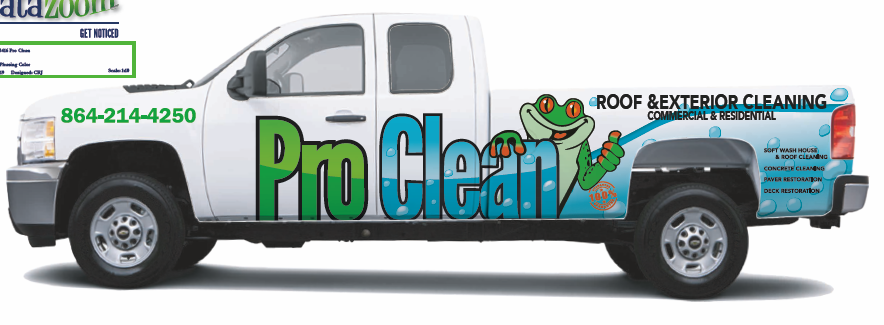
Partial truck wrap - good, bad, indifferent. Want to get taken care of next week.
 like it
I think it looks good. Only thing Id consider is maybe outlining the name in hi vis yellow so it can be seen from a distance better. Just add the yellow, keep eveything else same.
“Roof & Exterior Cleaning” needs to be easier to read. I suggest a simple stroke. White text and black stroke comes to mind first but you could probably come up with a better color scheme. It’s hard to read
Some would say that commercial & residential isn’t necessary and I tend to agree. Less is more. When people see that fancy rig they will call. It should be in question if you do commercial or not.
It’s black on a white background, can’t get much more contrast
Looks good, be a lot better on a ford ;>)
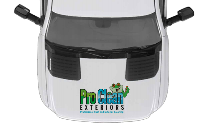
Is the hood wrap to make it easy for the carolina night birds after @Grizz “borrows” your truck. lol
Seriously, good job
Looks good
The blue stripe makes it hard to read. Add a stroke/border.
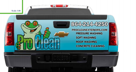
Also, I would find another arrangement on the tailgate. The services directly below the phone and website look jumbled.
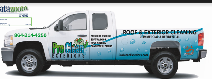
I think the design is clean as hell. Just a few tweaks.
y, kind of agree with you. A little busy on the rear. Think if I just cut down the size of the services some it would help
Here was my other semi finalist
But showed both to several of my customers and they all agreed that they liked first one
That could work. Or shrink the frog and put the www and phone under it. You could also list services horizontally
Vs
I like the first one as well. The services are more prominent. Frog as cute as he is should be secondary. Service. Contact. Everything else. Can’t wait to see the finished build
On the side, I have room to add a couple more services, like Wood Restoration and/or Pavers, etc but didn’t have room on the rear. should I add just to sides or leave it be?
Don’t want to make it too busy though.
I think it looks great! I was going to say the same thing as Harold about the blue line making it a little tougher to read. I like the 1st design better than the second. Could you maybe have them make that blue line narrow down some once it hits the bed and have it curve down right above the wheel well and right below the "commercial and residential?
Even if you left it as is I think it would be fine. I really like it.
I would keep it as simple as possible. But I understand the dilemma. Tough call
Might get them to drop it just a little and make a tad smaller and see how it kind of goes up towards the rear. Maybe let it come down enough to pick up the slant of the top of the tail light. Don’t want to drop it too far though because it’s tinted some below it.
The Commercial and Resi could probably slide down just a little more
Ask them to put a thin white stroke/border on roof & exterior cleaning. I think you would like the way it’ll pop out more. It’s literally the most important thing on the truck.
In all honesty, Harold may be right as far as keeping it simple. This thing is a real beast. I’m not sure anyone will notice the graphics that much. I could probably just put in black down the the side ’ We Clean S…’ and the phone number, lol.
I’m calling it the War Wagon ! - ‘we wage war on dirt’
Limarado boy @SchertzServicesLLC and Truck Norris @Infinity going to have to step up their game. 
I’m not planning on lettering anything at this time lol… if I add the other 5 new trucks for next to winter it will have “not for hire” on them