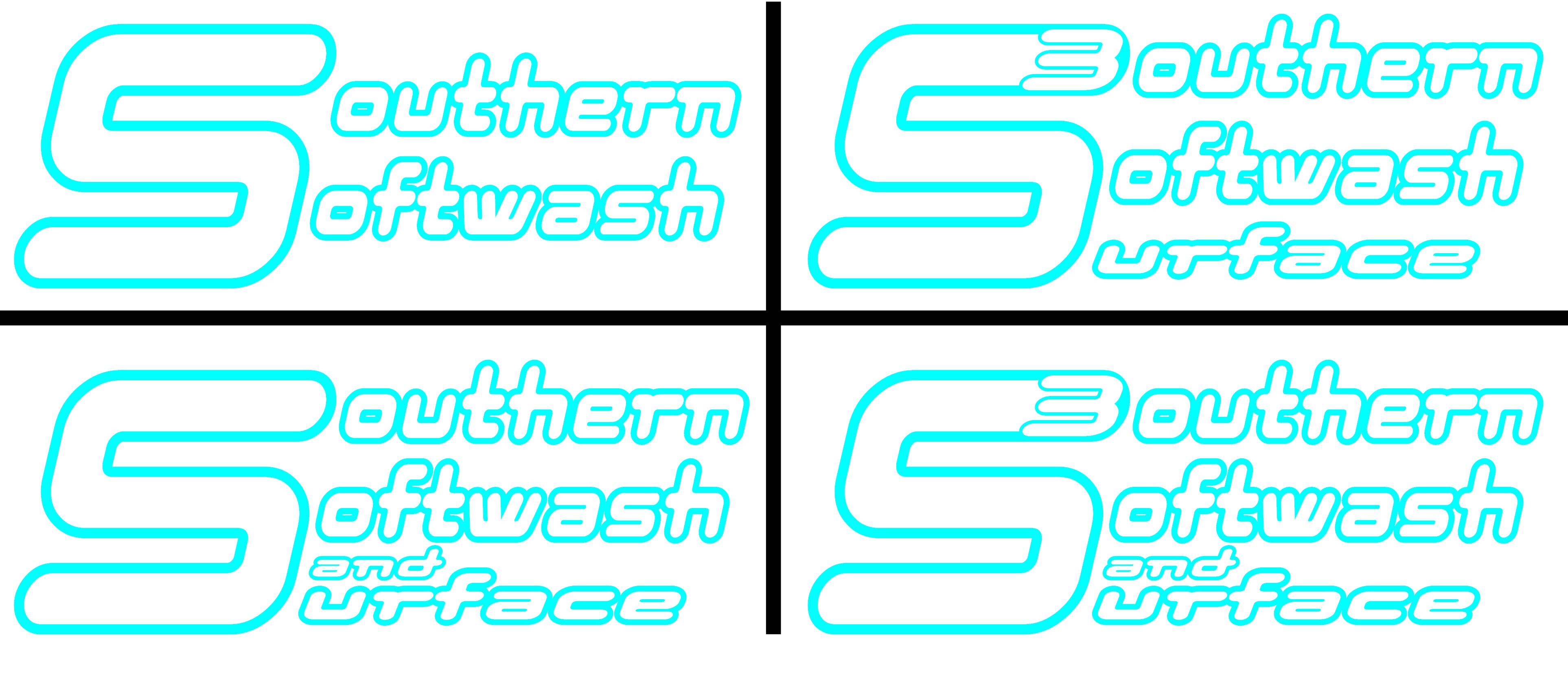
Still in the planning stages of my build, but going up to the Nashville Power Wash Store tomorrow, and also hopefully going to look at a truck (07 GMC Sierra). BUT in the meantime ive been trying to work on a name and logo…figured id get yalls input.
Even though i am just getting started i know marketing and advertising is very important, and would want to at least have a facebook page set up and some vista-print business cards ASAP. though i will be focusing on residential/community work at first i do plan to expand to light commercial, and i know a catchy name and logo will stick with people if properly thought out. several other companies/people in my area (60 mile radius or so) seem to hit heavy on certain key words like “extreme” or “pressure” in their names and slogans…which id think to those unfamiliar with the process might seem a little “rough” persay when someone is thinking about washing their home. as ive learned it is more flow than pressure that does the average cleaning…i think id like to put that ideal out to potential clients. so i drew up a few ideas and would love some input, either on my reasoning or my designs.
personally i like the “S3” the best, as it could be an easily recognizable logo for shorthand…though it might be “too much”…let me know what ya think, you all are the experts
I’m not only the resident chemist, i’m also your target market…a.k.a. mom in the suburbs. While the phrase softwash is HUGE in the industry, us normal folks have no idea what it is. Pressure wash or Power wash would tell me what you do…but softwash…you might be a laundry service.
My advice is to come up with a more memorable and unique name. Then pay a graphic designer to do what graphic designers do. If you’re on a budget you can’t go wrong with fiverr. $10-* whatever you want to spend. I used actualreviewnet. His services cost me $85 bucks but it was well worth it.
That blue and hot pink were actually voted to be the best colors for marketing by some demographic group about 3 years ago. I only know this because one of my customers insisted on using them.
I don’t have a problem with the color…it is weird that they are like bubble letters though. Be more catchy if every other letter was at least colored in.
I dont really care for any of them either. You already have your idea made up. Send thise rough drafts to someone on fivrr and they can make it look alot better. They like it when you already have a idea of what you want.