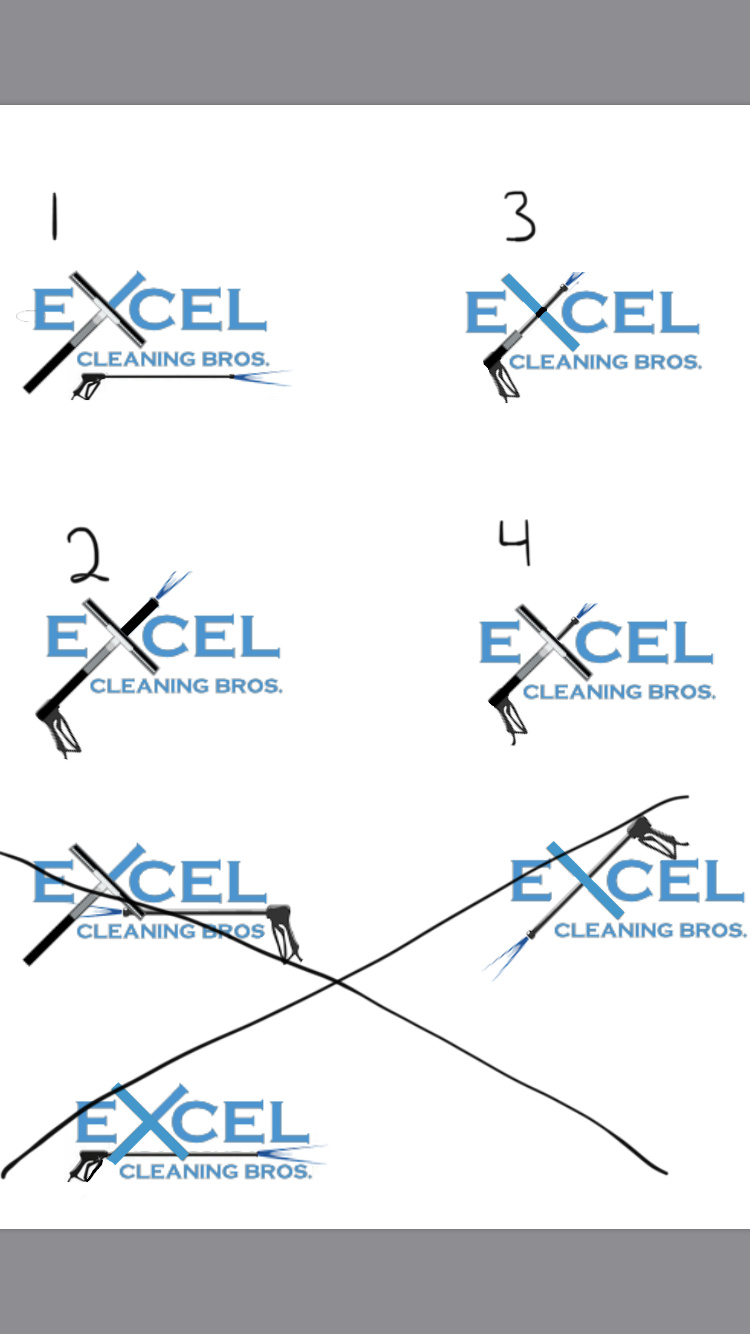
My original logo had just the squeegee in the x because I did mainly windows but now we are shifting to mostly pressure washing and soft washing and wanted to incorporate a pw wand in the logo. Should I take the squeegee out or have both?
I would get rid of the animation on the X for number 1 and used that one with just a capital X.
all the ones with the squeegee or wand incorporated into the x look like a crucifix, and not in a good way.
1 Like
when I went back to look, That made me laugh so hard I cried.
Yeah I would stick with a Capital X.
The X represent like a problem or something, At first glance it’s a bit discouringing… Just my honest opinion
It’s reminded me of exon gas stations
1 Like
Man, all I see now is a crucifix. I would make the X a slightly larger text than the rest of the letters.
1 Like
 I’m kindz leaning towards the #3. Need to make a few tweaks tho. What we have now is just the squeegee and a guy from our church actually said he loves how we incorporated Christ into our business… lol not really what we were going for but cool
2 Likes
