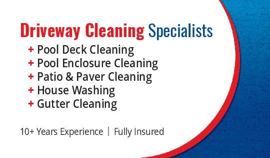
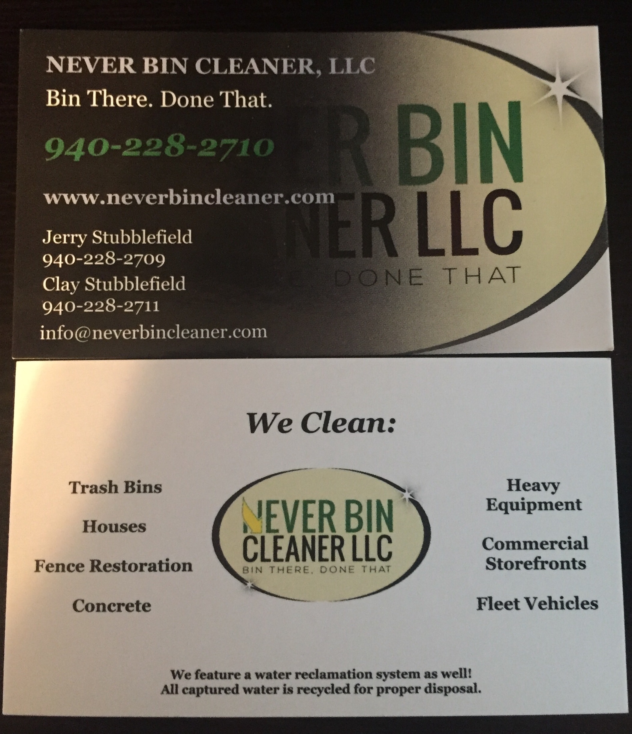
Changed the name of my company and had these made.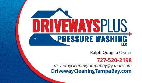
1 Like
Those look great RalphQ!
Jesse
Atlas Services
Exterior Cleaning Specialists
North Carolina
That’s a really good idea
Jesse
Atlas Services
Exterior Cleaning Specialists
North Carolina
www.CallAtlas.com


A lot of white space.
Clean, crisp, glossy image. Perfect to display my brand without bombarding the customer.
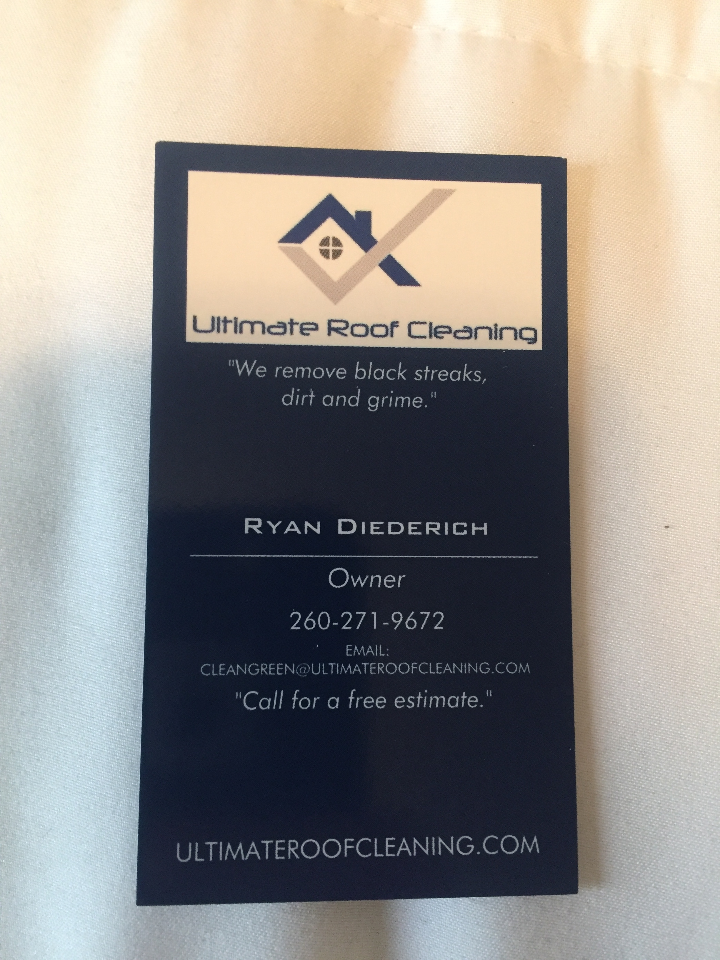
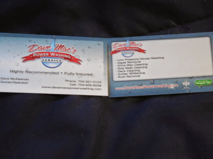
Nice looking card
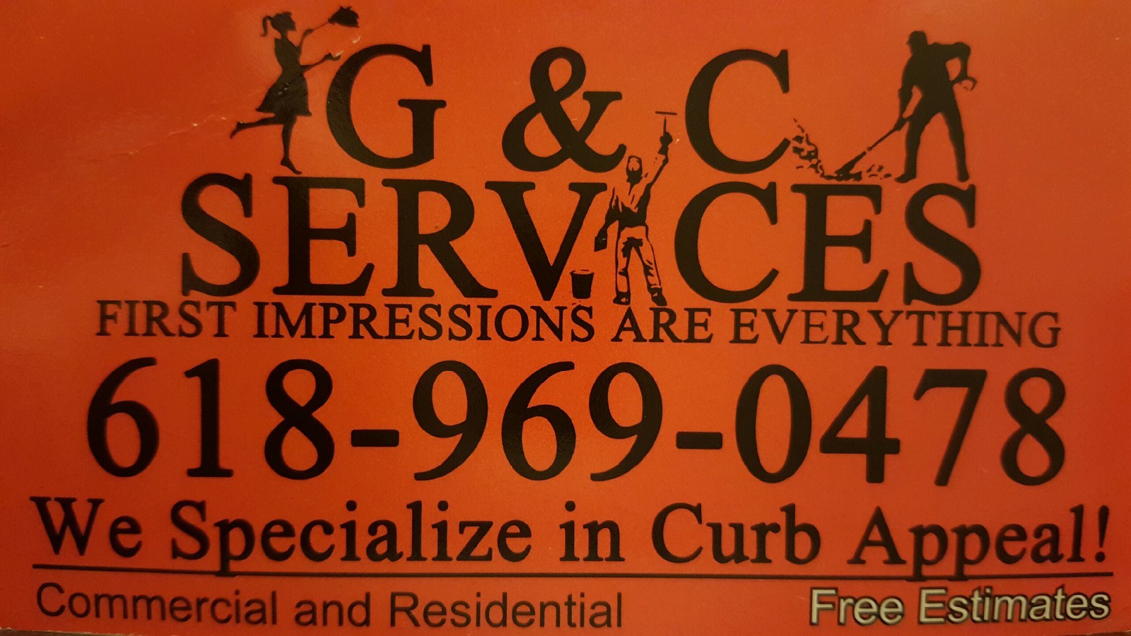
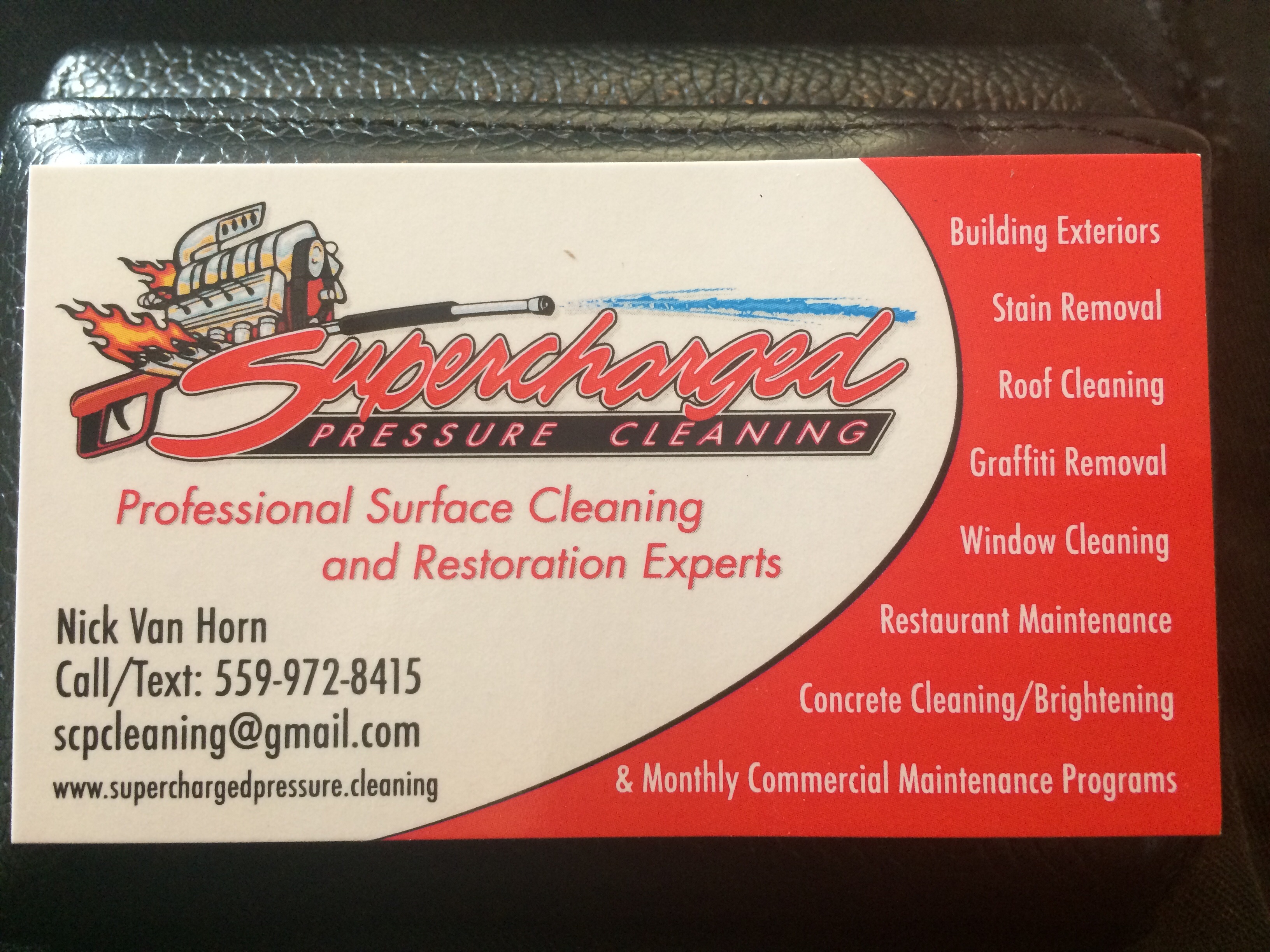
Here’s mine - simple (although possibly too much text), but easy to keep the the theme consistent over cards, flyers, web site, facebook, google+ etc

I love that orange color and the simple logo!
3 things stand out to me personally though:
1:Maybe put your list of services on the back to keep the front from being too “busy”
2: Make your website and phone number HUGE
3: You might want a little different font. The one you have for your list of services looks a little boring (like its from an old typewriter)
I’m by no means a marketing expert…just my $0.02
1 Like

1 Like

Thanks Atlas - I hear you on those points.
It’s tough call on whether the card is just your business name, your name & contact details; or more like a mini flyer/leaflet with info to get peoples attention.
Cheers
John
I agree! It’s easy to overkill on cards. My opinion is keep the front VERY simple and uncluttered (Logo, Slogan, Website, Phone Number) and put the more detailed info on the back.
1 Like
I like that card, wish I would have thought of it, lol