thinking about switching up our logo a little bit, in the hopes of capturing more commercial work. Seems like the “Inc.” might help in that regard.
old logo:
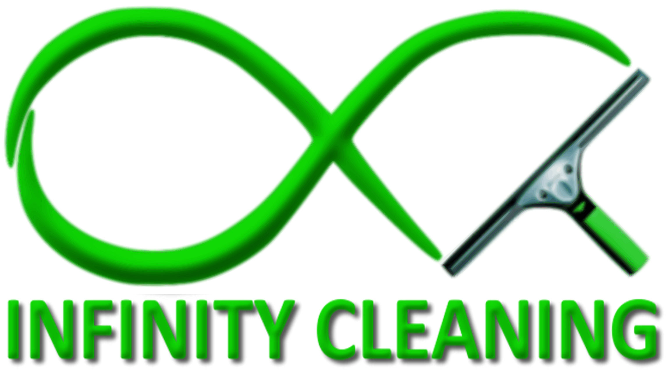
new concept:

thoughts?
thinking about switching up our logo a little bit, in the hopes of capturing more commercial work. Seems like the “Inc.” might help in that regard.
old logo:
new concept:
thoughts?
Yes, the new makes a better statement.
What the difference? Lol
Grrrr… ![]()
![]()
![]()
![]()
I like the color of the OG infinity symbol and the detail of the new squeegee. New words look good.
I agree with 
Its crisper and cleaner. 
Unger? Ettore guy myself.
Ditto. I just like the color of the Unger squeegee handles. My EDC is actually a 14” liquidator channel in an aluminum Ettore handle.
Thanks all for the input. I’m partial to the new shade of green, and the flattened look of the logo, myself. But I sort of wish I had the photoshop skills to “flatten” the look of the squeegee to better match the rest of the logo. I attempted drawing a new squeegee by tracing the old one, and the results just looked like bad clipart 
Anyway, shifting the topic slightly: how does everyone feel about the name adjustment from a marketing perspective?
I realize that I could probably accomplish more in some ways by a more complete rebrand in the direction of power washing, dropping the squeegee altogether. But I’m greatly torn on that, because I feel I’ve actually developed a level of brand recognition in my little town.
I personally like the idea of the logo, but could do with some professional work ![]() Im just giving my personal opinion…
Im just giving my personal opinion…
fiverr.com or freelancer.com could help you at a reasonable price… ![]()
And if you do not have an agreement with Unger about using their copyrighted design in your logo, perhaps make some adjustments.
I did actually reach out to Unger for permission back in 2010 when I first came up with the logo; they were fine with it.
As far as getting “professional” help on the logo, I can see the wisdom in that. I’ve just not been thrilled with a lot of what comes out of Fiverr, and don’t see a real need to fork over good money for what would largely be a vanity expense. I have customers compliment my logo almost daily, as it is.
I’m also way too much of a control freak to turn over the reigns 

If you have any specific design suggestions, I’m open to them and will see what I can accomplish in GIMP (the poor man’s photoshop)
I actually just did this. Changed the name and logo of my company. I also live in a smaller community and was widely known which was part of the problem. I was widely known as the window cleaning guy. With the rebrand people are a little confused but I am able to explain that I changed the name of the business to better reflect the new company focus.
Mind sharing before and afters in a PM?
I like the logo as it is - it is simple, recognizable and straight forward. If you’re wanting to push towards more of a power washing theme for it, I’d replace the squeegee with a wand or something like that. You could easily do that and not lose the brand recognition you have already established In your area as it is a fairly unique logo. The word infinity assumes a starting point or beginning, but no ending. If you started with window washing, I’d keep the squeegee. If for no other reason, maybe a conversation starter with new customers about your company and how established you are and where you are going. I think the logo and company name together are very professional.
I wouldn’t mind knowing the before and after affects of changing your business name and image .
That would be a good topic here. I like my name and logo but, commercial and professionally doesn’t work well. Already thinking about changing it
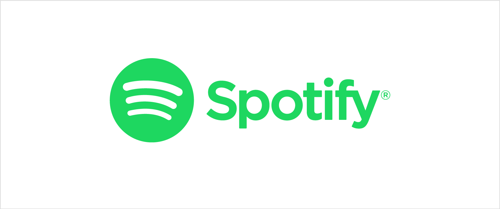
The logo itself is no doubt better, however the text style i’m not a fan of. i would suggest something sleeker to match the logo instead of the clunky basic text you currently have. if you look at spotify’s logo, the green spotify text style is what i have in mind
That’s a good idea ^
I kinda like the change, but do you need the inc in the pic? I don’t care if your inc, llc scorp etc but some people like it for bidding purposes. Just an idea.
Now…what about if you added some more lines, like all around good guy, or men want to be like him and men want to be with him…I can’t help myself.