Would you please give me some feed back? Would this peak your interest if you was a home owner?
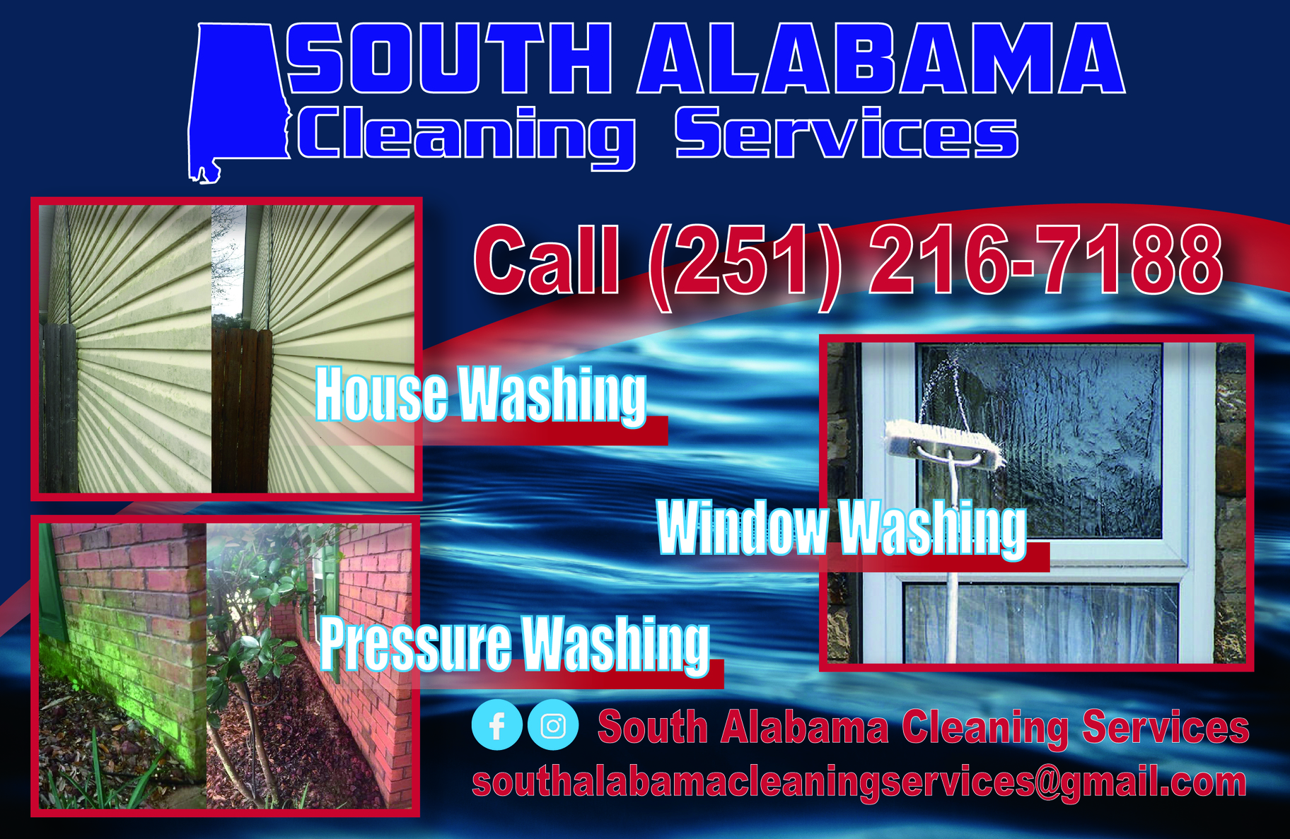
The lettering could use some tweaking as the red is hard to read against the blue, especially when using outlined letters.
Agreed make the background more of a gray scale to hard to read the letters. Also use a better photo to show whats being cleaned on the siding.
Also, I would shorten your email address to something like SACS@gmail and then replace that email on the card with a website address.
Agree the before and after on the siding isn’t different enough…also, I rarely think about my windows…now my patio under my deck…dang that is covered in gunk. You only have vertical surfaces on the card.
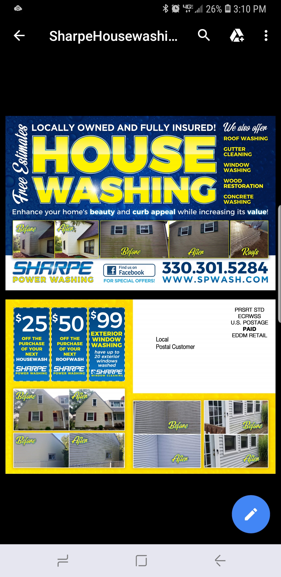
This is an Eddm I have had good success with if it helps. Minus the before and after mix up on the back of course!!!
8 Likes
I can see why it works! Looks great!
1 Like
Great card.
1 Like
Thanks
As always your killing it in the marketing game well done sir! Who does your design work if you dont mind me asking?
1 Like
One of my helpers is a full time graphic designer. He does it all and hes awsome at it!
2 Likes
It shows. He does good work.
Thanks for the feed back.
1 Like
