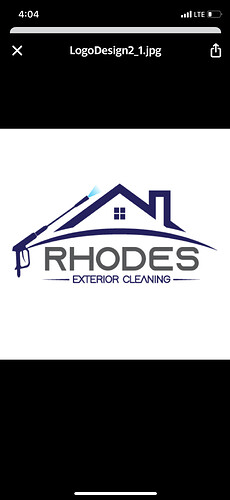
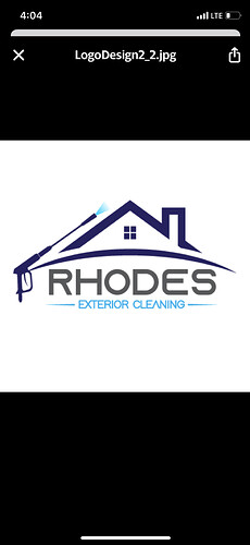
Which one would yal go with or what changes if any should I make
the only difference I see is the font color of “Exterior Cleaning”?
Really up to you. I think it looks kinda generic & clip-arty, but I’ve seen much worse.
In the second one, exterior cleaning matches the color of the water so I guess that is better. I’m not seeing any other changes jumping out at me. I don’t mean to sound like an asterisk, but does it matter that much? I don’t know where your phone number will go in conjunction with that, or the web site/FB name that everyone lists nowadays.
I agree with Infinity. A little clip art looking. I’ve had a ton of stuff made by this girl and she is amazing. From logos to business card and marketing material. Spend the money and you’ll be really happy.
Everyone has the roofline logo. Exterior. Cleaning in light blue won’t show up well from a distance.
The dark blue for sure. Also know that the gradient of the water spray may be hard to reproduce on promotional materials or uniforms. Gradients are very hard to nail.
Thanks for the feedback guys well appreciated
I can tell you from experience if you get that embroidered on a black material the dark blue is hard to see.


