A couple of thoughts…
I apologize as I wrote without thinking through what I was writing, this morning. You don’t have to represent your services in a logo (example: Nike’s logo doesn’t represent what they do). You just need an element that represents your business and is unique and compelling enough to be memorable, and even then you don’t have to have an element - plenty of businesses just have a textual logo. However, logo elements that portray what a business does/provides can be more impact-full although not necessarily as recognizable or memorable.
For example, the re-brand that I went through with my FTJ, they wanted to signify spraying, movement, power, and technology. These were their visual goals. We ended up going with something similar to PWR’s logo, albeit recognizably different. It told enough of the story and kept things simple. It represented spraying and movement, and we opted to integrate power and technology visuals into the rest of our graphics and marketing pieces to represent those ideas.
You should also take color theory into consideration. The colors you choose absolutely affect the subconscious perception that your customers have about your business. It may be easier to represent “washing” and “cleaning” by simply changing your brand color.
Blue
Blue is the color of the sky and sea. It is often associated with depth and stability. It symbolizes trust, loyalty, wisdom, confidence, intelligence, faith, truth, and heaven, and produces a calming effect. Blue is strongly associated with tranquility and calmness.
Use blue to promote products and services related to cleanliness (water purification filters, cleaning liquids, vodka), air and sky (airlines, airports, air conditioners), water and sea (sea voyages, mineral water). As opposed to emotionally warm colors like red, orange, and yellow; blue is linked to consciousness and intellect. Use blue to suggest precision when promoting high-tech products.
Avoid using blue when promoting food and cooking, because blue suppresses appetite.
*Light blue is associated with health, healing, tranquility, understanding, and softness.
*Dark blue represents knowledge, power, integrity, and seriousness.
Green
Green is the color of nature. It symbolizes growth, harmony, freshness, and fertility. Green has strong emotional correspondence with safety. Dark green is also commonly associated with money.
Green has great healing power. It is the most restful color for the human eye; it can improve vision. Green suggests stability and endurance. Sometimes green denotes lack of experience; for example, a ‘greenhorn’ is a novice. In heraldry, green indicates growth and hope. Green, as opposed to red, means safety; it is the color of free passage in road traffic.
Use green to indicate safety when advertising drugs and medical products. Green is directly related to nature, so you can use it to promote ‘green’ products. Dull, darker green is commonly associated with money, the financial world, banking, and Wall Street.
*Dark green is associated with ambition, greed, and jealousy.
*Yellow-green can indicate sickness, cowardice, discord, and jealousy.
*Aqua is associated with emotional healing and protection.
*Olive green is the traditional color of peace.
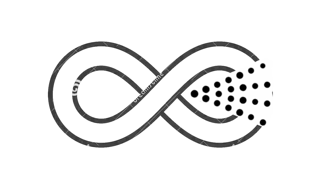
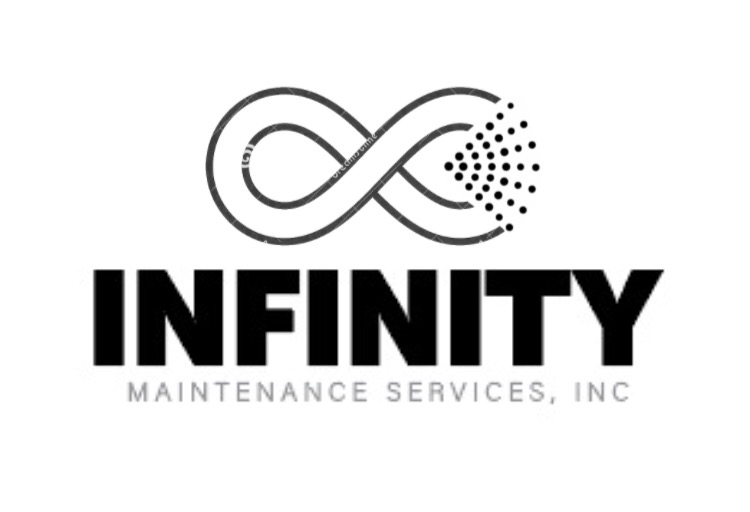
Personally, I think you should keep your infinity logo as it will be more memorable. You may just need a different design of it to make it “stand out”. I also think that if soft washing and window cleaning are your services that “maintenance” isn’t the best word representation of those. But, that is my opinion and this is your business. Maybe, Infinity Low-Pressure Cleaning, Inc. or something along those lines. But, again, my opinion.
@Infinity, I’m more than willing to help you get the perfect logo designed for your business, free of charge. I’m the type of guy who would rather store up good karma through helping others. You never know when I will need help that others can provide me. Shoot me a message so I can give you my email and let’s make this happen for you!