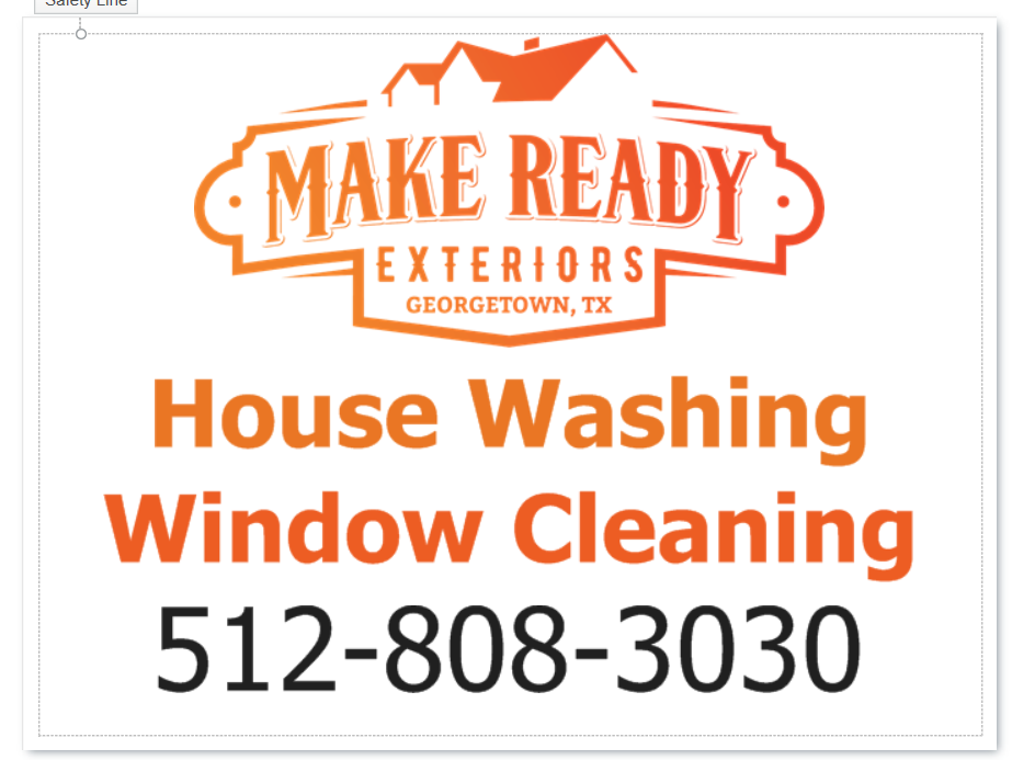
Anyone care to comment on these yard signs? I am going to order 6 - 18x24. Very basic…
Any advice?
Your logo is nice but this goes against the marketing tactics that are not only preffered but
are proven & have brought many on this forum success.
I’m new to the game as well but have been researching this for a while.
The consensus around here is that you want to highlight the service you are offering followed by the best way to contact you (phone). Those two things should be the focus.
By the way try to stick to one service on the sign.
Example:
House Washing or Roof Cleaning - Big noticeable letters
Phone- Can be slightly smaller then above but still very big noticeable letters.
I would highlight your website if you have one as well but everything else is fluff. Lots of folks don’t even put their logo on there.
You also have to be wary of colors & contrast, that red to orange gradient on white would be hard to read from a moving vehicle or from a distance. You only have a second or 2 to get the customers attention & relay the message.
Check out sign2day.com, the owner from what I understand is like the pioneer of this marketing method & albeit I have not dealt with him yet, I hear he’s a great guy. Also if you join PWRA & WCRA, they have some pretty good templates that you could use.
Tha m you for your valuable input.
Not enough contrast. The art doesn’t have enough ‘pop,’ - for lack of a better term.
